Photoshop Contest PhotoshopContest.com
Creative Contests. Real Prizes. Essential Resource.
You are not logged in. Log in or Register


Photoshop Contest Forum Index - General Discussion - Logo design help - Reply to topic

Goto page Previous  1, 2, 3, 4, 5  Next

lpoetschke

Location: Texas

Post Sat Jun 27, 2009 6:42 pm   Reply with quote         


Just something I came up with...


Marx-Man

Location: The United Kingdom!

Post Sat Jun 27, 2009 10:15 pm   Reply with quote         


Congratulations to everybody who came up with a header instead of a logo. Rolling Eyes

Azionite
lpoetschke

Nice looking Logo Designs...

There are three main things a logo needs to be.

Scalable. (Down to 16 X 16 px, a website browser thumbnail
)
This means it has have a simple constitution and be instantly recognizable.

Printable.
The next thing to consider is the formats to print, you really want to restrict your colors to as little as 3 or less including black and white. Remember this has to be printed en-masse
so make sure you have no gradients.

On message
If your company claims to be a web developer the last thing it wants to state in its logo is that it is a Photoshop manipulation site. But if the company name or purpose can be incorporated in the logo its wise to do so.


Logo Design Notes:
The Original Design was a based from a Pixel.

Turning the Pixel on its side shows off what the company does in its simplest form.

Taking the words and using the Fed-Ex Arrow principle I adjusted a gradient towards the "red" in Altared.
This does three things.
1.) Red Draws the eyes to the top of the logo and also attracts attention.
2.) The red changes the way you read the word making you read it twice.
"Alt-ar-ed" becomes "Alt-a-RED"
3.) It accents the top of the logo making it stand out, so when viewed it looks like a perspective exclamation mark with the Dot of the ".com becoming the bottom point. Effectively shouting the name of the company.

The last touch is the gradually increasing font size anchoring it as weighted down.

The entire thing has been color reduced for both style and cost effectiveness.


(Off .com version)


_________________

Post Sun Jun 28, 2009 1:25 am   Reply with quote         


Thanks everyone for the great input...

Here's one that I just did and I think I like it. It is recognizable if I just use the AP logo without the name and it's only a few colors. Easy to put on letterhead, etc.


supak0ma

Location: Photoshop Nation

Post Sun Jun 28, 2009 5:49 am   Reply with quote         


so you're going to ingore my warning? don't come back crying! Laughing


EJH

Location: NYC

Post Sun Jun 28, 2009 11:31 am   Reply with quote         


supak0ma wrote:
so you're going to ingore my warning? don't come back crying! Laughing

About the misspelling in the name? I'd have to agree.

Az, you really might want to reconsider that. It's one thing if you're misspelling a word in such a way that it makes another real word that people know the meaning to (like making a pun). But I think in the case of "altared", it just looks like a mistake. Or, it looks like your business involves religion or weddings.

You have such a short time to get your customers' attention and make a good impression... you don't want them to be immediately confused by your name (which is not the same thing as being memorable in a good way)—or think that you can't spell (they won't trust you).


Another random thing— note that "AP" is very widely known as "Associated Press". So you may want to be sparing in using the initials alone, since they already have such a well-known meaning.


pakimo

Location: Norway

Post Sun Jun 28, 2009 11:37 am   Reply with quote         


Remember a logo should look good as:

- Black on white
- White on Black
- Grayscale on white
- Grayscale on black
- Color on white
- Color on black

So use limited amount of colors and shades Wink
And keep it extremly simple.


Post Sun Jun 28, 2009 3:26 pm   Reply with quote         


supak0ma wrote:
so you're going to ingore my warning? don't come back crying! Laughing


I appreciate your input and I'm not ignoring it. I like the name as it is, but it seems I've gotten enough feedback about that particular point that I'm considering making the change. I definitely don't want to make a mistake early on and wish I had changed it after I've gotten business cards and letter head, etc.

At this point, I'm going for the look of the logo itself. After getting the design I want, changing the name is not a big deal.

It's been a big help putting my ideas out there and getting feedback.

Cool


Post Sun Jun 28, 2009 4:06 pm   Reply with quote         


I'm confused... why does this one get to have a gradient?

and... 3 colors or less including black and white?

Marx-Man wrote:
Nice looking Logo Designs...

There are three main things a logo needs to be.

Printable.
The next thing to consider is the formats to print, you really want to restrict your colors to as little as 3 or less including black and white. Remember this has to be printed en-masse
so make sure you have no gradients.


Taking the words and using the Fed-Ex Arrow principle I adjusted a gradient towards the "red" in Altared.


(Off .com version)


_________________
nancers 04/05 @ 10:40 pm
I like beefhead. He's such a noob. Guide him someone, please?

nancers 04/06 @ 08:41 pm
Because you don't count beef. JMH decided that when you were a noob.

PooDeFuego 06/23 @ 03:32 pm
BEEF YOU SON OF A BITCH!!!!!
Marx-Man

Location: The United Kingdom!

Post Mon Jun 29, 2009 11:42 pm   Reply with quote         


Yea you made three mistakes there beefhead.

1.) Mistaking graduated block shades for a smooth colour gradient. Also that when I said that "I adjusted a gradient" it meant that it was a gradient until I "posterized" it to 3 graduated block shades.

2.) Thinking that a shade is a different colour.

3.) Trying to catch Marx-Man out.

Hands up who knows how much it will cost to print two shades of the SAME colour (Red, Darker Red, or Black and Grey). Wink
A small lesson, the more colours you use in your logo, the more it costs to print on stationary, like business cards, letter heads etc.

The great thing about shades is that the printer adds black (On white paper / card.) to make the red darker, and as I included black in the logo only three colours exist... so it costs the same as three colours.

(Yes black is a colour ink when printing but is not a strictly a colour it is an absence of colour.

We treat white as a colour because you may end up printing the logo on coloured surfaces in which case that also needs an ink.

But on white buisness cards you do not need white ink. so technically even if you treated the logo design as having 4 colours one woudn't be printed at all unless it was a rare case but even then, Its a SHADE.

Why blocks instead of gradients... You ever seen how a printer struggles with a gradient... it never turns out how you want it.


_________________

blue_lurker

Location: Australia

Post Tue Jun 30, 2009 3:06 am   Reply with quote         


Marx-Man wrote:


A small lesson, the more colours you use in your logo, the more it costs to print on stationary, like business cards, letter heads etc.

The great thing about shades is that the printer adds black (On white paper / card.) to make the red darker, and as I included black in the logo only three colours exist... so it costs the same as three colours.

(Yes black is a colour ink when printing but is not a strictly a colour it is an absence of colour.

We treat white as a colour because you may end up printing the logo on coloured surfaces in which case that also needs an ink.

But on white buisness cards you do not need white ink. so technically even if you treated the logo design as having 4 colours one woudn't be printed at all unless it was a rare case but even then, Its a SHADE.

Why blocks instead of gradients... You ever seen how a printer struggles with a gradient... it never turns out how you want it.


Shit dont know what printers are like where you are but if I take an image to my printer I want what I show him, after 2-3 test prints sometimes there is a compromise on colour but very rare. Thats if your talking professional printers, home printers are just that fro the home.

I have never had issues with gradients or colours other than some magenta's other than that its all been good. Thats heat printing and off set


_________________

DaVinci

Location: The Netherlands

Post Tue Jun 30, 2009 6:49 am   Reply with quote         


EJH wrote:
if you'd wait for 2 minutes, you'd get it Razz


(I added a couple more squares, because I think it's stronger to align them to get the subliminal "ALT" effect)

ok, my work here is done. Going to the outside world while the sun is shining... Smile


This one is very nice! Very Happy


Canuck <º)))><

Location: Dorchester, Ontario Canada

Post Tue Jun 30, 2009 8:37 am   Reply with quote         


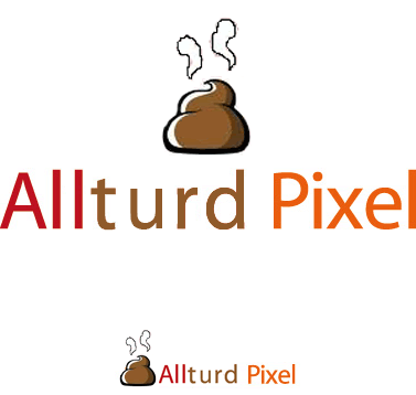
Well, since spelling doesn't seem to be an issue:


_________________
"The atheist can’t find God for the same reason that a thief can’t find a policeman."
dewking

Location: Pembroke, MA

Post Tue Jun 30, 2009 9:55 am   Reply with quote         


_________________
zebob 06/09 @ 11:14 am
im more of an alethic computer geek that doesnt play sports but is still strong.
Eve
Site Moderator

Location: Planet Earth

Post Tue Jun 30, 2009 10:28 am   Reply with quote         


Laughing @ Canuck


_________________
If you're going to walk on thin ice, you might as well dance!
thank u Tawiskaro
EJH

Location: NYC

Post Tue Jun 30, 2009 10:50 am   Reply with quote         


dewking wrote:

great article!


Goto page Previous  1, 2, 3, 4, 5  Next

Photoshop Contest Forum Index - General Discussion - Logo design help - Reply to topic

You cannot post new topics in this forum
You cannot reply to topics in this forum
You cannot edit your posts in this forum
You cannot delete your posts in this forum
You cannot vote in polls in this forum


Navigate PSC
Contests open  completed  winners  prizes  events  rules  rss 
Galleries votes  authentic  skillful  funny  creative  theme  winners 
Interact register  log in/out  forum  chat  user lookup  contact 
Stats monthly leaders  hall of fame  record holders 
PSC advantage  news (rss)  faq  about  links  contact  home 
Help faq  search  new users  tutorials  contact  password 

Adobe, the Adobe logo, Adobe Photoshop, Creative Suite and Illustrator are registered trademarks of Adobe Systems Incorporated.
Text and images copyright © 2000-2006 Photoshop Contest. All rights reserved.
A venture of ExpertRating.com