Photoshop Contest Forum Index - Fun and Games - Heinlein Logo Contest - Reply to topic
Goto page Previous 1, 2, 3, 4, 5, 6, 7, 8, 9 Next
Trann

Location: Canadian Prairies, eh?
|
 Tue Nov 13, 2012 3:50 pm Reply with quote Tue Nov 13, 2012 3:50 pm Reply with quote
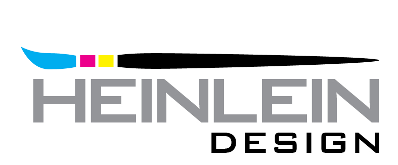
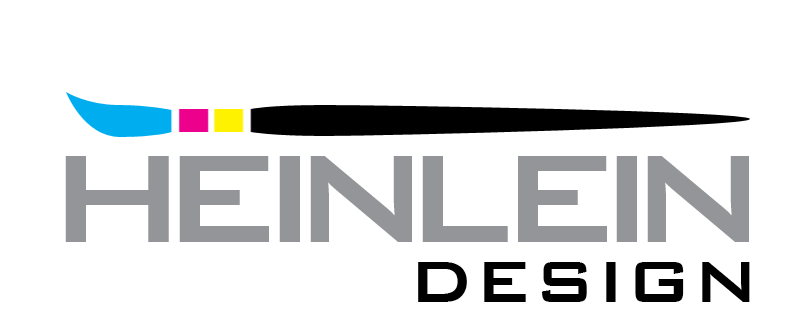
vokaris wrote: The kerning of HEINLEIN needs adjustment for a more pleasing spacing between the letters. e.g. the L is too close to the E
Rekerned:
Squared up:
I personally like the brush that hangs off the end a bit.
|
Heinlein

Location: Rochester, New York
|
Tue Nov 13, 2012 4:36 pm Reply with quote
Again, thank you everyone for making this fun.
We might have to extend the contest a little longer. There are so many good logos, it will be kind of hard to decide.
I feel kind of bad though because here I am a designer, and I am having a contest for my logo to be designed.
I thank everyone for all their efforts.
|
vokaris
Site Moderator

|
Tue Nov 13, 2012 5:00 pm Reply with quote
Trann wrote: I personally like the brush that hangs off the end a bit. I would tweak the font a bit to bring the middle lines of the E's to align with the top/bottom lines, and square off the slanted lines of the S and G in Design (or maybe pick a different similar looking font)
|
|
|
Tue Nov 13, 2012 6:16 pm Reply with quote
Took the pencil from your old logo and updated it a bit...
|
ShootHerman

Location: Norway
|
Tue Nov 13, 2012 6:21 pm Reply with quote
badcop wrote: Took the pencil from your old logo and updated it a bit...
I liked it. 
SH
_________________
Fuck Putin.
|
ShootHerman
Location: Norway
|
Tue Nov 13, 2012 6:23 pm Reply with quote
badcop wrote: Took the pencil from your old logo and updated it a bit...
I liked the one at top best.
Clean! 
SH
_________________
Fuck Putin.
|
vokaris
Site Moderator
|
Tue Nov 13, 2012 6:42 pm Reply with quote
badcop wrote: Took the pencil from your old logo and updated it a bit...
My first thought: red and black and a large serif H - it looks like the History Channel logo
|
|
|
Tue Nov 13, 2012 8:00 pm Reply with quote
vokaris wrote: My first thought: red and black and a large serif H - it looks like the History Channel logo
I only watch Jersey Shore and Honey Boo Boo so I don't know about this "History" channel.
To me, the degree of similarity here is on the light side, but a sans serif H is easy enough to do (I still prefer the original).
|
cringer8

Location: Seattle
|
Wed Nov 14, 2012 12:02 am Reply with quote
Too aggressive... it would make a good logo a rebel faction or dictator
|
DaVinci

Location: The Netherlands
|
Wed Nov 14, 2012 3:10 am Reply with quote
Trann wrote: vokaris wrote: The kerning of HEINLEIN needs adjustment for a more pleasing spacing between the letters. e.g. the L is too close to the E
Rekerned:
Squared up:
I personally like the brush that hangs off the end a bit.
Wow, the pencil is a nice touch! I like it 
|
DaVinci
Location: The Netherlands
|
Wed Nov 14, 2012 3:11 am Reply with quote
badcop wrote: Took the pencil from your old logo and updated it a bit...
Nice, I like the font here...
|
DaVinci
Location: The Netherlands
|
Wed Nov 14, 2012 3:13 am Reply with quote
Tesore wrote:
Ha, oh yes! That was good fun
|
Heinlein
Location: Rochester, New York
|
Wed Nov 14, 2012 9:19 am Reply with quote
badcop wrote: Took the pencil from your old logo and updated it a bit...
I love it! And I do watch the History Channel all the time.
Also, really like the integration of the H and D using the pencil icon.
Very nice work!
All the designs are awesome, but it looks like I might be leaning toward this one at the moment.
|
Goto page Previous 1, 2, 3, 4, 5, 6, 7, 8, 9 Next
Photoshop Contest Forum Index - Fun and Games - Heinlein Logo Contest - Reply to topic
You cannot post new topics in this forum
You cannot reply to topics in this forum
You cannot edit your posts in this forum
You cannot delete your posts in this forum
You cannot vote in polls in this forum
|