Photoshop Contest Forum Index - Brain Storm - PSC Header Re-Design - Reply to topic
Goto page Previous 1, 2, 3, 4, 5, 6, 7, 8 Next
YerPalAl

Location: On Deck, South by Southeast
|
 Sat Feb 26, 2005 9:23 am Reply with quote Sat Feb 26, 2005 9:23 am Reply with quote
Well, in all seriousness, you should not even refer to those faces as italics . . . they are not. They are oblique faces. True italics are a completely different letterform as opposed to being merely skewed. Look at Times and Times italic for an example.
Chrispis, yes, I will PM you links when I get back to work next week.
Ledrilo. If readability is your ONLY critera, the you should be using a classic serif font which has long be proven to have a slight, repeat, SLIGHT readability advantage.
You guys are missing the point here, though. Type is to read, yes, you have that right. But to read your message the eye has to be attracted to it. Type is a subtle and, in many cases powerful addition to design. Yes, designers COULD use all the same type face and at one point in the early 60s roughly 80% of all advertising type set in the U.S. was Helvetica (the root of the spin-off Arial) but good sense and taste overcame and we moved away from that. Type faces should be selected for appropriateness to the message and the style of design as well as impact and no one face can do that, period.
_________________ YerPalAl
--------------------------------------------------------------------------------
I'm highly motivated to be un-ambitious today.
|
HandToolUK

Location: London, UK
|
Sat Feb 26, 2005 11:33 am Reply with quote
lol
Personally, I think the fuss against Comic Sans is way over the top. Sure, it gets overused on personal websites, etc, but it's basically a clear and good-looking font.
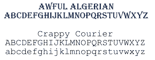
FAR worse IMO are Algerian ( so overused on shop/van signs - in the UK at least - and not even an attractive font) and Courier (useless for anything except simulating typewriter text... and how often is that really necessary??)
And Arial, while plain and easy to read, is far too boring for most text work, yet that gets massively overused too.
Also, a lot of Gothic-style fonts (and admittedly, script fonts) are too complex or illegible to be of much use in design work...
_________________
"The true work of art is but a shadow of the divine perfection." - Michelangelo
|
YerPalAl
Location: On Deck, South by Southeast
|
Sat Feb 26, 2005 11:40 am Reply with quote
Pecisely my point HT. The right face for the right usage.
If you have never sat staring at a type sample book, lost for hours in "font trauma", you have not really grasped the true zen of graphic design. 
_________________ YerPalAl
--------------------------------------------------------------------------------
I'm highly motivated to be un-ambitious today.
|
HandToolUK
Location: London, UK
|
Sat Feb 26, 2005 11:48 am Reply with quote
YerPalAl wrote: If you have never sat staring at a type sample book, lost for hours in "font trauma", you have not really grasped the true zen of graphic design.
Heh.. true, true. I can't say I've done that with books, since I'm not in the professional printing business -
but I've definitely done that with screens of font tables and TTF folders.
Ah, the joy of text... 
Anyway - back to the theme of this thread: the banner redesign. Does NOONE else want to comment on whether they think Fugue and I
are right to prefer one of these style flashes to the one currently in use??

_________________
"The true work of art is but a shadow of the divine perfection." - Michelangelo
|
Cynn

Location: California Choppin'
|
Sat Feb 26, 2005 12:00 pm Reply with quote
In my opinion, the ability to spec type is what distinguishes a good graphic designer from a hack. We've got a multimedia designer in my office who does glammy Flash work, and it blows my mind that he can't identify fonts by looking at them. Alas, the poor fool has never even used an E-scale.
That being said.. is that Gadget, up there in the header? I'd say it was, except that the "a" is wrong.  It is a true italic, though. Look at the "a." (Unless JMH swapped out the a in the Roman with Gill Sans or something.)
I agree that the swash should flip horizontally, to match the newly oriented logo--good call, that. Al, you know I adore you, but I am not convinced that a script type would be effective, on Unleashed. I think it'd look great in orange, though.
Isn't it time for a joke involving art directors and lightbulbs? 
|
HandToolUK
Location: London, UK
|
Sat Feb 26, 2005 12:09 pm Reply with quote
Cynn wrote: .. is that Gadget, up there in the header? I'd say it was, except that the "a" is wrong. It is a true italic, though. Look at the "a." (Unless JMH swapped out the a in the Roman with Gill Sans or something.)
It's Trebuchet (for the "contest.com" and "Creative Minds Unleashed" bits), but I don't know what AtHeaMo used originally for the "Photoshop" bit. Something relatively simple and clean though.
Cynn wrote: Isn't it time for a joke involving art directors and lightbulbs?
lol - given all the squabbling and contradictory viewpoints, we should make a similar lightbulb joke up involving PSCers...
_________________
"The true work of art is but a shadow of the divine perfection." - Michelangelo
|
YerPalAl
Location: On Deck, South by Southeast
|
Sat Feb 26, 2005 12:56 pm Reply with quote
Well, then . . . . let me point out something then.
Long Tool, your banner looks great. The upswept swash gives a positive atitude, the type is fine, the logo now is correct way up . . . . . why, it has everything-art, type . . . . . . except
a photograph.
Since this is a photoshop contest site, don't you think a photograph might be appropriate in the back ground?
NOTE: I am not campaigning for my car post to be used, (thanks anyway AtHeamo), that is not the idea. But I DO think we should have an example of what we are all about up there.
_________________ YerPalAl
--------------------------------------------------------------------------------
I'm highly motivated to be un-ambitious today.
|
HandToolUK
Location: London, UK
|
Sat Feb 26, 2005 1:16 pm Reply with quote
YerPalAl wrote:
Since this is a photoshop contest site, don't you think a photograph might be appropriate in the back ground?
NOTE: I am not campaigning for my car post to be used, (thanks anyway AtHeamo), that is not the idea. But I DO think we should have an example of what we are all about up there.
Yeah, possibly. dbbowling and AEagleNFitch were on chat with me at the same time jmh was putting up the new banner, and they felt it could use a photo or 2 too, but jmh didn't seem keen on that idea.
Personally, I'm not fussed either way - it could brighten the banner, but that depends a lot on what pic(s) get used and how they are integrated. Also, on the pages that are already very image-heavy (eg the contests page) the banner doesn't really need it.
_________________
"The true work of art is but a shadow of the divine perfection." - Michelangelo
|
ScionShade

Location: VeniceFlaUS
|
Sat Feb 26, 2005 1:34 pm Reply with quote
Wouldn't a photograph need to be updated or replaced often?
Unless someone has one that's so good it can stay up.
BTW that banner looks good to me. 
|
AEaglenFitch

Location: Washington, USA
|
Sat Feb 26, 2005 5:34 pm Reply with quote
hey that's cool i just noticed that you fliped the logo and it makes mor sence now but the mid section of the big banner would have to be fliped too to match wouldnt it? oh wait nevermind... HandTool did it
|
chrispis

Location: The Netherlands
|
Sat Feb 26, 2005 7:28 pm Reply with quote
YerPalAl wrote: Yes, designers COULD use all the same type face and at one point in the early 60s roughly 80% of all advertising type set in the U.S. was Helvetica (the root of the spin-off Arial) but good sense and taste overcame and we moved away from that..
Still best type there is ,... Helvetica.
|
chrispis
Location: The Netherlands
|
Sat Feb 26, 2005 7:32 pm Reply with quote
YerPalAl wrote: Since this is a photoshop contest site, don't you think a photograph might be appropriate in the back ground?
Damn Al,... I seem to disagree with you a lot,... it is nothing personal.
Maybe it's a good thing there is no photo in the header. Just keep things clear in the overall design of the site and have the photos of the posts be the fireworks. I think adding a nother photo in the background will be distracting.
|
chrispis
Location: The Netherlands
|
Sat Feb 26, 2005 7:37 pm Reply with quote
YerPalAl wrote: Chrispis, yes, I will PM you links when I get back to work next week.
That would be great! I'm always curious about work others do. I will be looking forward to it.
|
|
|
Sat Feb 26, 2005 7:54 pm Reply with quote
B/W ruled.....especially for displaying photographs.
alos, the grey background of PS would be cool.
Adrian Frutiger is the master of fonts for those who wanna dig it.Awesome man.
|
Goto page Previous 1, 2, 3, 4, 5, 6, 7, 8 Next
Photoshop Contest Forum Index - Brain Storm - PSC Header Re-Design - Reply to topic
You cannot post new topics in this forum
You cannot reply to topics in this forum
You cannot edit your posts in this forum
You cannot delete your posts in this forum
You cannot vote in polls in this forum
|