As some of you know, I'm getting ready to (finally) go back to school later this year!
After being screwed by the government, it looks like I'm going to need just a little bit more aid than I'm given.

I'm entering an illustration contest for a chance at some $$$.
I have to come up with 3 illustrations having to do with fantasy or science fiction. There are a few different mediums that are allowed, but I decided to sketch mine and paint them in PS.
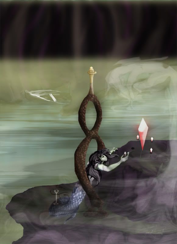
My first one is about done, and I was wondering if I could get some insight/critique on what might make it better. I'm not looking for ideas on elements or what to make the illustrations about... I'm thinking more along the lines of lighting/reflection/shadows/etc.
Here is my first, it took a little over a week on the coloring. Sorry if the picture stretches the thread a little bit.
Thanks guys!
(give me a break if some of the edges aren't straight, I'm working with a mouse here...)
Edit:
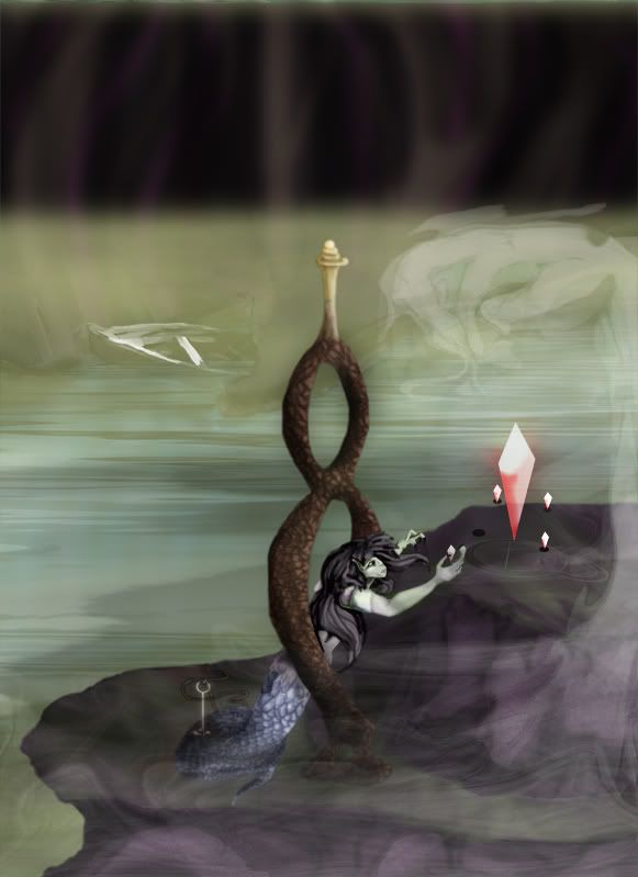
BS suggested that I soften some of the edges with the blur tool or a "fuzzy eraser" to bring the image more together.
Here's an updated version.
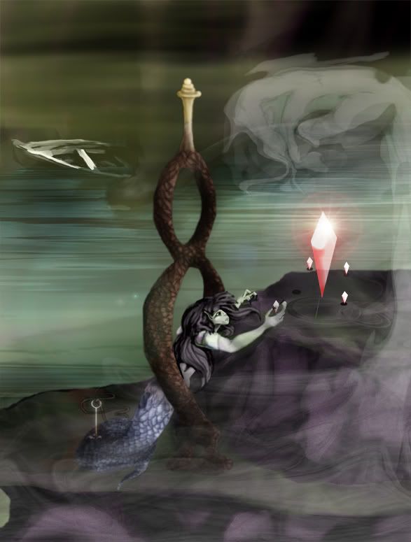
Took Rey's advice and cropped out the ceiling instead of adding more at the top, had to keep a near 8.5x11 ratio.. (glad for hi-res, for the first time...)
Tried to define the fog to see the boat more clearly.. went darker in the back for distance.
More shadows around the girl to show where she sits.. hopefully she's no longer floating, but if it looks like it to you I'd like to know.. (about any of it, really..)
Added a few more lights and darks in certain areas and added a fun little lens flare to the crystal.. (thanks Blurker...)
Overall I think it's a lot clearer. Happy to have such talented friends

If anyone else sees something I've missed, please let me know.
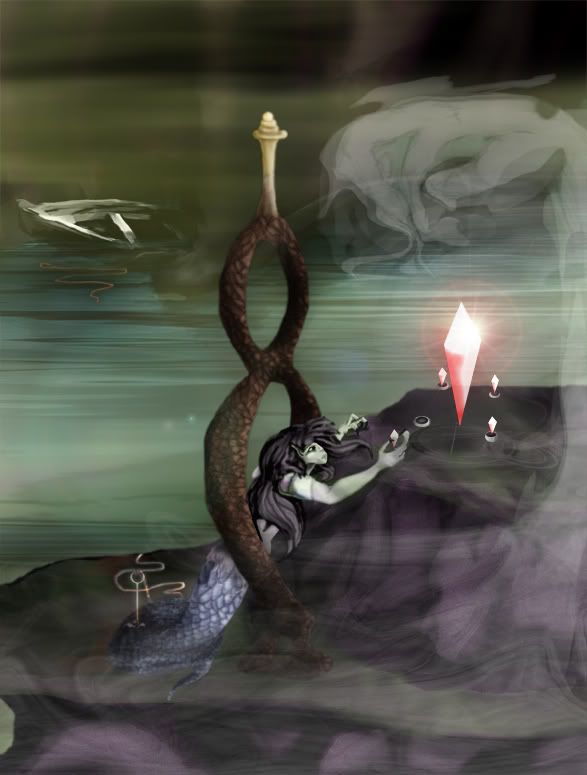
Dechene pointed out the poor quality of my rope, and that the boat could use a little work/may not be necessary. I turned the rope into more of a shining thread.
I attached the other end of the broken rope to the boat, giving it more of a purpose than just to create balance. I messed with the bottom of the boat as well, hoping to get rid of the "I just messed with the opacity" look.

He also pointed out that the placeholders for the crystals could just be shadows... so I added silver rings around each, making them more solid.
Thanks Dechene!
I did one last edit to try and make the colors unite a little better, also to draw out just a little more contrast. Unless anyone else sees anything I should be worried about, I think I'm going to finally go on to my next piece.
I really appreciate everyone who's given this some thought, and I'm sure I'll be back with my next one!


