By: chadchud
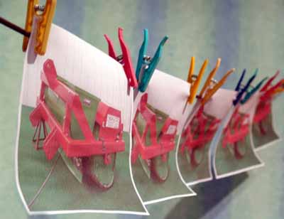
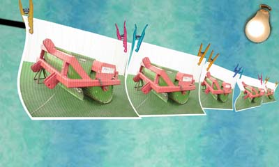
Well, i knew the day would come when my photoshop skills would advance
so much that somebody would accuse me of cheating! The picture in
question is this:
just to cover certain questions about my post, i have made a
step-by-step guide as to how and why I did this. The original entry
took me nearly a whole day to complete, and as far as i've noticed, i
can't see anything else i could do to improve it. This step-by-step
guide will cover just the basics of what i did as I have lost much of
the original material i used (mainly by flattening files and so on),
and I only spent a short time covering the basics - so for those of you
who think the new attempt looks nothing like the original, then it
won't because I haven't spent any time perfecting it.
Before we begin, you will need a copy of this:
and this:
(Joking apart, the book is very good!)
Here we go....
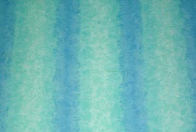
First I created a background (anyone would have worked fine, but
the stripes give the depth of field more emphasis) and then blurred it
using Filter - Blur - Gaussian Blur
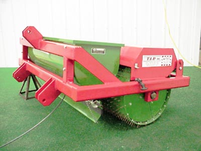
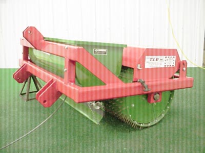
then I opened the original image:
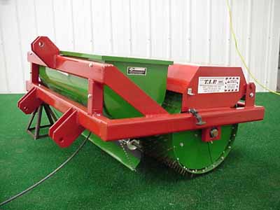
For the effect i wanted to create, I needed to work on the original
image before it was to be pasted into the main file. I wanted the image
to look printed, with bleeding lines (as if the head wasn't aligned
properly) and I wanted the colours to be slightly different, and a bit
more plain.
Above, I used 'Select - Colour Range' and selected the red in the
picture with a fuzziness of 157. I then created a new layer, filling
the selection with a lighter red. I did the same for the green and then
changed the opacity of both of them to blend it in.
I then flattened the image and altered the Brightness/Contrast.
I then Copied the flattened image layer (Background) and selected the mode to 'Soft Light'
I then created the 'print lines' by roatating the canvas 90'CCW then
applyed 'Filter - Sketch - Halftone Pattern'. The pattern was set to
'Line' and the size =2, Contrast=3
I then rotated the canvas back to normal (90'CW) - i had to rotate
the canvas as applying this filter without doing so would have given me
lines in the other direction!
I then flattened the image and increased the canvas size to give me a white border.
I then dragged the final image onto the background i had created:
A bit on depth of field.......
When a lens focuses on a subject at a distance, all subjects at
that distance are sharply focused. Subjects that are not at the same
distance are out of focus and theoretically are not sharp. However,
since human eyes cannot distinguish very small degree of unsharpness,
some subjects that are in front of and behind the sharply focused
subjects can still appear sharp. The zone of acceptable sharpness is
referred to as the depth of field. Thus, increasing the depth of field
increases the sharpness of an image. We can use smaller apertures for
increasing the depth of field.
the pic below is taken with a small aperture rating and has a greater depth of field:
and this one has a higher aperture rating, a smallere depth of field:
I wanted to create a picture that looked realistic, so I wanted to
use a greater depth of field. When you look at the final pic i created,
the front (left) and the back (right) are out of focus. This is because
the focal point is towards the centre.
To help me with the perspective, I drew a grid on the background
with lines. I then distorted the grid to follow the line of a 'hanging'
line.
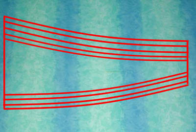
the top of the grid will represent my imaginary hanging line
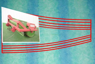
I then set about distorting the paper to make it look as if it was
at an angle to the viewer. I used 'Edit - Transform - Distort' and
aligned it to the grid:
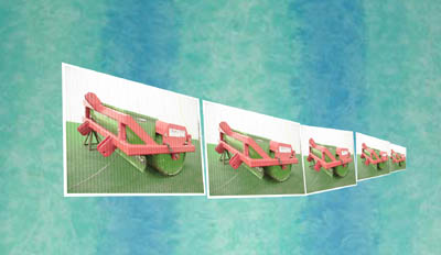
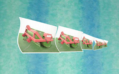
After having copied the paper image five times, I then went about
distorting them all, then scaling them smaller and smaller to give the
'distance' more feel.
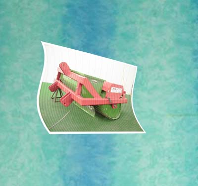
Curling the paper.........
This one took me ages to get right, and many attempts. To give the
paper it's 'curled' look, I used the 'Filter - Distort - Shear' and
after many attempts I had it right. Unfortunately, this was more of a
trial-and-error process, but worth the experimentation in the end!)
I then did this to the rest:
The only other source pic i used was one of some pegs:
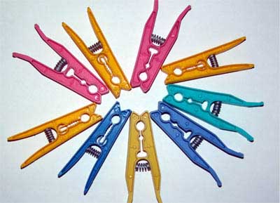
Here, I quickly cut them out, but in the original effort, I obviously spent more time on them.
Using 'Edit - Transform - Distort' again, I added them to the pic.
Using the eraser tool, I shaped the pegs to make them look as if the
paper was through them.
I then scaled them down more progressivly each time so they would
match the paper size. I then drew the line in with the shapes tool -
'line'
A bit about shadows......
I obviously spent a lot of time on the original completing the
shadows. Implementing shadows into the picture will help enhance
distance, depth of field and lighting.
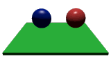 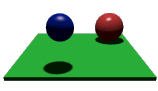
Take a look at the first picture. It depicts two spheres sitting
on, or floating above a green base. It's hard to tell whether they are
touching the base or if they are floating above it.
Now look at the second picture. Suddenly it has all become clear. The
red sphere is the larger of the two, and is resting at the back of the
green base. The blue one is floating above the base, and is nearer. The
only thing that is different between the two is that the second picture
has shadows, otherwise they are identical.
As you can see, shadows provide the viewer with a great deal of
information about a scene. An object with a shadow has more presence
than one without. Shadows give depth to a scene and reinforce our
perception of the location of lightsources. Take a look at Quake. It's
shadows add mood and atmosphere. Imagine how boring it would look with
everything at the same brightness.
I imagined a light source from the angle below:
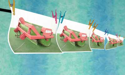
I then - quickly - added some shadows:
Now for the Depth of field conversion!
I flattened the image and chose the blur tool. With reference to
the depth of field, I chose a focal point (just off centre, to the
left) and then blurred the far left hand side. I then started from the
centre, blurring progressively more the further right I went, until the
distance was not in focus.
And that is - basically - what i did.
� all photoshop tutorials
|