Photoshop Contest Forum Index - Fun and Games - Arborist guy needs help! So let's play a game... - Reply to topic
Goto page Previous 1, 2, 3, 4, 5, 6, 7, 8, 9 Next
Kansas

Location: Kansas
|
 Tue Jun 13, 2006 9:27 pm Reply with quote Tue Jun 13, 2006 9:27 pm Reply with quote
I think you've done it! Scion.. funny thing is I told him you were an arborist and that you thought DP's was the best one... I thought that you had meant the title too...
I think the guy would use them all if he could...
I think the font change makes it.. Before it even kind of looked like the word titanic.
AWESOME!
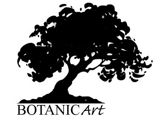
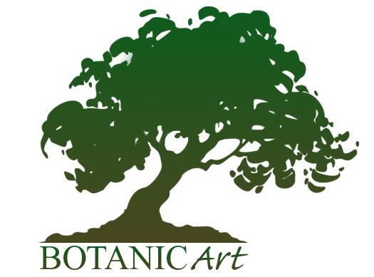
I think the Botanic Art is cool now... I wasn't sold on it... but like Scion said eariler it may look more professional then Arbor Barber...
_________________
Few are those who see with their own eyes and feel with their own hearts.
Albert Einstein
|
ScionShade

Location: VeniceFlaUS
|
Tue Jun 13, 2006 9:30 pm Reply with quote
Now if there were just some way to make the tree logo also the "T" in the middle
of boTanic and make THAT look good............................

|
Kansas
Location: Kansas
|
Tue Jun 13, 2006 10:06 pm Reply with quote
digitalpharaoh wrote: Sans Colour...
Avec Colour...
Seriously, he digs Botanic Art?
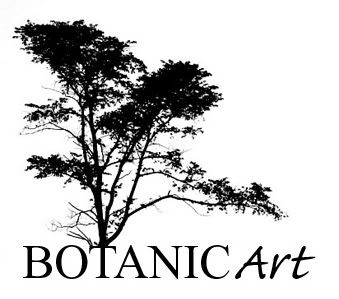
I don't know.. If you are going to use that tree I think it kind of stands alone...
It's beautimus!
_________________
Few are those who see with their own eyes and feel with their own hearts.
Albert Einstein
|
|
|
Tue Jun 13, 2006 10:15 pm Reply with quote
ScionShade wrote: Now if there were just some way to make the tree logo also the "T" in the middle
of boTanic and make THAT look good............................
I tried something to that effect...wasn't happy with it...may try it again
|
ScionShade
Location: VeniceFlaUS
|
Tue Jun 13, 2006 10:16 pm Reply with quote
Yeah, it looked like it might be difficult to make work 
|
Kansas
Location: Kansas
|
Tue Jun 13, 2006 10:30 pm Reply with quote
digitalpharaoh wrote: Ahem...How's this for a quickie?
Dang it all... I'm starting to get like that guy.. I love all the designs.. how do you know which is the right way to go?
how do you know without having to check with Scion all the time...lol 
_________________
Few are those who see with their own eyes and feel with their own hearts.
Albert Einstein
|
|
|
Tue Jun 13, 2006 10:34 pm Reply with quote
Well, the last one, for me is a little tooooooo detailed as far as the tree is concerned...simpler is better in logo designs, if you ask me...
|
ScionShade
Location: VeniceFlaUS
|
Tue Jun 13, 2006 10:46 pm Reply with quote
OH NO!
You guys crazy? KEEP that original tree no matter what--
I'll take a crack at making it squared up tomorrow too,
I've an idea.
|
|
|
Tue Jun 13, 2006 10:51 pm Reply with quote
ScionShade wrote: OH NO!
You guys crazy? KEEP that original tree no matter what--
I'll take a crack at making it squared up tomorrow too,
I've an idea.
By all means...a collaborative logo design...  Do they still make those anymore? 
|
ScionShade
Location: VeniceFlaUS
|
Tue Jun 13, 2006 10:53 pm Reply with quote
I was gonna try adjustments...tree smaller and to left--stretch the roots out over the text--and two thin stylish pinstripes under the text.
People will recognize that tree, it's gotta stay.
|
ScionShade
Location: VeniceFlaUS
|
Tue Jun 13, 2006 10:55 pm Reply with quote
Uhhhhhhhhhhhhhhhhhhh..HAHAHAH!
HAHAHA! You guys CRack me uP!
I meant using the tree AS the "T"--replacing it!!!
HAHAHAHAHAHAHHAHHAHAHAH!
The trunk would reach below the text and the root structure would underline the text that way 
Under that a thin set of professional looking pintripes and beneath that the phone# for the truck
|
|
|
Tue Jun 13, 2006 11:12 pm Reply with quote
Alright...don't blow a fuse...we know what you meant...
|
Queen La Tiff

Location: MI
|
Wed Jun 14, 2006 10:56 am Reply with quote
Just an FYI, I've not been keeping up with this post the past couple. As you may know, my web page/ business is Tiffco,Inc. So when I started trying to find an ebay name, that was taken for some reason, so I added "art" to it. So now it's like Tiffcoincart. Which is like "Tiffco in cart" rather than "Tiffco,Inc. art." You see? It's like, why is tiffco in the cart?
I didn't think about this until I saw it later. He might not want people saying "botanic cart? What's that?"
Or maybe I'm just putting my own issues on there.
Tiff
|
Kansas
Location: Kansas
|
Wed Jun 14, 2006 11:04 am Reply with quote
Queen La Tiff wrote: Just an FYI, I've not been keeping up with this post the past couple. As you may know, my web page/ business is Tiffco,Inc. So when I started trying to find an ebay name, that was taken for some reason, so I added "art" to it. So now it's like Tiffcoincart. Which is like "Tiffco in cart" rather than "Tiffco,Inc. art." You see? It's like, why is tiffco in the cart?
I didn't think about this until I saw it later. He might not want people saying "botanic cart? What's that?"
Or maybe I'm just putting my own issues on there.
Tiff
I hear you.. but did you see the font change up Tiff? Just curious... I thought it changed the cart effect...
_________________
Few are those who see with their own eyes and feel with their own hearts.
Albert Einstein
|
Goto page Previous 1, 2, 3, 4, 5, 6, 7, 8, 9 Next
Photoshop Contest Forum Index - Fun and Games - Arborist guy needs help! So let's play a game... - Reply to topic
You cannot post new topics in this forum
You cannot reply to topics in this forum
You cannot edit your posts in this forum
You cannot delete your posts in this forum
You cannot vote in polls in this forum
|