Photoshop Contest Forum Index - General Discussion - Claf: my work in 2007. - Reply to topic
Goto page Previous 1, 2, 3, 4 Next
dewdew

Location: Upstate South Kack-a-lack
|
 Mon Dec 17, 2007 10:31 am Reply with quote Mon Dec 17, 2007 10:31 am Reply with quote
great stuff Claf.....nice job.....You have a BILLBOARD with your art on it! Holyshit  I'm speachless  .........
hey, hey....hold it down in the peanut gallery........Sorry, about that........they have never seen me speachless 
|
Stevster

Location: Jacksonville FL
|
 Mon Dec 17, 2007 11:16 am Reply with quote Mon Dec 17, 2007 11:16 am Reply with quote
billtvshow wrote: Claf owns.
Everyone should look through his portfolio to understand what good, clean chopping is all about.
Beautiful work my friend.
Agree with Stephen, Claf is a pro.
|
annajon

Location: DEAD THREAD DUMPINGGROUND NEAR YOU
|
 Mon Dec 17, 2007 11:46 am Reply with quote Mon Dec 17, 2007 11:46 am Reply with quote
Stevster wrote: billtvshow wrote: Claf owns.
Everyone should look through his portfolio to understand what good, clean chopping is all about.
Beautiful work my friend.
Agree with Stephen, Claf is a pro.
I third that....
|
annajon

Location: DEAD THREAD DUMPINGGROUND NEAR YOU
|
 Mon Dec 17, 2007 11:48 am Reply with quote Mon Dec 17, 2007 11:48 am Reply with quote
Micose wrote: annajon wrote: I love your sense of humor Claf.
...;Anna?? you re doomed....u know he's canadian (quebequois which is more) right?  
Well, my French friend .... what is wrong with Canadians? And their sense of humor???
|
|
|
 Mon Dec 17, 2007 12:28 pm Reply with quote Mon Dec 17, 2007 12:28 pm Reply with quote
Thanks!! Happy if you enjoy this thread. 
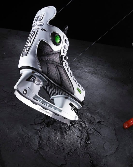
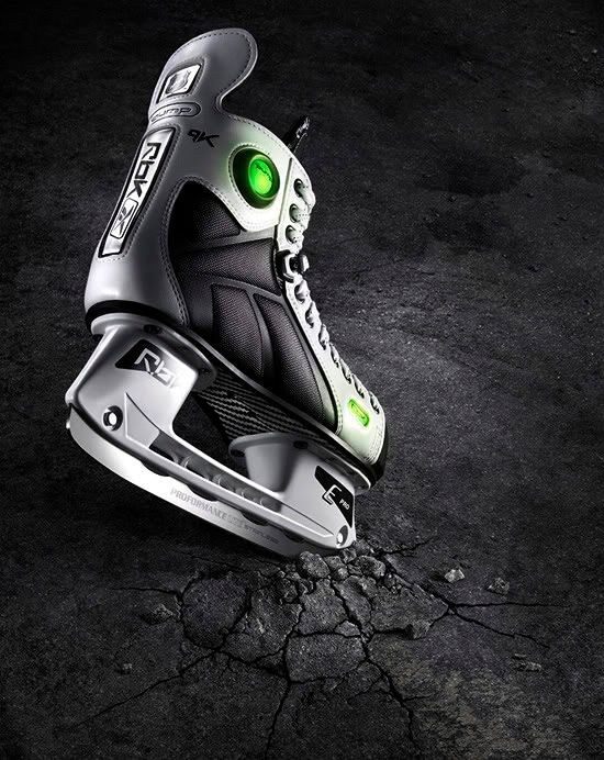
Now, some work I made for Reebok.
Here they asked to make the background with an asphalt look & drawing new cracks. Clean-up and
few adjustments on the skate.
Before...
After...
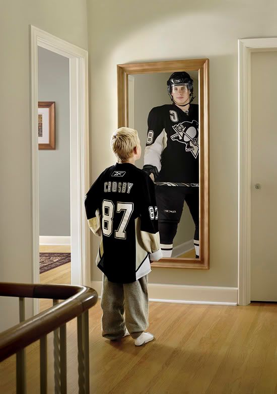
Work on skin, taking off shadow, adding visor.
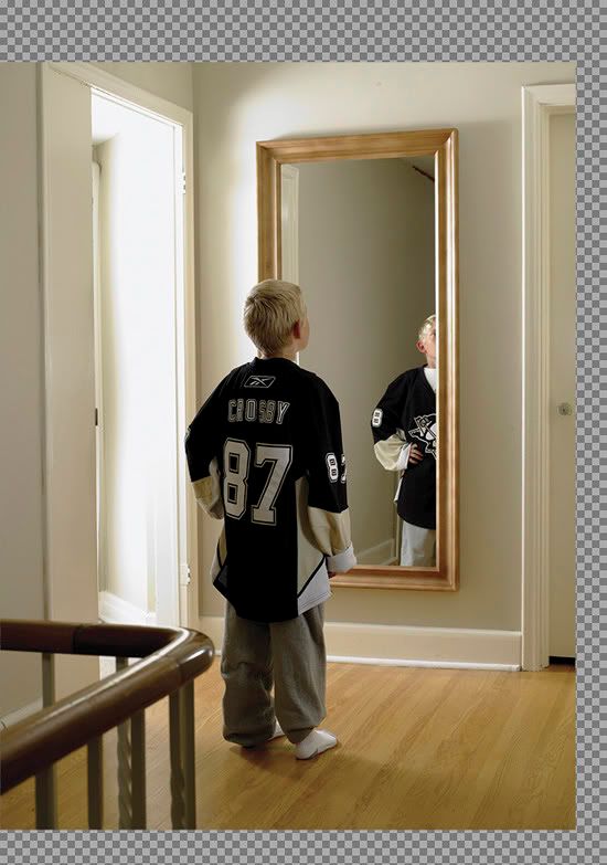
I'm maybe getting the Sydney Crosby's official photo-retouching artist.  I regularly retouched Sydney's pictures for Reebok.
Before...
After...
I had to make a room on left side, adding extentions.....
Before...
After...

|
|
|
 Mon Dec 17, 2007 12:42 pm Reply with quote Mon Dec 17, 2007 12:42 pm Reply with quote
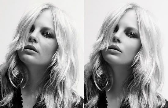
Here a detail of a picture from Buffalo advertising campaign. Few adjustments about shapes... smaller nose, better chin, rotating eye a bit, longer neck & skin clean-up.
A close-up to show the skin texture. I usually always see too much stamp tool with addition of noise from other pros. That way, we always loose the natural skin texture. I always try to use the stamp tool the less possible. I'm playing with few adjutment layers ( for black & white only two brightness/contrast layers for lighter & darker details) with a lot of brush tool work on layer masks. No need for noise.
|
buglover

Location: Hamburg, Germany, Europe, right hand of the USA
|
 Mon Dec 17, 2007 2:33 pm Reply with quote Mon Dec 17, 2007 2:33 pm Reply with quote
Realy like that Wave Artwork. Looks Great. Cheers BL
_________________
Once he was addicted to psc - Now he's dead and free.
|
|
|
 Tue Dec 18, 2007 4:07 am Reply with quote Tue Dec 18, 2007 4:07 am Reply with quote
Some more...
This was for a tv channel, about suspense movie program.
The major thing was to transform the tv controls. Looks like easy, but enough complex to keep every details without any bad distortion & to keep good proportions.
Before...
After...
|
|
|
 Tue Dec 18, 2007 4:10 am Reply with quote Tue Dec 18, 2007 4:10 am Reply with quote
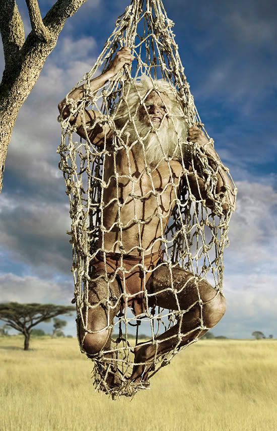
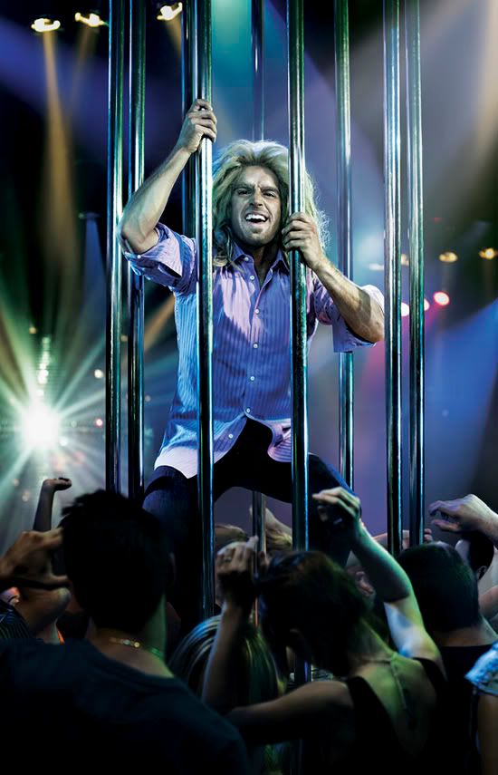
This was for a Ford Focus campaign. The first visual is a mixture of 5 pictures. 3 stock photo pictures of sky, african wildlife & african trees. The guy was shot downtown in early morning. The branches in top corner was shot at botanical garden. The net needed some transformations, especially around the feet.
The disco bar image is made with 5 pictures. Funny concept!
Here's the Ford Focus website, it can give you a better idea about the concept... with some funny videos...
http://www.ford.ca/SocialAccelerator/index.asp

|
annajon

Location: DEAD THREAD DUMPINGGROUND NEAR YOU
|
 Tue Dec 18, 2007 5:43 am Reply with quote Tue Dec 18, 2007 5:43 am Reply with quote
Psssst .... are women allowed to say that that lion man is NOT sexy at all?
How does this work then, some people have a pow wow and use a white board to outline an idea, and a storyboard is created? And after that they ask photographers to recreate that storyboard, and they ask you to make it look spiffy, yes?
|
|
|
 Tue Dec 18, 2007 12:13 pm Reply with quote Tue Dec 18, 2007 12:13 pm Reply with quote
annajon wrote: Psssst .... are women allowed to say that that lion man is NOT sexy at all?
How does this work then, some people have a pow wow and use a white board to outline an idea, and a storyboard is created? And after that they ask photographers to recreate that storyboard, and they ask you to make it look spiffy, yes?
 Sure, not sexy at all! I think they wanted to make it funny, not sexy. The girls on videos are a lot sexier. 
First, after meeting the client (Ford) and talking about the needs & target market, the art directors usually are doing brain storming (don't know if sometimes it's becoming a pow wow  ) and finding the right applications (magazines, newspapers, billboard, tv commercial). In this case, the tv work & website stuff were already made. after, they just asked the photographer to realize all the pictures for printing stuff (bus stop, billboard, subway wall, magazine & newspapers). My work is to make the final artwork before printing. It took one week of adjustments, clean-up, other & other adjustments & drawing some details (there was enough work on the too rough make-up & wig) for those 2 images.

|
|
|
 Tue Dec 18, 2007 1:57 pm Reply with quote Tue Dec 18, 2007 1:57 pm Reply with quote
Claf wrote: Some more...
This was for a tv channel, about suspense movie program.
The major thing was to transform the tv controls. Looks like easy, but enough complex to keep every details without any bad distortion & to keep good proportions.
I know this is kinda strange thinking, but why didn't they just buy the remotes that they wanted in the first place instead of using whatever they had and changing the perspective "in post"?!
Just curious what the rationale was....

|
EJH

Location: NYC
|
 Tue Dec 18, 2007 4:08 pm Reply with quote Tue Dec 18, 2007 4:08 pm Reply with quote
billtvshow wrote: Claf owns.
Everyone should look through his portfolio to understand what good, clean chopping is all about.
Beautiful work my friend.
agree 100%
|
Goto page Previous 1, 2, 3, 4 Next
Photoshop Contest Forum Index - General Discussion - Claf: my work in 2007. - Reply to topic
You cannot post new topics in this forum
You cannot reply to topics in this forum
You cannot edit your posts in this forum
You cannot delete your posts in this forum
You cannot vote in polls in this forum
|
