Photoshop Contest PhotoshopContest.com
Creative Contests. Real Prizes. Essential Resource.
You are not logged in. Log in or Register


Photoshop Contest Forum Index - General Discussion - Looking For Feedback - Reply to topic

SyderBomb

Location: Albany NY

Post Fri Jan 25, 2008 4:22 pm   Reply with quote         


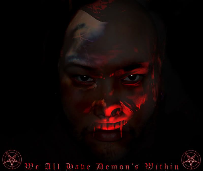
I made this the other day its a picture of me merged with a demon i made in poser 7 its kinda cool you can see more of the demon if you look from the bottom angel and more of me if you look from the top view. Just looking to see what i could improve it i do another picture like this.


_________________

Tawiskaro

Location: New York

Post Fri Jan 25, 2008 4:34 pm   Reply with quote         


SyderBomb wrote:
I made this the other day its a picture of me merged with a demon i made in poser 7 its kinda cool you can see more of the demon if you look from the bottom angel and more of me if you look from the top view. Just looking to see what i could improve it i do another picture like this.


Cool image, but the correct plural of "demon" is "demons"--there is no apostrophe.


vokaris
Site Moderator

Post Fri Jan 25, 2008 4:54 pm   Reply with quote         


change the white highlights in the eyes to match the red light source coming from the bottom right

might want to take a new self-portrait photo with an evil smile to match the grin on the 3d model


annajon

Location: DEAD THREAD DUMPINGGROUND NEAR YOU

Post Fri Jan 25, 2008 4:56 pm   Reply with quote         


Yes, the eyes should reflect the red glow more as a red transparent half moon then a white dot


Eve
Site Moderator

Location: Planet Earth

Post Fri Jan 25, 2008 5:09 pm   Reply with quote         


It's amazing how much better your image looks on my lcd pc screen as opposed to my crt mac monitor.

Is that a crack or a scar on the forehead?


Wiz

Location: Brisbane Australia

Post Fri Jan 25, 2008 6:26 pm   Reply with quote         


"Elbow that ghastly type, it belongs on some S&M Whacko's Website, it spoils and distracts from the image IMNSHO!

Twisted Evil Wiz


_________________

Paul Von Stetina

Location: Deep Shit

Post Fri Jan 25, 2008 7:04 pm   Reply with quote         


Looks like Mr.T on crack...I pity the fool Twisted Evil


So this is a project for...?


dumbat

Location: Sydney

Post Fri Jan 25, 2008 7:17 pm   Reply with quote         


it's a cool chop. not sure what's going on with the top of the head though (sorry if that's what the top of your head looks like Laughing). and for me the text detracts from the image


Martrex

Location: California

Post Fri Jan 25, 2008 7:34 pm   Reply with quote         


The vamp teeth seem out of shape or too long but not wide enough. And the missing head part too. Text does distract.

Is the guys left nostril way out of wack? Shocked


dumbat

Location: Sydney

Post Fri Jan 25, 2008 7:43 pm   Reply with quote         


Martrex wrote:
The vamp teeth seem out of shape or too long but not wide enough. And the missing head part too. Text does distract.

Is the guys left nostril way out of wack? Shocked

but who really knows what a demon looks like? Twisted Evil


Martrex

Location: California

Post Fri Jan 25, 2008 7:54 pm   Reply with quote         


dumbat wrote:
Martrex wrote:
The vamp teeth seem out of shape or too long but not wide enough. And the missing head part too. Text does distract.

Is the guys left nostril way out of wack? Shocked

but who really knows what a demon looks like? Twisted Evil


Down boy he asked for feed back. So gave general input. Very Happy


Oscar

Location: Northern California

Post Fri Jan 25, 2008 8:42 pm   Reply with quote         


Sucks... looks like a 30 second pic overlay chop. I hope this is not some sort of final product thing. Smile


Maliciously Delicious

Location: The Deathsert

Post Mon Jan 28, 2008 1:23 pm   Reply with quote         


not bad, but I would suggest cropping out your top lip, I can still see it even with the fangs Smile


dewdew

Location: Upstate South Kack-a-lack

Post Mon Jan 28, 2008 2:11 pm   Reply with quote         


loose the red all together.....make your picture light and soft...sorta like a glamour shot......then have the demon a darker color showing through slightly.

Like if your Glamour pic was made using a white filter....then the demon should be made with a darker shade...but with a blueish....purpleish .....even redish hue......remember he is the Darker side...the evil one.....you should be lighter....like an angel with a glow.


Photoshop Contest Forum Index - General Discussion - Looking For Feedback - Reply to topic

You cannot post new topics in this forum
You cannot reply to topics in this forum
You cannot edit your posts in this forum
You cannot delete your posts in this forum
You cannot vote in polls in this forum


Navigate PSC
Contests open  completed  winners  prizes  events  rules  rss 
Galleries votes  authentic  skillful  funny  creative  theme  winners 
Interact register  log in/out  forum  chat  user lookup  contact 
Stats monthly leaders  hall of fame  record holders 
PSC advantage  news (rss)  faq  about  links  contact  home 
Help faq  search  new users  tutorials  contact  password 

Adobe, the Adobe logo, Adobe Photoshop, Creative Suite and Illustrator are registered trademarks of Adobe Systems Incorporated.
Text and images copyright © 2000-2006 Photoshop Contest. All rights reserved.
A venture of ExpertRating.com