Photoshop Contest Forum Index - General Discussion - Looking for CC on this image - Reply to topic
Goto page Previous 1, 2
ScionShade

Location: VeniceFlaUS
|
 Thu Apr 17, 2008 3:05 pm Reply with quote Thu Apr 17, 2008 3:05 pm Reply with quote
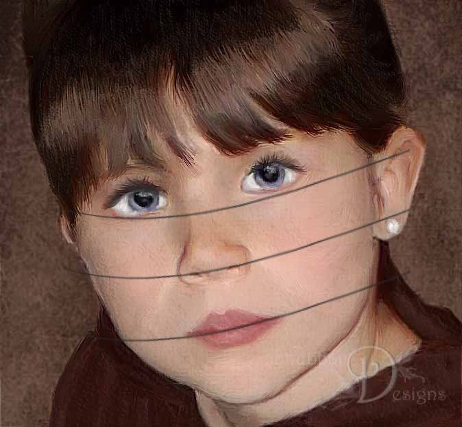
She's is a beautiful child Del. On the ear, and everything else, I was complimenting on you not changing her natural proportions. Nicely done.
|
Wiz

Location: Brisbane Australia
|
Thu Apr 17, 2008 5:55 pm Reply with quote
Couple of CC's for you Dave.
1. Overall color of mouse brown is dull and flat, take a look at any old Dutch Master and see the depth and translucency that gives a sense of depth to their subjects. Glazes and washes at work, works wonders.
2. fringe hairline is far too sharp, soften those whispy curls into the skin tones of the forehead and 'join' the hair to the head. BTW: I was always being told off for doing this in my 'Life' Classes by a superb teacher.
His fist would grip my hair as he'd shake my head as he said..."Is what I'm holding, part of you or not, yes or no?... Then fix that bloody wig of yours!!!!!!!!!
3.Eyes: The most expressive part of the body that most people can never manage to do properly. Your daughters left eye needs more work on the lids and in sizing to match her right eye.
Again go back to those canny Dutch painters and study some C/U's of how they tricked out those glassy glints & highlights
BTW: If you can, get hold of a book called 'Mastering Glazing Techniques in Watercolor' by Don Rankin ISBN 0-8230-3024-5
I bought this book long before I found out about the wonders of Photoshop and it sure helped me while learning how to use the intricacies of the P/S 'Layers' palette.
Controlling watercolors is so similar to what we do in Photoshop that it's uncanny, and reading this book really does give you a great insight to clever color management.
Remember Guache sucks, and should be avoided at all time. MAKE that palette of yours sing out as a 'Watercolor or as a 'Oils' masterpiece!" 
HTH 
Wiz
|
delia

Location: Near Albany, NY
|
Thu Apr 17, 2008 6:23 pm Reply with quote
Thanks, Wiz. I am sure you really meant well, but having no formal art training at all (unless you count high school art, LOL!) I have no idea what most of your stuff meant.
However, I can see some interesting phrases in there to google that I am sure will help me achieve a more realistic effect. I appreciate you taking the time to share these tips!
Wiz wrote: Couple of CC's for you Dave.
1. Overall color of mouse brown is dull and flat, take a look at any old Dutch Master and see the depth and translucency that gives a sense of depth to their subjects. Glazes and washes at work, works wonders.
2. fringe hairline is far too sharp, soften those whispy curls into the skin tones of the forehead and 'join' the hair to the head. BTW: I was always being told off for doing this in my 'Life' Classes by a superb teacher.
His fist would grip my hair as he'd shake my head as he said..."Is what I'm holding, part of you or not, yes or no?... Then fix that bloody wig of yours!!!!!!!!!
3.Eyes: The most expressive part of the body that most people can never manage to do properly. Your daughters left eye needs more work on the lids and in sizing to match her right eye.
Again go back to those canny Dutch painters and study some C/U's of how they tricked out those glassy glints & highlights
BTW: If you can, get hold of a book called 'Mastering Glazing Techniques in Watercolor' by Don Rankin ISBN 0-8230-3024-5
I bought this book long before I found out about the wonders of Photoshop and it sure helped me while learning how to use the intricacies of the P/S 'Layers' palette.
Controlling watercolors is so similar to what we do in Photoshop that it's uncanny, and reading this book really does give you a great insight to clever color management.
Remember Guache sucks, and should be avoided at all time. MAKE that palette of yours sing out as a 'Watercolor or as a 'Oils' masterpiece!"
HTH
Wiz
|
Wiz
Location: Brisbane Australia
|
Fri Apr 18, 2008 1:39 pm Reply with quote
deliandave wrote: Thanks, Wiz. I am sure you really meant well, but having no formal art training at all (unless you count high school art, LOL!) I have no idea what most of your stuff meant.
However, I can see some interesting phrases in there to google that I am sure will help me achieve a more realistic effect. I appreciate you taking the time to share these tips!
Wiz wrote: Couple of CC's for you Dave.
1. Overall color of mouse brown is dull and flat, take a look at any old Dutch Master and see the depth and translucency that gives a sense of depth to their subjects. Glazes and washes at work, works wonders.
2. fringe hairline is far too sharp, soften those whispy curls into the skin tones of the forehead and 'join' the hair to the head. BTW: I was always being told off for doing this in my 'Life' Classes by a superb teacher.
His fist would grip my hair as he'd shake my head as he said..."Is what I'm holding, part of you or not, yes or no?... Then fix that bloody wig of yours!!!!!!!!!
3.Eyes: The most expressive part of the body that most people can never manage to do properly. Your daughters left eye needs more work on the lids and in sizing to match her right eye.
Again go back to those canny Dutch painters and study some C/U's of how they tricked out those glassy glints & highlights
BTW: If you can, get hold of a book called 'Mastering Glazing Techniques in Watercolor' by Don Rankin ISBN 0-8230-3024-5
I bought this book long before I found out about the wonders of Photoshop and it sure helped me while learning how to use the intricacies of the P/S 'Layers' palette.
Controlling watercolors is so similar to what we do in Photoshop that it's uncanny, and reading this book really does give you a great insight to clever color management.
Remember Guache sucks, and should be avoided at all time. MAKE that palette of yours sing out as a 'Watercolor or as a 'Oils' masterpiece!"
HTH
Wiz
Here's a Dutch Masters link for you Dave:-
http://images.google.com.au/imgres?imgurl=http://www.geheugenvannederland.nl/hgvn/webroot/files/Image/collections/RIJK01_rembrandt.jpg&imgrefurl=http://www.geheugenvannederland.nl/%3F/en/collecties/schilderijen_van_het_rijksmuseum&h=182&w=150&sz=6&hl=en&start=20&tbnid=EayMM8CTNUlpRM:&tbnh=101&tbnw=83&prev=/images%3Fq%3DFranz%2Bhals%2Bmasterpieces%26gbv%3D2%26hl%3Den%26sa%3DG
Check out Franz Hals, Jan Steen, Vermeer and of course Rembrandt himself.
BTW: Gauche is that terrible stuff called 'Poster Paint' by some manufacturer's... it is very opaque and is useless as a artist's medium for portraits or landscapes.
Best let me know if you want any other CC's of your work via PM... As I can be a bit more ruthless then!

Wiz
|
Eve
Site Moderator

Location: Planet Earth
|
Fri Apr 18, 2008 3:34 pm Reply with quote
Faces, bodies are made of contours (convex and concave). Whether you're sketching or painting over an image, keep this in mind. Her right eye may look a bit "off" as Marty mentioned. Also, if you study a person's eyes, there is a slight shadow, cast from their lashes on the upper most part of the eye. Compare the left eye (where I quickly added a slight shadow) to the right.
Nice work, beautiful daughter, Delia. 
|
annajon

Location: DEAD THREAD DUMPINGGROUND NEAR YOU
|
Fri Apr 18, 2008 3:38 pm Reply with quote
I love the paintwork you did DD, but there is one thing that I am wondering about with every painting I have seen of you. The hair is always way to controlled. I can't say it in another way. You make the skirt flow into the background, you create beautiful hands on the skirt, but the hair is like you have cut it out and pasted it on the background. Perhaps it is the size of the image that makes it look like that, but I feel the hair should have a softer outline that allows for a little air through and play with the background.
I hope you don't mind me saying so.
|
delia
Location: Near Albany, NY
|
Sun Apr 20, 2008 9:39 pm Reply with quote
annajon wrote: I love the paintwork you did DD, but there is one thing that I am wondering about with every painting I have seen of you. The hair is always way to controlled. I can't say it in another way. You make the skirt flow into the background, you create beautiful hands on the skirt, but the hair is like you have cut it out and pasted it on the background. Perhaps it is the size of the image that makes it look like that, but I feel the hair should have a softer outline that allows for a little air through and play with the background.
I hope you don't mind me saying so.
I certainly don't mind you saying so....
In this particular picture I had just french braided her hair, so there was no play in it really. However, I think I got whispy with the one I posted in this contest:
http://photoshopcontest.com/view-entry/136408/study-of-human-form.html
Do you think, in your opinion, that I need to get even more strands in view? Or just soften the area where the hair and background meet, perhaps with a bit of feathering or blurring slightly?
Thanks for adding some thoughts on this!
|
annajon
Location: DEAD THREAD DUMPINGGROUND NEAR YOU
|
Mon Apr 21, 2008 6:36 am Reply with quote
I think you can try the feathering/blurring, because the adding strands of hair by the ears, like there are in the original photo, may not fit the image you have created.
|
Goto page Previous 1, 2
Photoshop Contest Forum Index - General Discussion - Looking for CC on this image - Reply to topic
You cannot post new topics in this forum
You cannot reply to topics in this forum
You cannot edit your posts in this forum
You cannot delete your posts in this forum
You cannot vote in polls in this forum
|

