Ha! I love looking at the ads while I read magazines, I have seen some really,
really bad/hilariously bad/hilariously sad/sadly bad/badly sad "works"
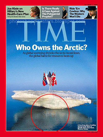
Hell, every now and then even the covers of Motor Trend and Road & Track have a bad case of floaty car or terrible angles.
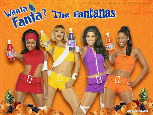
I was laughing my ass off for a few minutes over this one:
You have to wonder if, at some point, the artist working on this actually realized what was happening and yet carried on regardless.
Foreshortening can be a tricky thing to get right. One minute your image is bursting out of the frame, the next you seem to have assembled a cast of deformed mutants. The strange thing is that the picture above is in order, from right to left: OK; a bit dodgy; a lot dodgy; freakish.
Here's a close-up of the last one. The shadow doesn't really help either.


wow...


