Photoshop Contest Forum Index - General Discussion - Biggie Size It! - Reply to topic
Goto page Previous 1, 2, 3, 4 Next
Do you go big? |
I always view the larger file (going big) |
|
33% |
[ 20 ] |
no, I just look at the entry (as is) |
|
5% |
[ 3 ] |
depends on the entry (purely for admiration) |
|
61% |
[ 36 ] |
Total Votes: 59
|
|
 Wed Mar 11, 2009 9:43 am Reply with quote Wed Mar 11, 2009 9:43 am Reply with quote
ReinMan wrote: When I DO get the time to vote, it is simple for me. If I see a chop that works great at "normal viewing size" and I love it I then vote for it and get on with the voting process. (sorry Marco & Rey, I may miss out on some of your brilliance, but there are many other that I need to view too and time is money so I must move on...)
IF I see chop that seems to tweak my fancy but I'm not sure I will THEN GO BIG. And I'll also click on the View Larger Size button as well.
Then I'll make my decision and vote or not vote according to my final opinion based on both the Smaller and the Bigger version.
ReyRey is right, a LOT can be told about a chop from a small version of it. But if I'm questioning the QUALITY of the chop, I'll go BIG. And then also click on the View Larger Size button. 
Gotta agree with Reinman. For me, the idea is most important. How many times have you commented or voted and said "nice idea" because the chop quality was only OK.
With that said, i also feel if someone asks you to "go big" you should do it. If they don't ask, then perhaps they aren't too concerned with being judged on the larger image size.
Maybe it's my monitor or something but most times when i "go big", i often dont see the added detail i'm being told to look for.
MARCOBALLISTIC - i'm guilty of running through comps looking at thumbnails. I like a thumbnail to jump out at me. But not all the time. (how can you judge a GIF thumbnail LOL)
HEY SHAMAN, why dont you post some example pics on this thread (thumbnail, normal and big size)? showing how you can benefit from going big...
|
TheShaman

Location: Peaksville, Southeast of Disorder
|
 Wed Mar 11, 2009 9:52 am Reply with quote Wed Mar 11, 2009 9:52 am Reply with quote
Awesome Idea drum!
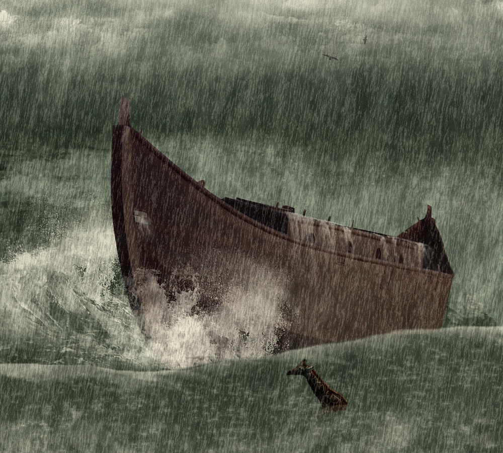
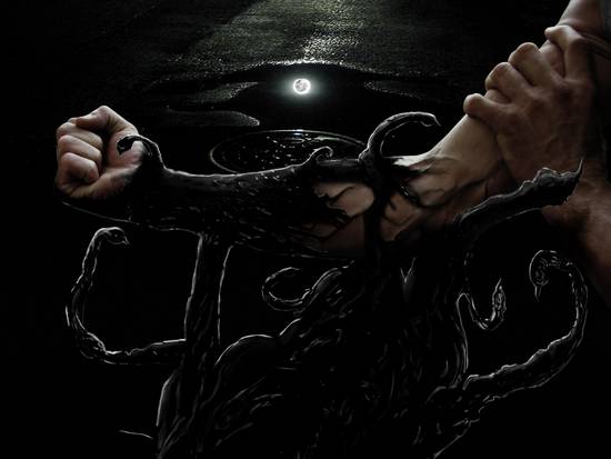
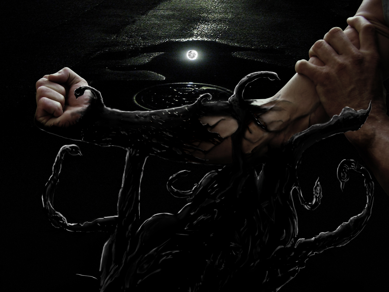
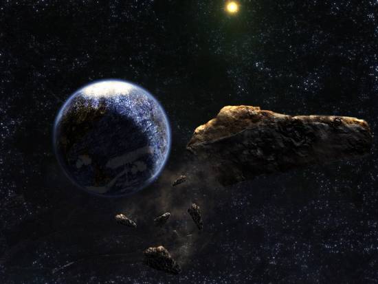
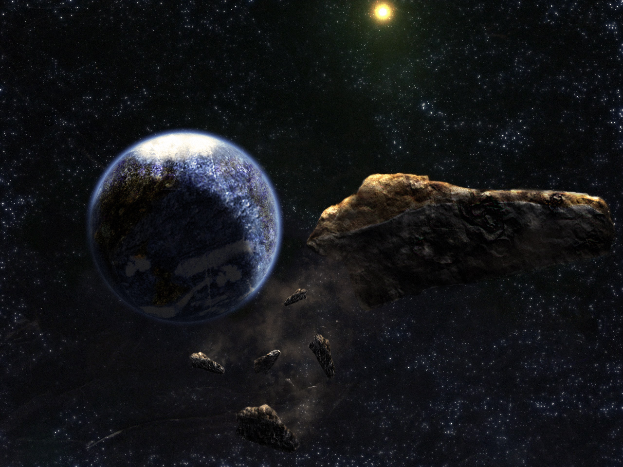
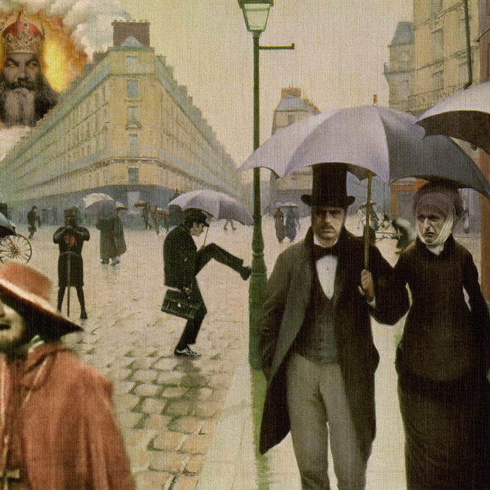
I'll show you three, cause I don't really have that many at 1280 size (because like I said, I don't like what happens, when PSC downsizes to fit into contest size)
These are mostly "all source" and PS brush work with little or no outside sources used.
thumbnail
contest size
biggie size
http://photoshopcontest.com/view-entry/127265/40-days--40-nights.html
|
TheShaman

Location: Peaksville, Southeast of Disorder
|
 Wed Mar 11, 2009 10:19 am Reply with quote Wed Mar 11, 2009 10:19 am Reply with quote
as you can see esp with darker images, thumbnails can look like a black box, and if you don't go big, you miss a lot of the detail like star fields and such.
this is the standard size I'd like to adopt.
700x700 http://photoshopcontest.com/tournament/view/594/display.html
OR we can make it 700 x 500 if you wanna keep things more like they are today as a landscape format.
anyone else wanna throw some examples up?
Rey? I know you've got a few.
|
marcoballistic

Location: I am everywhere, and Nowhere, but mostly, I am right here!
|
 Wed Mar 11, 2009 11:26 am Reply with quote Wed Mar 11, 2009 11:26 am Reply with quote
The H2H size is obviously the way to go, it can show a great amount of subtle detailed work and not need enlargement, it is the happy middle ground for this argument, and when an image is opened everyone will be 100% seeing the finished article, it negates the whole please click this big, look here load of tosh we are used to since the site was upgraded in 2006.
Some things need to return from the old days, for that I am certain.
|
vokaris
Site Moderator

|
 Wed Mar 11, 2009 11:58 am Reply with quote Wed Mar 11, 2009 11:58 am Reply with quote
I like to zoom in 200-300% on the biggie size image in a desperate attempt to find small inconsistencies to criticize. Just ask Marco.
|
marcoballistic

Location: I am everywhere, and Nowhere, but mostly, I am right here!
|
 Wed Mar 11, 2009 12:09 pm Reply with quote Wed Mar 11, 2009 12:09 pm Reply with quote
 that is so true it hurts 
|
Micose

Location: Quebec (CAN) & France
|
 Wed Mar 11, 2009 4:09 pm Reply with quote Wed Mar 11, 2009 4:09 pm Reply with quote
TheShaman wrote: awesome...
my biggest beef of all, is the quality that is lost with PSC downsizing my 1280 x 960 entry to the contest viewable size to 550 x 413. Which as we all know is the normal view size here...
I'd much rather see a larger standard size of 700 x 700 like in H2H where no one then needs to 'click big'
so right about the 700x700 without a click bro.
and thx ReyRey for what u said.....yep my stuff i all about textures and each time need to be clicked
|
TJ

Location: Utah, USA
|
 Thu Mar 12, 2009 12:48 am Reply with quote Thu Mar 12, 2009 12:48 am Reply with quote
TheShaman wrote: as you can see esp with darker images, thumbnails can look like a black box, and if you don't go big, you miss a lot of the detail like star fields and such.
this is the standard size I'd like to adopt.
700x700 http://photoshopcontest.com/tournament/view/594/display.html
OR we can make it 700 x 500 if you wanna keep things more like they are today as a landscape format.
anyone else wanna throw some examples up?
Rey? I know you've got a few.
I kinda like the 700X700, but I also like the go big for fine detail. To me that makes a good chop!
Would those detail be lost or am I'm I not getting it?
You guys know way more about this the I do.
 
|
TheShaman

Location: Peaksville, Southeast of Disorder
|
 Thu Mar 12, 2009 10:46 am Reply with quote Thu Mar 12, 2009 10:46 am Reply with quote
TJ wrote:
I kinda like the 700X700, but I also like the go big for fine detail. To me that makes a good chop!
Would those detail be lost or am I'm I not getting it?
You guys know way more about this the I do.
 
I don't think you'd really loose that much TJ, but if you really wanted to show it even bigger, you could always put a link in the authors notes 
|
marcoballistic

Location: I am everywhere, and Nowhere, but mostly, I am right here!
|
 Thu Mar 12, 2009 11:35 am Reply with quote Thu Mar 12, 2009 11:35 am Reply with quote
I was thinking that too, 700 x 700 shows a damn site more than the size we currently have, I am always surprised in the H2H what can be done and seen easily.
MAKE THIS HAPPEN DAMN IT!!! 
|
|
|
 Thu Mar 12, 2009 11:56 am Reply with quote Thu Mar 12, 2009 11:56 am Reply with quote
Maybe have the option of uploading either a 700x700 or something 1024x768...
|
Goto page Previous 1, 2, 3, 4 Next
Photoshop Contest Forum Index - General Discussion - Biggie Size It! - Reply to topic
You cannot post new topics in this forum
You cannot reply to topics in this forum
You cannot edit your posts in this forum
You cannot delete your posts in this forum
You cannot vote in polls in this forum
|
