Photoshop Contest Forum Index - Contests and Entries - A diffrent layout for PSC - Reply to topic
Goto page Previous 1, 2, 3, 4, 5, 6, 7 Next
JORDAN792

Location: Michi-gan
|
 Fri Apr 10, 2009 12:14 pm Reply with quote Fri Apr 10, 2009 12:14 pm Reply with quote
It's not a total redesign but it sounds like nobody wants it to be... Just a face lift.
|
Oscar

Location: Northern California
|
Fri Apr 10, 2009 10:54 pm Reply with quote
Grefix wrote:
Thats damn pretty good ...
|
Eve
Site Moderator

Location: Planet Earth
|
Fri Apr 10, 2009 11:00 pm Reply with quote
I've never been a fan of the big bezelled fat buttons. It looks old skool to me...or just old.
_________________
"Recently, NASA scientists discovered that most people love to play video games but hate to die in fiery airplane crashes." lifted from mason4300
|
ReinMan

Location: Kingston, ONTARIO, CAN
|
Fri Apr 10, 2009 11:39 pm Reply with quote
Eve wrote: I've never been a fan of the big bezelled fat buttons. It looks old skool to me...or just old.
Agreed!
(*makes note to convert all current client websites to non-clunky versions...*)
_________________
_________________________________
THIS SITE REALLY DOESN'T EXIST
the way our EGO THINKS IT MIGHT!
_________________________________
|
Oscar
Location: Northern California
|
Sat Apr 11, 2009 12:31 am Reply with quote
Eve wrote: I've never been a fan of the big bezelled fat buttons. It looks old skool to me...or just old.
+ 1 digg
|
|
|
Sat Apr 11, 2009 8:38 am Reply with quote
Oscar wrote: Eve wrote: I've never been a fan of the big bezelled fat buttons. It looks old skool to me...or just old.
+ 1 digg
Oh let's not bring DIGG into this and their evil toolbar.
Besides...the big fat buttons just look...bad. I thought Trey said it was just a change in the color scheme anyway? 
|
splodge

Location: Yorkshire,
|
Sat Apr 11, 2009 9:05 am Reply with quote
i still think pakimos design is the best one yet
|
splodge
Location: Yorkshire,
|
Sat Apr 11, 2009 9:45 am Reply with quote
you know,,,,,,,,,,,,,,, there's room on the button bar for a H2H button instead of hiding it in that drop down, after the h2h is over the button could be replaced with a link to the next event
|
Dechene

Location: Australia
|
Sat Apr 11, 2009 10:54 am Reply with quote
splodge wrote: you know,,,,,,,,,,,,,,, there's room on the button bar for a H2H button instead of hiding it in that drop down, after the h2h is over the button could be replaced with a link to the next event
true, but when's the next event gonna be? took a long time decide on the date for this one! 
|
splodge
Location: Yorkshire,
|
Sat Apr 11, 2009 3:00 pm Reply with quote
yes sirenka, time to arange stuff for wide screen format, even nasty crappy laptops have the abilaty now
|
splodge
Location: Yorkshire,
|
Sat Apr 11, 2009 3:09 pm Reply with quote
Dechene wrote: splodge wrote: you know,,,,,,,,,,,,,,, there's room on the button bar for a H2H button instead of hiding it in that drop down, after the h2h is over the button could be replaced with a link to the next event
true, but when's the next event gonna be? took a long time decide on the date for this one!
the next event is the scavenger hunt, we only need granulated and 3 more helpers, as none of the original team are helping, "original team conferm" i cant help as i run the score pages,
|
Eve
Site Moderator
Location: Planet Earth
|
Sat Apr 11, 2009 3:29 pm Reply with quote
splodge wrote: i still think pakimos design is the best one yet
I agree. For those who haven't seen it...
http://photoshopcontest.com/boards/viewtopic.php?p=243129&highlight=#243129
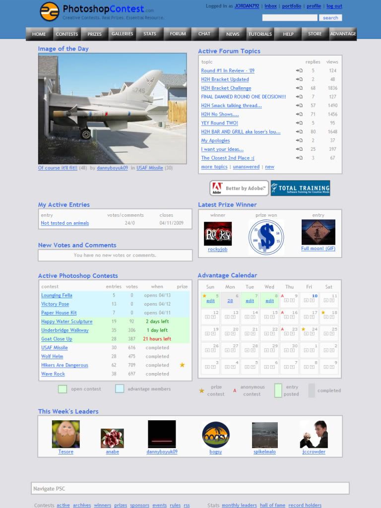
The week's leaders and last winner of the $$ comp are secondary to what's currently going on, what's coming up, special news, etc.
I think the Advantage calendar with HOW TO GET ADVANTAGE should take the place of active forum topics...most are silly or spam.
Take advantage of wide screens...most of us have them. And subdue the color scheme, especially the dark grey.
my 2 cents.
_________________
"Recently, NASA scientists discovered that most people love to play video games but hate to die in fiery airplane crashes." lifted from mason4300
|
blue_lurker

Location: Australia
|
Sat Apr 11, 2009 3:29 pm Reply with quote
Scavhunt talks are in progress, news at 11
Just a thought, this is a photoshop site I just think it should have more images than any thing else, its what we do here and they do say a picture paints a thousand words, and we have over a thousand pictures so why not show off what we do best.
Take 2
|
splodge
Location: Yorkshire,
|
Sat Apr 11, 2009 3:37 pm Reply with quote
low res guys are getting uset to scanning sideways, it's time PSC expanded, the 765pixel width we use now coz it's is so sad,
time for a massive shake up and re-disign, never mind a slight color change
|
Goto page Previous 1, 2, 3, 4, 5, 6, 7 Next
Photoshop Contest Forum Index - Contests and Entries - A diffrent layout for PSC - Reply to topic
You cannot post new topics in this forum
You cannot reply to topics in this forum
You cannot edit your posts in this forum
You cannot delete your posts in this forum
You cannot vote in polls in this forum
|