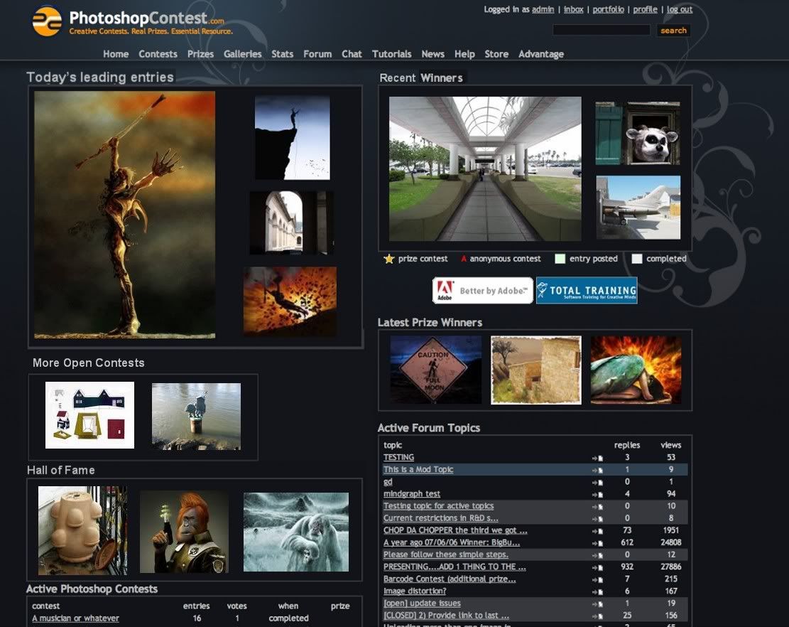
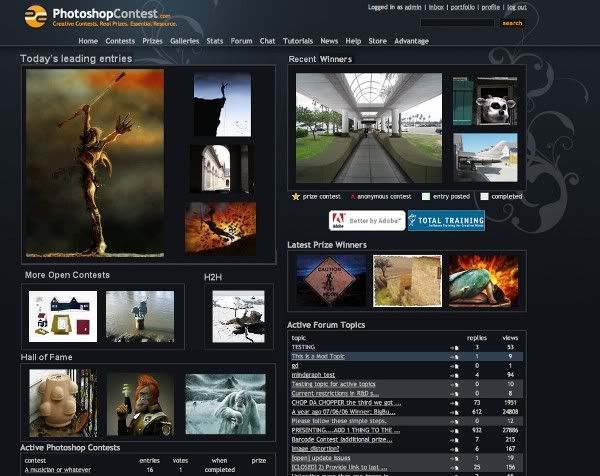
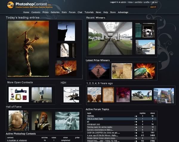
With all the talk about the front page redesign, lets have a think about showing a bit more of our stuff.
Lets give visitors something to tweak their interest and click on.
How about;
1. Today at a glance. Today's leading entries.
2. Recent Winning Entries.
3. Recent Prize Winners. Rather than waste space with avatars/prize icons, lets give them extra thumbs/entries to click on.
4. Other open contests
5. Hall of fame? How about cycling some of the wonderful entries from our galleries through the front page.
In short, lets give visitors a look at some of our stuff!
We really could lose a bit of text heavy space wasting from the front page.
Lose the advantage calendar, I don't think we need news headlines on the front page....lets face it there never is any.
Thumbs, Thumbs and more thumbs is what we need.
Used trey's model as a guide here. Ignore the colour, lets think about what BEST DISPLAYS OUR WORK.


