Ninja9 wrote:
It would be nice if ya'll could mention why you vote what you vote for. I can't mention which pic is mine, but I'd like to know why I'm winning/losing. Very Happy
sure... im always working to improve myself and constructive criticism is a big help to me.
Image number 1..
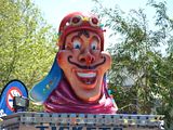
I like the idea, but the execution isnt as good as it could be. It looks to be drawn onto a portion of the picture.
shadows can make or break anything, and as an active party in the chops, the shadowing on image one sets a lot of people off. The color, though close is just not smooth, the overall look, gradients, the texture of it are all wrong for me. the other faces in it stand out 3d like, clear, crisp, and defined (i know its a photo, but I know realism is also achievable)... the added face is flat and at a strange perspective. so if it had been mine, I would have made the other portions of the pic match my add in, or made the addin look more like the photo. Integration is the key on this challenge to gain my vote. It simply looks incomplete....
image 2,
it seems to fit together better. the shape of the faces v/s the theme they are on. It has a consistency image 1 just don't have. All aspects of 2 have this appealing cartoonish look throughout which shows me the author took time to incorporate the entire picture. There are plenty of flaws there as well, but they blend in much better as the image dont transition from real to drawn to real again. Everything has the same look and feel.
I voted for image 2 because I felt it was the best work in this comp. Had these been in a daily contest, image 2 would have gotten a vote for sure, image 1, it depends. had this been from a newbie, I would have said welcome. Had it been from anyone else, i might have voted or commented to give my opinion on what could help..


