Photoshop Contest PhotoshopContest.com
Creative Contests. Real Prizes. Essential Resource.
You are not logged in. Log in or Register


Photoshop Contest Forum Index - General Discussion - Critics please help - Reply to topic

Goto page 1, 2  Next

Tad

Location: Michigan

Post Fri Sep 24, 2010 2:47 pm   Reply with quote         


I was working on a PS pic idea I had and finally finished it. Took about 2 hours. What I really want is help on what I may have missed or what I could have done to make things better. I know alot of people here understand the processes better then me by far and would appreciate some constructive criticism.

Heres the sources..


And mine...


I would really appriciate any help. I assume the theme is easy to see... so help regarding that would be amazing.

Thanks in advance. Smile

-T@D-


YerPalAl

Location: On Deck, South by Southeast

Post Fri Sep 24, 2010 3:22 pm   Reply with quote         


A couple of things. Although the light on the man sitting and bench is nicely done there is no light falling on the ground below and there should be. I would also pull the light rays back a bit as they seem to be so strong they overpower the rest of the image. I also feel the perspective is off a bit on the road. But overall the piece has a nice feel to it.


_________________
YerPalAl
--------------------------------------------------------------------------------
I'm highly motivated to be un-ambitious today.


jasper

Location: Location, Location.

Post Fri Sep 24, 2010 4:12 pm   Reply with quote         


ok - other than the overall image being a bit dark (did not see the crossroads text at first):

1. The road's perspective is not far off, but the clouds make it seem flatter because the source was taken overhead.
2. the light seems a bit cheesy at the source with rays as powerful as the sun yet too weak to cast on the ground?
3. some noticeable dark patches around the bench.
4. missing light on the ground.
5. shadows on subject did not use proper technique.

There are a few more issues, but...
OTHER Suggestions:
Make the image greyscale or desaturate as you have some color on the light pole but nowhere else.

Try again to create light and shadow with a small soft dodge and burn tool. dodge along the top edges of the subject with a slightly larger softer dodge tool to add some "glow" from the bright clothing.

Use a different source for the clouds - one that is shot to the horizon. (look up mammatocumulus)

Create a soft circle of light on the ground (oval) to complete the cone of light and weaken the light at the lens, drop the rays.

You picked some really nice sources and have come up with a VERY nice composition otherwise. GOOD WORK so far.


Tad

Location: Michigan

Post Fri Sep 24, 2010 5:10 pm   Reply with quote         


I appreciate those responses thus far. I will work on those things and repost after a few more, hopefully, review it.

But thank you so much so far....I wanna get this picture right...


Tad

Location: Michigan

Post Fri Sep 24, 2010 5:29 pm   Reply with quote         


YerPalAl wrote:
A couple of things. Although the light on the man sitting and bench is nicely done there is no light falling on the ground below and there should be. I would also pull the light rays back a bit as they seem to be so strong they overpower the rest of the image. I also feel the perspective is off a bit on the road. But overall the piece has a nice feel to it.


http://photoshopcontest.com/view-entry/168239/night-at-the-lake.html

That was my 1st attempt at light w/o filters.... Im getting better, but not there by anymeans.

I agree with both of your opinions completely.

Also, does the man/bench seem "flat" as well. Seems to have no depth to me, and I dont know what to do to fix that either.

Also.... Al, when do I get my boat ride?!?!?!?


YerPalAl

Location: On Deck, South by Southeast

Post Fri Sep 24, 2010 8:53 pm   Reply with quote         


Possibly, the man on the bench looks a bit flat because the shadows on him are so black. You might lighten them a bit, (always a crap shoot as every monitor displays images differently), and lat a bit of detail show, that could give a better 3-dimensional feel to him.

And when do you want your boat ride. Smile


_________________
YerPalAl
--------------------------------------------------------------------------------
I'm highly motivated to be un-ambitious today.


Martrex

Location: California

Post Fri Sep 24, 2010 9:10 pm   Reply with quote         


I fooled with it and gave some thoughts on the image, if you don't like it then disregard. Very Happy Very Happy


Designed2522

Location: my special place

Post Fri Sep 24, 2010 9:16 pm   Reply with quote         


Tad overall, I like the fact that your asking for feedback!
so hear it goes...and remember... im certainly no expert...I like the concept I agree with everything that has been said prior... I cant stress enough about the fact that its just to dark. Are you hiding something or where you going for that look... the border does not help the image... and if your going to add a border always ensure that its centered. the black outline is off. I agree about the light... right up around the lens of the street light its to "white". the source picture for the clouds is nice but when merged it looks flat.... I too can see black around the bench and if your going to have script in you picture it needs to be more noticeable... Im going to stop here take all of this in a positive light!!! its friday nite and im out!!! PEACE!


_________________

Tad

Location: Michigan

Post Fri Sep 24, 2010 10:00 pm   Reply with quote         


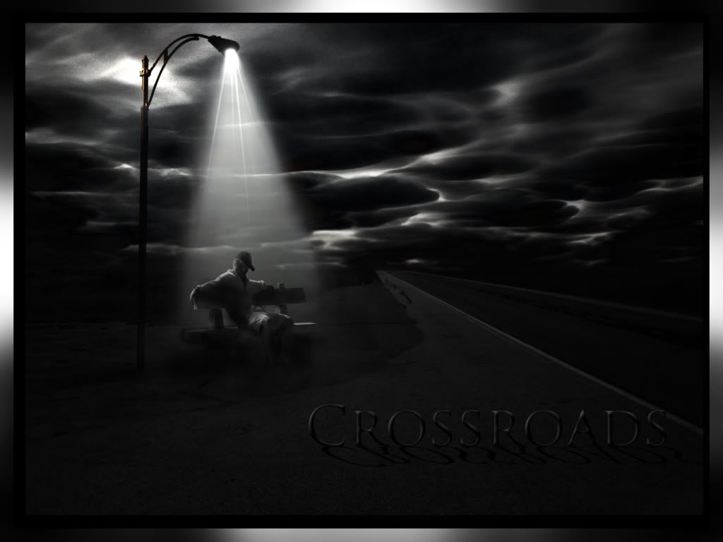
Mart... superb. One of the problems I mentioned before was the man looking "flat" your changes seemed to give it back the 3d look. I can see that know and understand it better. Tyvm. Although I do prefer the text where I put it so it.... extends the picture more, your change on the text is perfect as well. The highlighting brings more of a tie in to the street lamp which is what I was trying to do..... you just did it better Smile I also agree on the sky. Honestly I just think I used the wrong source completely. I needed something more broken up yet defined. I picked that one and was going to make a storm, but it didnt work well.... yet I kept the source for some reason lol.

Design.... I agree the black under the bench is off. I made a huge mistake trying to freehand the shadowing on a new layer.... for about a good 5 minutes before I realized I was on the main BG layer Huh.. 
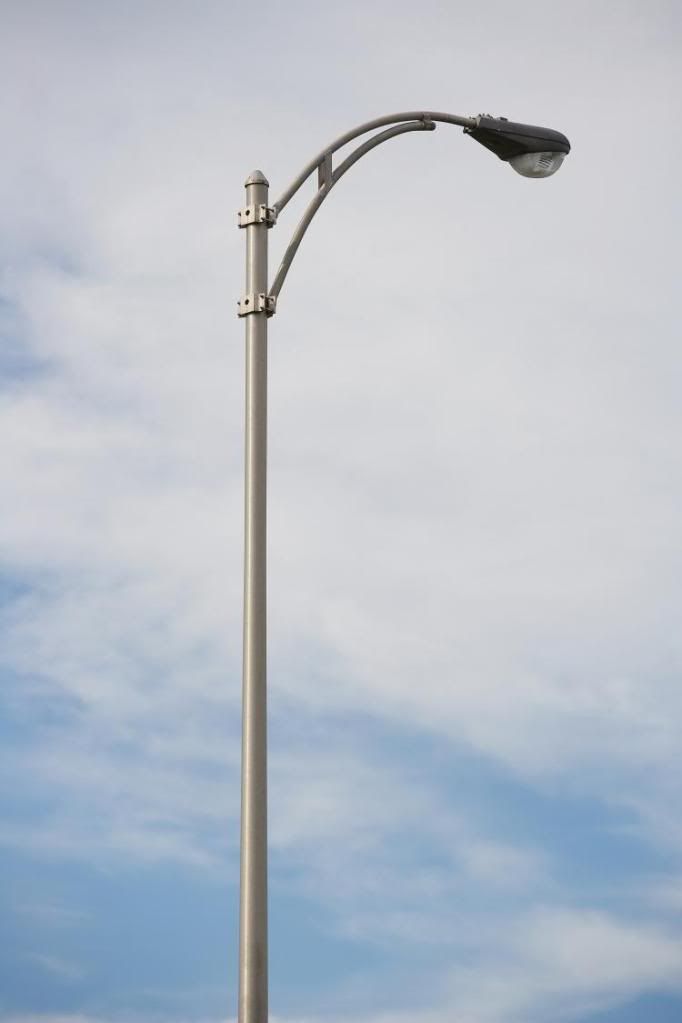
I only know how to ctl-alt-z till it stops letting me lol. The boarder was a test really. Trying to make reflective metal with just a brush. I agree it doesnt fit. I prefer just the black mat border personally. To define the edges.

Some mentioned about the darkness/text style... that was really the idea to me.

Basic story... A man, alone, in the middle of nowhere finds a bench to sit... not knowing where to go, if someone will pass. He has a feeling of distraught but the light brings him comfort. He absorbs it while contemplating his next move, at the crossroads of life.

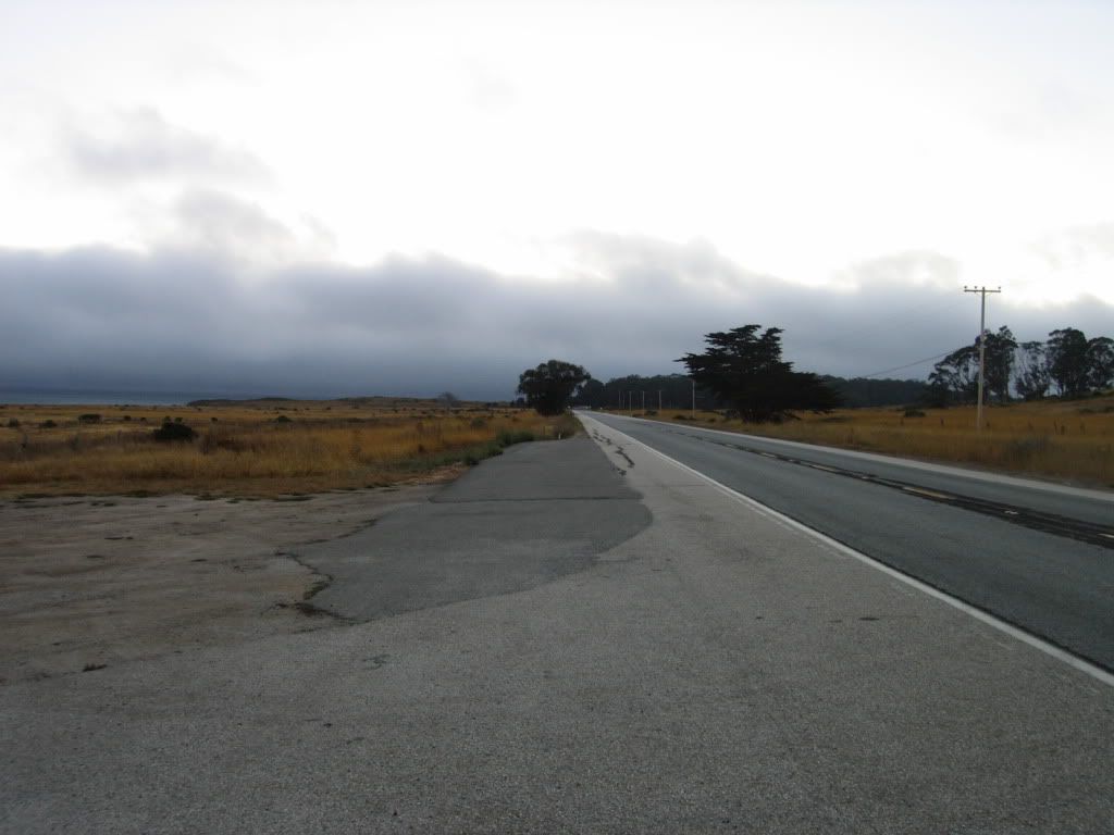
The original idea I had was the same concept.....but the person was not on a bench, but in a covered bus stop with dim lighting. A sign pointing one way saying "nowhere"... a sign pointing the opposite direction saying "somewhere". I just couldnt find the sources to make it properly lol.

Again, I extremely appreciate the help and criticisms. I take nothing to heart but use your ideas to learn. Hopefully I can take all the advice and make this a finished project that.... in reality, we all made possible together Smile

Keep the ideas/help/tell me why I suck comments coming!!!!


Tad

Location: Michigan

Post Fri Sep 24, 2010 10:03 pm   Reply with quote         


and design... thats 1 bad ass sig..... Very Happy


rockyjob

Location: Anywhere but where I am.

Post Fri Sep 24, 2010 10:16 pm   Reply with quote         


Main problem for me, what takes the realism entirely out of it: the man looks stretched vertically. When you scaled him down you didn't keep the proportions which are extremely important for a realistic image. Plus all the stuff that's been said before. It's all practice, practice and more practice. Just keep on training Smile


Tad

Location: Michigan

Post Fri Sep 24, 2010 10:54 pm   Reply with quote         


I agree. Ill work on the scaling of that layer. My monitor is set to duplicate on my 50" TV so its obscured a bit. That may be why... Razz


Tad

Location: Michigan

Post Sat Sep 25, 2010 3:26 am   Reply with quote         


Ok... took some advice.... hopefully we can go from here forward. Again, please tell me what I didnt fix or didnt fix properly lol

I softened it up alot... which looked good small... buy may not transfer good on a larger scale. I also tried to bring the text out more as mentioned. Lighting had a lot of work as well....as did shadows...

And I noticed after I posted that the text shadows are off a little.... I can fix that Smile


nat_g31

Location: Permanent vacation from Nor Cal

Post Sat Sep 25, 2010 10:42 am   Reply with quote         


Just my view of the image. . .
It is a great idea and I love the power that it tries to convey. I think it went in extremes. The sky in back was too light before and now it is too dark. To me the words should be a different color or have some highlights so you can see it better.
And some coloring would be nice. The colors should be lowly saturated but the light can be yellow and the post color can be there. The guy should have some color which wasn't there originally. I think a bit of yellow highlights would make this jump off the page.

Just my amateur opinion, but I love the direction this is going Tad!


_________________

“I had a dream I could buy my way to heaven, when I awoke I spent that on a necklace.”~~~ Kanye West
ScionShade

Location: VeniceFlaUS

Post Sun Sep 26, 2010 9:31 pm   Reply with quote         


I like it. Just needs a 'clue' as to what crossroads are being referred to.


Goto page 1, 2  Next

Photoshop Contest Forum Index - General Discussion - Critics please help - Reply to topic

You cannot post new topics in this forum
You cannot reply to topics in this forum
You cannot edit your posts in this forum
You cannot delete your posts in this forum
You cannot vote in polls in this forum


Navigate PSC
Contests open  completed  winners  prizes  events  rules  rss 
Galleries votes  authentic  skillful  funny  creative  theme  winners 
Interact register  log in/out  forum  chat  user lookup  contact 
Stats monthly leaders  hall of fame  record holders 
PSC advantage  news (rss)  faq  about  links  contact  home 
Help faq  search  new users  tutorials  contact  password 

Adobe, the Adobe logo, Adobe Photoshop, Creative Suite and Illustrator are registered trademarks of Adobe Systems Incorporated.
Text and images copyright © 2000-2006 Photoshop Contest. All rights reserved.
A venture of ExpertRating.com