Today's Woot item's description made me think of you guys.
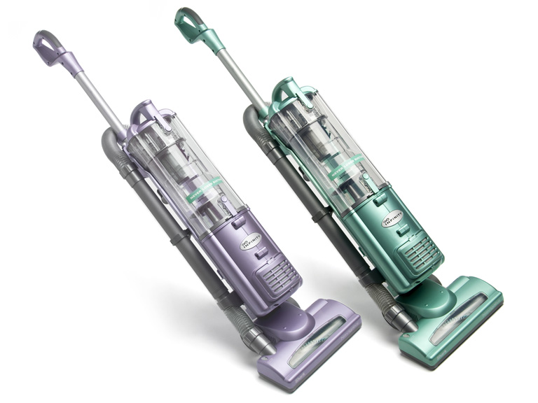
Euro-Pro Shark Navigator Upright Bagless Vacuum
ENCLOSED: Logo Sketches:
The only vacuum good enough to be named for a shark that pilots boats around Europe professionally.
TO: Euro-Pro Logo Committee
Hi guys, sorry to be so long in getting back to you. Ive been working all week on sketches for a logo for your vacuum, and doing my best to incorporate all the (unsolicited) feedback Ive gotten from various members of your staff. Let me just say again for the record that I think youd be a lot better off if you just dropped one or two of the products names. I know, I know, Im in the minority on this one, but its just
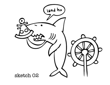
Well, youll see what I mean. Let me just show you what Ive got. First, I took a shot just at illustrating Shark Vacuums. Pretty straightforward, and shark is a word that immediately brings an image to your mind anyway, so I thought that was going to work.
But then Debra from Marketing let me know that the Navigator part of the name was an integral part of the vacuums identity, so it was essential that I get that across somehow. That brought me to this concept here:
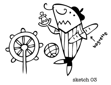
Thats supposed to be a sextant, incidentally. See, because hes a shark navigator. Anyway, I was already thinking this draft was pretty cluttered, but then Debras boss Mike emailed me that we really needed the logo to communicate Euro-Pro somehow, too. So I made the shark a French soccer player.
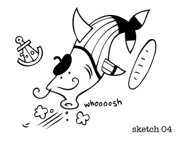
I dont mind telling you that this logo seems like a complete disaster. But this was before Gus, the CEOs son-in-law, pointed out there was nothing vacuumy about it, and asked why the Euro-Pro Shark Navigator mascot couldnt also be sucking up dirt, dust, and hair. I did this sketch:
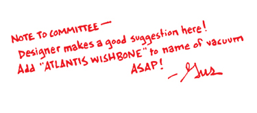
This is the worst idea for a logo I have ever seen, let alone drawn. We desperately need to start over on this thing, and step one should be shortening the product name so theres just one idea in it. Think about what makes a successful logo. Take the Dodge Ram logo, for example. Its simple, its bold, its memorable. How much worse would that logo be if it was for the Dodge Ram Stargazer Atlantis Wishbone?
Thanks,
Goober McGee
McGee Grafix, Inc.
