0_o
Eye twitch...
But... That's not...
...
...
THAT'S NOT A £U$&ING LOGO!!!
Logo's are supposed to be simple symbolisms scalable and visible at smaller sizes.
You scale that down to 16px by 16px you know what you will see...
FUCK ALL!
Why 16 px by 16 px you ask?
See that URL bar across the top of this website?
Your logo is meant to act as a favicon on your website.
You do have a website right?
Here is a gallery of favicons.
You see there is nothing inherently wrong with a large detailed and complex version of a logo, but it has to be scalable down to it's simplest elements because you will be printing it on everything like, batch processed business cards and possibly key rings or badges.
The smaller it gets, the less detailed it will have to be, if you try to keep the detail, nobody will recognise your logo.
--------------
Next Symbolism.
Your logo has to be synonymous with you and the best way to do this is to design it with this in mind.
I wonder what the logo for Shell is?
Maybe the logo for BadRobot...
What's Batmans symbol?
The Flash perhaps?
These are logos that mean something and as such they are easy to anchor to a product.
You might be inclined to think... Wait Pixar's lamp doesn't relate to pixar, but the lamp was Pixars first animation project and they were the forerunners in their field, it's a mascot for the company which brings me to my second point.
Nobody knows your stupid mascot unless you are a forerunner in your field.
You are always shit at logo design until you sit down and actually think about what you want your company should be shown as and what the simplest most scalable symbol represents it. Never mind the materials, never mind the colour just yet.
Right now your symbol is.
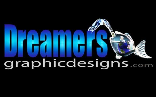
A fish with the world inside it.
Does your company fish for anything?
Do you fillet fish?
Is your company fish for jobs?
Do you have a fleet of fishing boats?
Is your company called fish for the world or something with fish/world connotations.
Do you sell goldfish from around the world.
If the answer to the above is no, why is your logo a fish with the world in it.
Your business is what... "a graphics business"...
Jee-zuz... I hope it's called WorldFishSpittingOcean Graphics or your screwed.


