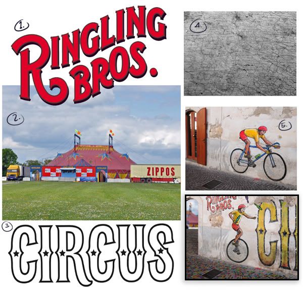
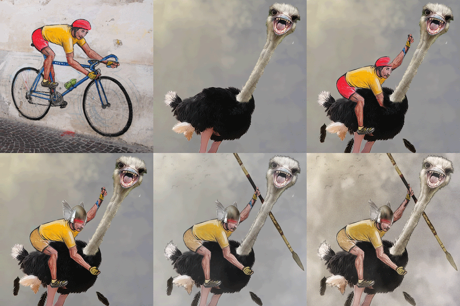
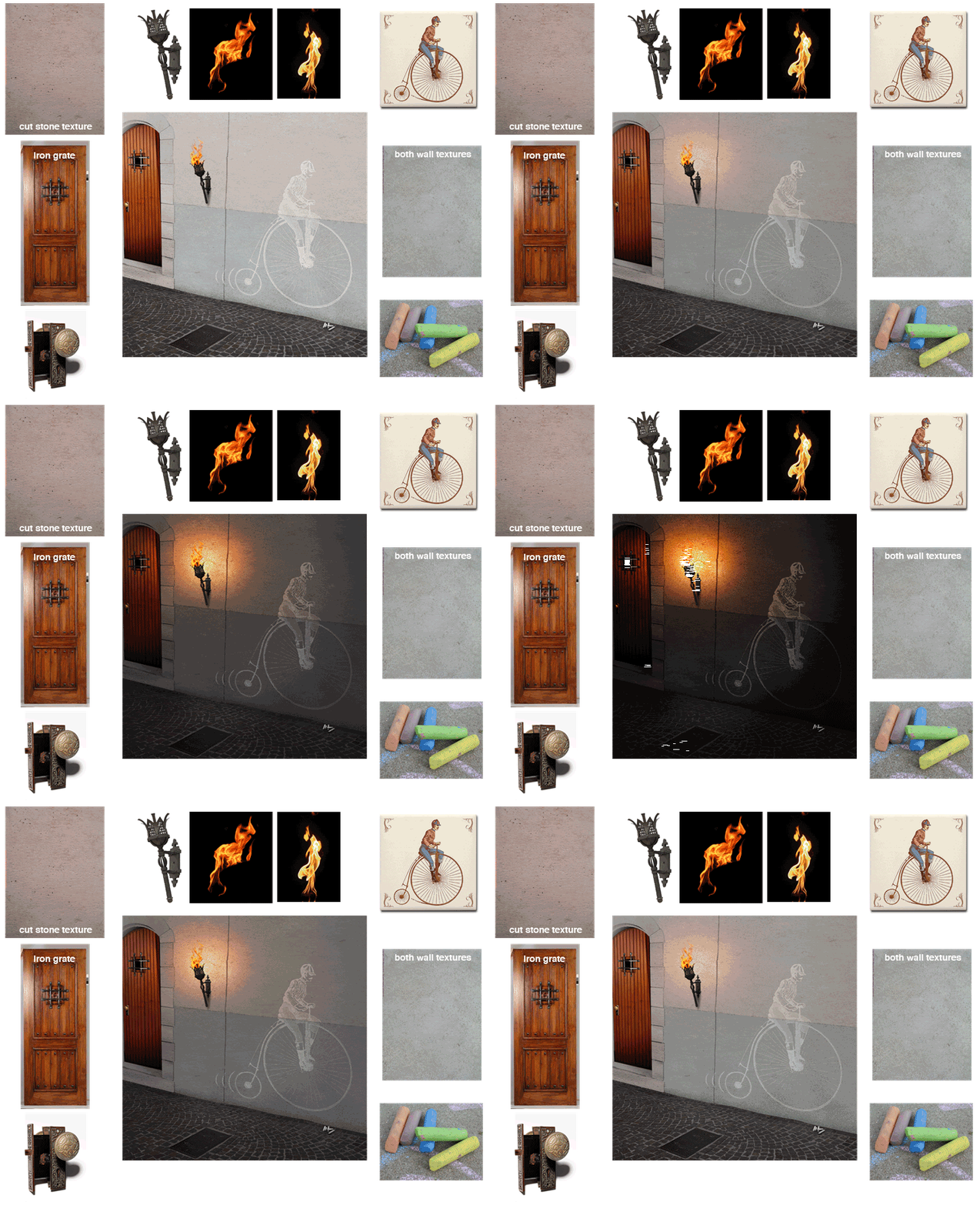
No Externals. This is All Source. Ok, technically it's mostly Photoshop and painting with a little bit of source sprinkled in. I don't like the term painting, because I like to take a shape and fill in light and shadow and manipulate color in batches. It's more like what sketch artists do to add shading to drawings to give a white piece of paper depth. Painting is what I think of on how I ended up doing the hair, with brush strokes. I also use the warp tool to bend textures.
1. Notice my semi-subliminal message? That was the reason for the font... period. 'fASt' had the 'AS' for All Source, and I even underlined it. For some reason I was worried that people might think I rendered the image using 3D software.
2. I do use references when I'm doing an all source. This is the model in which I based the lighting, skin tone, and eyes. Basically, I tried my best to match what I could with PS (but keep the shape of the face in the original source).
3. Shirt Pattern. I believe I took the skin pattern I created, added a motion blur horizontal. Duplicated the layer, rotated that layer 90 degrees and blended the layers together using a mode like Hard Light.
4. Skin pattern. Simply generated some noise, blurred, and added color.
5. One of the first things I focused in on was the eye. I had read ReyRey's tutorial last year on creating eyes. I did this from memory. His tutorial goes beyond the steps I took, and I did it my own way. His is way better. But I had an entire head to focus on, so I stopped when it looked good to me.
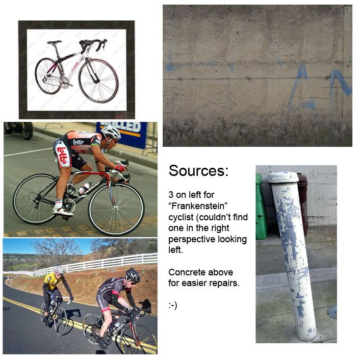
6. Helmet. Created from the door.... the padding and strap created from the street.
7. The lowest layer of the face. Darken, Highlight,.... weird things happen to it as I'm adjusting it while looking at all the layers on top of it.
8. Brows, Nose, Mouth.... separate layers
9. Hair and ear. I tried a few tutorials on creating hair and failed. I ended up just painting them. The ear is just like the face, a cutout of my skin patch and shaded and highlighted to give depth.
10. So I got a closeup of this cyclist and no view of the bike. This person needed to be doing something. So I motion blurred the background and added blue and red lights. Why? Because this cyclist is going so fast that she is breaking the speed limit. She's caught the attention of the POLICE. I was hoping people would connect the dots. I added spill lighting to my cyclist on the helmet, face and shirt of the police lights. This also gave me the opportunity to fill the black void in the lower right corner of my image and turn it into an advertisement and reveal my subliminal message. The neon bike was made with the pen tool. Noemi.... not sure if that's the famous Italian cyclist, the name of the wall artist, or a company. I decided to make Noemi my cyclist and the name of a company.


