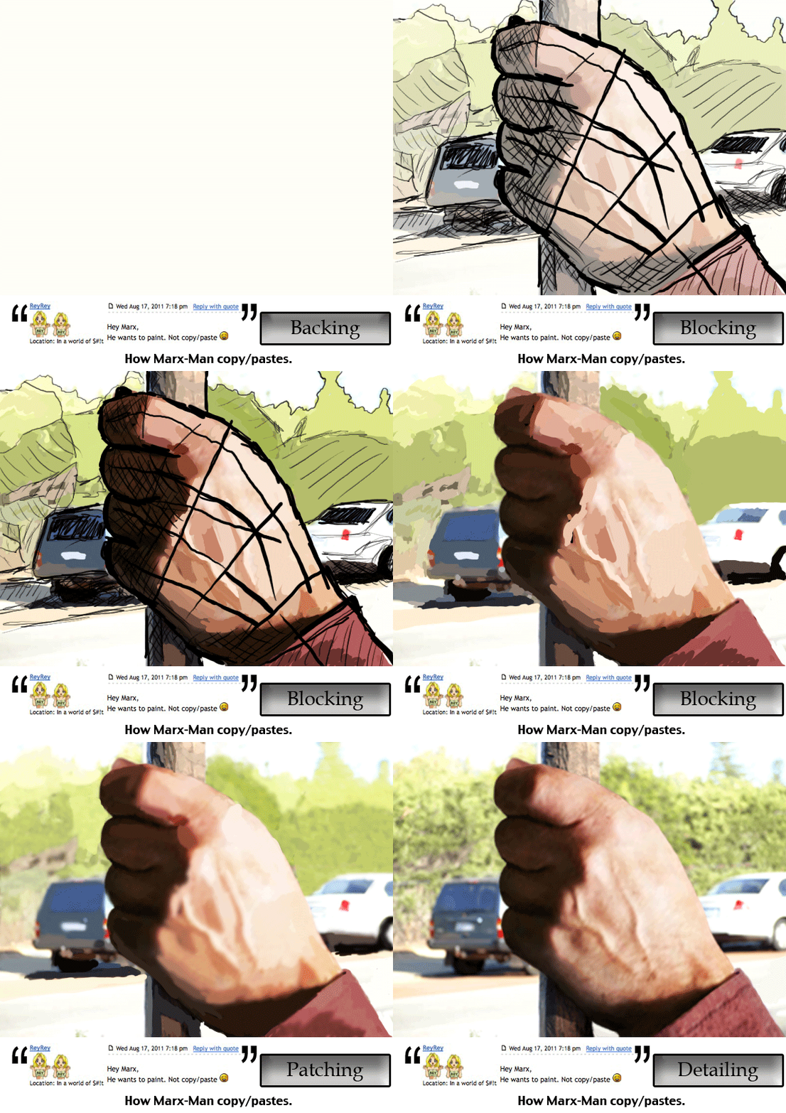
rohanpujaris wrote:
It was my first painting. I loved it but received less votes. I am posting it here for some critiques
I am going to start with the summary:
Bad things:
- It's crap.
- It probably took you a while to do, but not long enough, because it isn't finished.
- You make some basic errors in highlighting.
- Your shadows are too bold.
- The contrast between the little and ring finger is too low, it makes the two fingers look joined together.
- The handcuff looks flat because of the shading.
- The Shadows don't cast properly on the handcuff
Good things:
- The base of the hand where it meets the wrist isn't too bad.
Points to consider, you might be blind?
If I had to guess I would suspect the smudge tool and an overlaid colour.
The thing it lacks the most is detail, as the picture stands, the hand is in what some people would call the 'foundation stages' of construction.
I must state that you raised the bar way to high for yourself to start with. Having a photographic background means that your work needs to be photo-real looking in order for it to match, otherwise it will look jarring and noticeable.
You would have needed to draw hair, skin blemishes, texture, specular highlights and detail shading to make it look more real. All of the above takes a lot of time. [Edit: Turns out it takes me about 20 minutes]
If it got to the point where you said, this looks like a hand, you would be correct, it looks sort of like a hand, if you got to the point where you thought it was passable as a hand, you might need to see an optician.
Photoshop blindness happens to a lot of people. Try flipping the image occasionally to get rid of it.


