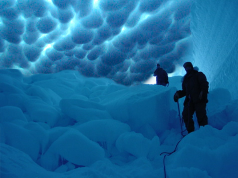
"This is perfect" .....That's the comment I left with my vote on
this image.
It appeared to be a straight up cut and paste--except
it was done RIGHT!
First-you divided that start source into several seperate objects and
incorporated them into the final image seperately--
second they were blended in so well, noone would ever notice this
wasn't the original image.
Third-you matched the lighting for all added parts perfectly
fourth-being as some of the added parts (from source) were people=-
you added them in a positon so that they
actually 'interacted' and added some "personality" to the image. Their
stances and "Expressions" absolutely not only fit but
do so 'dynamically'.
The basic integration of source into just one other image
is something I am not easily impressed with-
Exceptional work here
 http://photoshopcontest.com/images/thumbs/44817071dea09d51652893ee29c9df6b68191b1b382672.jpg


