| Voter | Comment |

|
bogonet
Good luck sir!
|
|

|
jerryhami
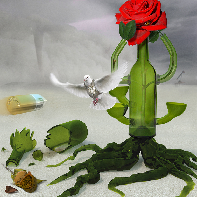
Other has a good message. I like the layout and colors of this one...Would have left out text.
|
|

|
Kid A
kool
|
|

|
seelcraft
Both really good. Great lighting on this one. Doesn't hurt that it's topical.
|
|

|
CarlC
...
|
|

|
billtvshow
I highly disagree with adding the text, but the other is much too all over the place and busy with ideas tying the theme together for my tastes, despite being a stronger effort. This is more concise and appealing.
|
|

|
KENNY CHUNG
...
|
|

|
ElectronChaser
...
|
|

|
Gort
...
|
|

|
Tea Man
...
|
|

|
vokaris
I like this better.
|
|

|
Patre
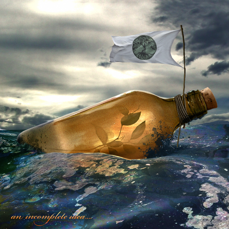
Both images are interesting and have uniquely creative ways of expressing feelings etc., related to the oil spill crisis off the coast of Louisiana. Terrific work..I voted for this image because of the simplicity of the powerful foreground presence,lighting in the bottle and oil texture in the ocean.
|
|

|
nevet
...
|
|

|
TheShaman
I like this very much.
|
|

|
Krank
...
|
|

|
Eve
I don't understand the other one. Incomplete or not, this rocks.
|
|

|
anabe
stunning, in all aspects
|
|

|
Tommeken
stil very nice ;)
|
|

|
thbeghin
:)
|
|

|
Sanctuary
...
|
|

|
marcoballistic
and yet I prefer it, as the other seems confused, I kind of wish this did not have the writing, as I like it a lot as a composition, very beautiful
|
|

|
Grefix
...
|
|

|
NButler
...
|
|

|
volkswes
...
|
|

|
FootFungas
...
|
|

|
ReyRey
...
|
|

|
beefhead
...
|
|

|
JAM
...
|
|

|
Salvezza
Agian both wondeful chops, hard decision, but I think I like this more.
|
|

|
arcaico
an incomplete vote...
|
|

|
vunt van pumununt
the other one has way more effort put into it (kudos), but I find the whole scene incoherent in some manner. This one is well chopped and is just a more pleasent image to look at (except for the text off course)
|
|

|
sirenka
...
|
|

|
Cartoon Contractor
Really hard choice on 2 GREAT chops! I liked this one better because of the simplicity of the idea. The other was a bit confusing! Looks like more work but the image held too many questions for me. Amazing work both of you.
|
|

|
ReinMan
I almost didn't vote for this because of the "an incomplete idea" message at the bottom, but othewise this is a great image. The other chop below was just too complex and confusing to me... but was well chopped.
|
|

|
sweetfelinity
...
|
|

|
Tawiskaro
Two oil themes from a bottle? This one is stronger, even if incomplete.
|
|

|
rashdog
...
|
|

|
Claf
I don't know why you wrote "an incomplete idea". For me your idea works. It is simple & strong. Looks like a great environmental message... a great ad. The other one is very nice too. Great work, some nice details & manipulation. But I think too busy... it makes me more confused than anything else. So generally I prefer this one. :-)
|
|

|
clonestamp trooper
...
|
|

|
DaVinci
...
|
|

|
annajon
I love both ideas, but this one feels better
|
|

|
Mel47
...
|
|

|
Sliver
...
|
|

|
EJH
...
|
|

|
Tad
...
|
|

|
TheBullShark
...
|
|

|
TofuTheGreat
I totally recognize that logo on the flag! Penny Arcade! Anyway I like the theme here. The other has nifty effects but doesn't make much sense to me. Looks more like rendered 3D effect rather than chopping.
|
|

|
Takser3
...
|
|

|
Alex
...
|
|

|
ScionShade
Funny. The idea seems complete to me..texty a nono..imagery...niiiiiiiiiiice.
|
|

|
cafn8d
I wish you left the text off. Incomplete or not, whatever you enter, let it stand for itself. You can always tell us after the competition that it was "incomplete." Some people will say, "Ah, thought so." But at least a few people, like myself, will say, "Oh. I liked it anyway." Congratulations to both of you for getting this far in the H2H, and thank you both for posting such excellent work along the way. I really like the feel of this composition... and the other image, while it seems to experiment more with the shape of the bottle, is too fragmented, so to speak, in its composition. Interesting you both picked the same theme.
|
|

|
neurotoxic
...
|
|

|
MamaBallistic
...
|
|