Photoshop Contest Forum Index - Contests and Entries - A diffrent layout for PSC - Reply to topic
Goto page 1, 2, 3, 4, 5, 6, 7 Next
pakimo

Location: Norway
|
 Wed Apr 08, 2009 10:32 pm Reply with quote Wed Apr 08, 2009 10:32 pm Reply with quote
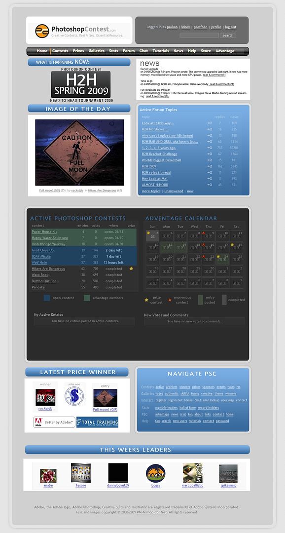
Had an hour to spare so played a bit with the layout of PSC for fun.
Where the news and ongoing specials get a more prominent place.
|
Eve
Site Moderator

Location: Planet Earth
|
Wed Apr 08, 2009 10:45 pm Reply with quote
whoa.............that's cool!
_________________
If you're going to walk on thin ice, you might as well dance!
thank u Tawiskaro
|
Micose

Location: Quebec (CAN) & France
|
Wed Apr 08, 2009 11:23 pm Reply with quote
its terrific, modern,classy, bravo ! i like. 
|
dewdew

Location: Upstate South Kack-a-lack
|
Wed Apr 08, 2009 11:26 pm Reply with quote
 ....WINNER
Now this dog has some "HUNT" in it. That would be a nice new layout.
MAKE IT SO NUMBER 1.....
|
TJ

Location: Utah, USA
|
Wed Apr 08, 2009 11:28 pm Reply with quote
That is awesome!!........... Make it happen Mods.
|
TutorMe
Site Moderator

Location: Sitting in this room playing Russian roulette, finger on the trigger to my dear Juliet.
|
Wed Apr 08, 2009 11:35 pm Reply with quote
A new layout is already in the works.
|
janetdog

Location: Las Vegas Baby!
|
Wed Apr 08, 2009 11:36 pm Reply with quote
PSC looked like that a few years back. I think the present lay-out has more to do with ads than anything else.
_________________
chop chop
|
Pearcinator

Location: NSW - Australia
|
Thu Apr 09, 2009 12:25 am Reply with quote
Some spelling mistakes but overall its great! Id like to see PSC like that becuase it fixes all the problems with the current layout (users not knowing about H2H for example)
|
Lord David

Location: Melbourne, Australian Continent, Earth, Sector 001, United Federation of Planets, Alpha Quadrant.
|
Thu Apr 09, 2009 12:32 am Reply with quote
|
|
|
Thu Apr 09, 2009 12:42 am Reply with quote
The overall layout is pretty nice, although the graphics and colors need a little refinement. It is a concept, though, so overall, nice work. 
_________________
"Recently, NASA scientists discovered that most people love to play video games but hate to die in fiery airplane crashes."
|
|
|
Thu Apr 09, 2009 1:04 am Reply with quote
For a hour to kill, you did a great homepage 
|
nat_g31

Location: Permanent vacation from Nor Cal
|
Thu Apr 09, 2009 1:09 am Reply with quote
looks good pak, I would keep the image of the day predominantly on top and bump the "what's happening now" lower, because most of the time nothing is happening, + we want to see the winning image first thing (at least I do) 
Still nice job, hopefully tutorme and gang come up with something awesome like this.
_________________
I had a dream I could buy my way to heaven, when I awoke I spent that on a necklace.~~~ Kanye West
|
TutorMe
Site Moderator
Location: Sitting in this room playing Russian roulette, finger on the trigger to my dear Juliet.
|
Thu Apr 09, 2009 1:17 am Reply with quote
The layout I'm working on is about 98% done. It's based off of a layout Oscar posted a while back. The position of things is exactly the same. I am working on some improvements for the home page, but they would come later.
|
pakimo
Location: Norway
|
Thu Apr 09, 2009 7:05 am Reply with quote
cool
I didn't know people was working on the page.
Looking farward to a change.

And thank you for nice feedbacks !
|
Dechene

Location: Australia
|
Thu Apr 09, 2009 7:11 am Reply with quote
TutorMe wrote: The layout I'm working on is about 98% done. It's based off of a layout Oscar posted a while back. The position of things is exactly the same. I am working on some improvements for the home page, but they would come later.
One thing that I think we need is a clock with 'PSC' time on it the homepage, maybe with a countdown to daily contests & H2H?
|
Goto page 1, 2, 3, 4, 5, 6, 7 Next
Photoshop Contest Forum Index - Contests and Entries - A diffrent layout for PSC - Reply to topic
You cannot post new topics in this forum
You cannot reply to topics in this forum
You cannot edit your posts in this forum
You cannot delete your posts in this forum
You cannot vote in polls in this forum
|