Photoshop Contest Forum Index - Ask the Experts - T-shirt design help... - Reply to topic
Goto page Previous 1, 2, 3, 4 Next
|
|
 Tue Jul 17, 2007 5:21 pm Reply with quote Tue Jul 17, 2007 5:21 pm Reply with quote
Here's my second attempt. More colors than I really wanted, but I can reduce the number of colors before printing if needed.
Thoughts, suggestions??
DP, I really like that last one. Maybe with a couple different colors (one color text, another color for the graphic)! Thanks for your input!
|
|
|
Tue Jul 17, 2007 7:59 pm Reply with quote
Azionite wrote: Here's my second attempt.
Again...COOL rocket...The font is...well...not horrible...but it doesn't fit well to me...Maybe if it were the funky font I usd in the second one...?
Azionite wrote: DP, I really like that last one. Maybe with a couple different colors (one color text, another color for the graphic)! Thanks for your input!
And here's a couple...
|
Procyon
Site Admin

Location: Toronto, ON
|
Tue Jul 17, 2007 8:40 pm Reply with quote
I like yours dp! Maybe make the rockets yellow at the bottom, so it looks like a launch. Just an idea.
_________________ Feel free to PM me, but PM a mod if you think they can help you. If you've won a prize, contact me!
|
|
|
Tue Jul 17, 2007 10:19 pm Reply with quote
digitalpharaoh wrote:
LOVE this one DP, my favorite so far!

|
bx3800

Location: .:Los Angeles:.
|
Wed Jul 18, 2007 3:06 am Reply with quote
Its MTV its hip and play on words:.
u tell me hate it or love it:.
And its only one color.........
Random fact for the Day:
Bx3800 Uuuuuuse to many moons ago run a church youth group...

|
|
|
Wed Jul 18, 2007 7:48 am Reply with quote
Azionite wrote: digitalpharaoh wrote:
LOVE this one DP, my favorite so far!
Thanks.
|
TofuTheGreat

Location: Back where I belong.
|
Wed Jul 18, 2007 9:22 am Reply with quote
bx3800 wrote:
I like where this one is going. The others are cool, and look great, but they look too "space camp" to me.
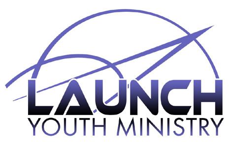
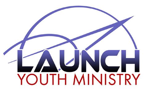
I misread the original post. I thought it was "Launch Your Ministry". Like maybe it was a slogan/motto/theme. 
_________________ Why I do believe it's pants-less o'clock! - Lar deSouza
The mind is like a parachute, it doesnt work if it isnt open. - Frank Zappa
Created using photoshop and absolutely no talent. - reyrey
|
bx3800
Location: .:Los Angeles:.
|
Wed Jul 18, 2007 10:36 am Reply with quote
I like Marcos third one and DP last one:.
very pimptatsic:.
|
|
|
Wed Jul 18, 2007 10:40 am Reply with quote
The CORRECT word, bx is PIMPALICIOUS.

|
|
|
Wed Jul 18, 2007 11:12 am Reply with quote
Some really good ones coming through now.
I really like that one, bx. Only thing is I might make the flame from the "M" a different color so it doesn't look like a mullet.
Here's a completely different idea:
|
|
|
Wed Jul 18, 2007 11:16 am Reply with quote
Azi...cool one....and this IS for the FRONT of the shirt, right?
|
|
|
Wed Jul 18, 2007 11:20 am Reply with quote
digitalpharaoh wrote: Azi...cool one....and this IS for the FRONT of the shirt, right?
Yep! I've got some text that's going to go on the back (if it's not too much more expensive).
|
bx3800
Location: .:Los Angeles:.
|
Wed Jul 18, 2007 1:41 pm Reply with quote
what's wrong with space mullets?and
DP according to the Cambridge American dictonary pimptastic is the correct term!
thank u very much!
|
Goto page Previous 1, 2, 3, 4 Next
Photoshop Contest Forum Index - Ask the Experts - T-shirt design help... - Reply to topic
You cannot post new topics in this forum
You cannot reply to topics in this forum
You cannot edit your posts in this forum
You cannot delete your posts in this forum
You cannot vote in polls in this forum
|