Photoshop Contest Forum Index - Ask the Experts - Design Project - Reply to topic
Goto page 1, 2 Next
How does this represent visual hierarchy? |
Very Well |
|
16% |
[ 1 ] |
Well |
|
0% |
[ 0 ] |
Meh, OK |
|
33% |
[ 2 ] |
Poorly |
|
50% |
[ 3 ] |
Terribly |
|
0% |
[ 0 ] |
Total Votes: 6
FootFungas

Location: East Coast!
|
 Thu Feb 19, 2009 5:22 pm Reply with quote Thu Feb 19, 2009 5:22 pm Reply with quote
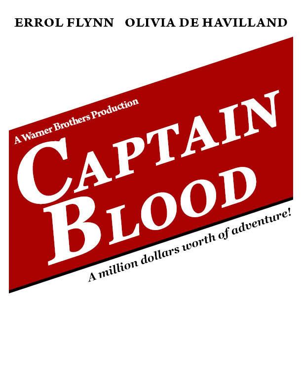
Sorry to take some of the focus away from poop related topics, but I wanted to ask some advice on a project for a Desktop Publishing class.
The focus of this project is to establish Visual Hierarchy, while applying the principles of Contrast, Repetition, and Alignment.
Its a handbill design for the 1935 movie Captain Blood!
I still have to add some text to the bottom, but let me know what you think.
_________________
Look out behind you!
|
Eve
Site Moderator

Location: Planet Earth
|
 Thu Feb 19, 2009 5:33 pm Reply with quote Thu Feb 19, 2009 5:33 pm Reply with quote
too much white space between the actors' names and the image. What's the purpose of the black bar on the bottom of the red? Needs a little more air between the C and B

*edit*
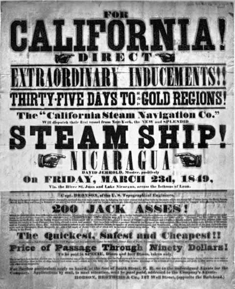
I googled 1935 handbills. I think your instructor had something along the lines of this...
They were all pretty "busy" ... the artists were forced to define the importance of some of the information over others.
_________________
"Recently, NASA scientists discovered that most people love to play video games but hate to die in fiery airplane crashes." lifted from mason4300
|
FootFungas

Location: East Coast!
|
 Thu Feb 19, 2009 5:39 pm Reply with quote Thu Feb 19, 2009 5:39 pm Reply with quote
Eve wrote: too much white space between the actors' names and the image. What's the purpose of the black bar on the bottom of the red?

Good point. If I raise the rotated block up, it starts enroaching on the names, but that white space is kind of annoying.
What do you think of the rotation of the block?
Too much?
I just used the black bar to add emphasis to the block containing the title.
_________________
Look out behind you!
|
Eve
Site Moderator

Location: Planet Earth
|
 Thu Feb 19, 2009 5:41 pm Reply with quote Thu Feb 19, 2009 5:41 pm Reply with quote
see my edit
_________________
"Recently, NASA scientists discovered that most people love to play video games but hate to die in fiery airplane crashes." lifted from mason4300
|
FootFungas

Location: East Coast!
|
 Thu Feb 19, 2009 5:46 pm Reply with quote Thu Feb 19, 2009 5:46 pm Reply with quote
Eve wrote: I googled 1935 handbills. I think your instructor had something along the lines of this...
They were all pretty "busy" ... the artists were forced to define the importance of some of the information over others.
Interesting.......
_________________
Look out behind you!
|
FootFungas

Location: East Coast!
|
 Thu Feb 19, 2009 5:53 pm Reply with quote Thu Feb 19, 2009 5:53 pm Reply with quote
Thanks for the pic, Eve.
I'm thinking about redoing the entire design.
_________________
Look out behind you!
|
ScionShade

Location: VeniceFlaUS
|
 Thu Feb 19, 2009 10:18 pm Reply with quote Thu Feb 19, 2009 10:18 pm Reply with quote
With all due respect. do it over!!!!!
"The focus of this project is to establish Visual Hierarchy, while applying the principles of Contrast, Repetition, and Alignment. "
You do this naturally, so uhh, you know...
be yaself Bro. Just do it. Just make the add how you'd do it, and
THEN make up yer excuses for why it fits the formula.
Personal opine here: When learning anything that is a craft or art in the classroom. Pay attention to the basics,
and immediately forget all this complicated theory the second the course is done. Especially when it's just a desktop publishing class. Like there's professional standards for this stuff? Goodness.
|
seelcraft

Location: High Bridge, New Jersey
|
 Thu Feb 19, 2009 10:22 pm Reply with quote Thu Feb 19, 2009 10:22 pm Reply with quote
To me the type verticals clash with each other: "Captain Blood.."
and "A million dollars.." have one alignment, but "A Warner Bros..." has another. Makes Warner Bros look twisted.
And "Errol..", with it's vertical alignment, doesn't connect to the rest at all.
Also the contrast in type sizes is so great that you're not led from one phrase to another.
I remember it as:
CRAP
contrast, repetition, alignment, and proximity. (--ala the real Robin Williams).
This advice, from a chemist who's never taken a design course, should be taken with a grain or two of salt. 
_________________ Seelcraft
Chemists have solutions!
|
splodge

Location: Yorkshire,
|
 Thu Feb 19, 2009 11:42 pm Reply with quote Thu Feb 19, 2009 11:42 pm Reply with quote
could they print diagonal type in the 1930's? i think it was all done in horizontal lines due to the printing blocks
|
Eve
Site Moderator

Location: Planet Earth
|
 Fri Feb 20, 2009 12:20 am Reply with quote Fri Feb 20, 2009 12:20 am Reply with quote
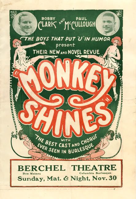
here's another example from the 30s...
the non-linear type was done by hand (duh)  ...using protracters (sp?) and stuff.
What might be fun and a challenge is to use a modern day movie and give it that 30s handbill look. Just an idea.
_________________
"Recently, NASA scientists discovered that most people love to play video games but hate to die in fiery airplane crashes." lifted from mason4300
|
Tarmac

Location: Hotel California
|
 Fri Feb 20, 2009 1:28 am Reply with quote Fri Feb 20, 2009 1:28 am Reply with quote
I snapped some shots of my DVD collection of Errol Flynn movies. I hope they might help you as they represent the actual cinema poster designs from those times.
|
seelcraft

Location: High Bridge, New Jersey
|
 Fri Feb 20, 2009 10:23 am Reply with quote Fri Feb 20, 2009 10:23 am Reply with quote
Eve wrote: here's another example from the 30s...
the non-linear type was done by hand (duh)  ...using protracters (sp?) and stuff.
What might be fun and a challenge is to use a modern day movie and give it that 30s handbill look. Just an idea.
My dad was a commercial artist (in Des Moines) in the 30's. He did stuff like that. Most type was drawn by hand, but they did have pantographs with type stencils that could be adjusted to make oblique letters.
Don't get me started on "the good old days." I spent most of my career facilitating the digital pre-press revolution.
_________________ Seelcraft
Chemists have solutions!
|
FootFungas

Location: East Coast!
|
 Fri Feb 20, 2009 12:20 pm Reply with quote Fri Feb 20, 2009 12:20 pm Reply with quote
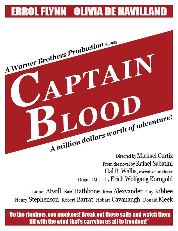
Thanks for the advice, everybody. This was not a large project, we had just a few days to work on it.
I knew someone who had the teacher, and they said a more modern design is what the teacher wanted.
So, this is what I did.
Thanks for the cool examples. Seeing the creative way they emphasized the text was interesting.
I'm sure I'll be back asking for more advice in the future for bigger projects.
*edit* this version has a black stroke on the bottom, which I took off.
_________________
Look out behind you!
|
Eve
Site Moderator

Location: Planet Earth
|
 Fri Feb 20, 2009 10:10 pm Reply with quote Fri Feb 20, 2009 10:10 pm Reply with quote
unless you've already turned it in, my only suggestion would be to put the same amount of air between the text above Captain Blood as the line of text below it.
Nice job! 
_________________
"Recently, NASA scientists discovered that most people love to play video games but hate to die in fiery airplane crashes." lifted from mason4300
|
glennhanna

Location: Eugene, Oregon
|
 Sat Feb 21, 2009 11:42 am Reply with quote Sat Feb 21, 2009 11:42 am Reply with quote
FootFungas wrote: Thanks for the advice, everybody. This was not a large project, we had just a few days to work on it.
I knew someone who had the teacher, and they said a more modern design is what the teacher wanted.
So, this is what I did.
Thanks for the cool examples. Seeing the creative way they emphasized the text was interesting.
I'm sure I'll be back asking for more advice in the future for bigger projects.
*edit* this version has a black stroke on the bottom, which I took off.
Nice Book Cover
|
Goto page 1, 2 Next
Photoshop Contest Forum Index - Ask the Experts - Design Project - Reply to topic
You cannot post new topics in this forum
You cannot reply to topics in this forum
You cannot edit your posts in this forum
You cannot delete your posts in this forum
You cannot vote in polls in this forum
|


