Photoshop Contest PhotoshopContest.com
Creative Contests. Real Prizes. Essential Resource.
You are not logged in. Log in or Register


Photoshop Contest Forum Index - General Discussion - Typography - Reply to topic

Post Sun Mar 29, 2009 1:41 am   Reply with quote         


I'm really interested in doing things with photoshop involving typography. It looks much different than most of the work that I see, so I want to try my hand at it. I gave it a go for the first time in the Scarfing Down Shells contest to somewhat mixed results (pretty much what I was expecting).

Does anyone here have any tips? I've done a few searches for it via google and come up with a bunch of not-too-helpful results. Confused Sad


the202
Site Moderator

Location: Cincinnati, Ohio

Post Sun Mar 29, 2009 2:25 am   Reply with quote         


Rharrington31, you might take a look at smashingmagazine.com. It’s a comprehensive designer/publishing site, but frequently covers typography.

You might also consider taking a look at this book:
http://www.amazon.com/Type-Motion-Innovations-Digital-Graphics/dp/0847821846
and its successor:
http://www.amazon.com/Type-Motion-2-No/dp/0500512434/ref=sr_1_1?ie=UTF8&s=books&qid=1238307564&sr=1-1
Both of these are coffee-table books, but very inspiring nonetheless.


glennhanna

Location: Eugene, Oregon

Post Sun Mar 29, 2009 2:34 am   Reply with quote         


That looked like a lot of work. My biggest concern would be that it is hard to read the words. If the words are going to blend together, it almost defeats the purpose, imo. You probably tried outlines or shadows, and determined they made the image less realistic.
If I was to give this a try, I'd do a version where all the text is horizontal, but each line of text would vary in height, then I would change the color of each letter to the average pixel color of that spot on the bird. I've seen something like that without color, a picture of Jesus Praying made up of the words of the entire bible. This is way before computers and Photoshop, I believe. I'm not sure how they did it. I wish I had a photo at the moment of it.... not having luck finding one on Google.


Tesore

Location: On the way to Utopia!

Post Sun Mar 29, 2009 6:31 am   Reply with quote         


splodge

Location: Yorkshire,

Post Sun Mar 29, 2009 10:17 am   Reply with quote         


_________________


Hallcross Toots

Post Sun Mar 29, 2009 3:53 pm   Reply with quote         


the202 wrote:
Rharrington31, you might take a look at smashingmagazine.com. It’s a comprehensive designer/publishing site, but frequently covers typography.

You might also consider taking a look at this book:
http://www.amazon.com/Type-Motion-Innovations-Digital-Graphics/dp/0847821846
and its successor:
http://www.amazon.com/Type-Motion-2-No/dp/0500512434/ref=sr_1_1?ie=UTF8&s=books&qid=1238307564&sr=1-1
Both of these are coffee-table books, but very inspiring nonetheless.


Smashingmagazine.com looks pretty interesting. That's just a solid website outside of their articles on typography. Next time that I'm at Barnes & Noble I'll find those two books, they both look quite interesting.

glennhanna wrote:
That looked like a lot of work. My biggest concern would be that it is hard to read the words. If the words are going to blend together, it almost defeats the purpose, imo. You probably tried outlines or shadows, and determined they made the image less realistic.
If I was to give this a try, I'd do a version where all the text is horizontal, but each line of text would vary in height, then I would change the color of each letter to the average pixel color of that spot on the bird. I've seen something like that without color, a picture of Jesus Praying made up of the words of the entire bible. This is way before computers and Photoshop, I believe. I'm not sure how they did it. I wish I had a photo at the moment of it.... not having luck finding one on Google.


You're actually completely right, thats exactly what I tried first and I didn't like how it came out so unrealistic (or at least seemed like thats where it was headed). I'll try something like what you suggested the next time I want to do a typography project. I have a feeling that its going to take forever and a year to complete that.

On my image, I tried a few different things. For the feathers I attempted overlaying gradients and shaping the letters around each specific feather. For the yellow and black parts I took one solid color for each area, but the text is pretty easily read-able. For the eye/beak/face/claw areas I sort of mashed it together a bit more. The yellow and black area is closest to what you described.

Tesore wrote:
http://www.graphicmania.net/amazing-3d-typography-that-truely-inspires/


Thats actually one of the things that I've seen before. A couple of those images are similar to what I'm looking for. This image specifically is roughly what I'm interested in:


splodge wrote:
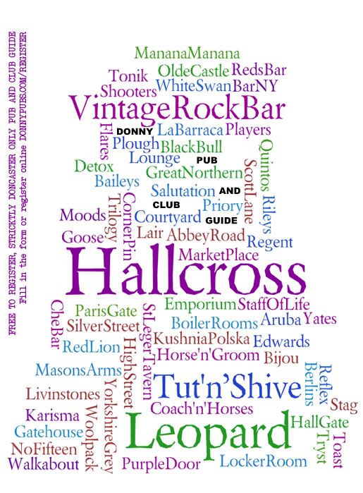
http://www.wordle.net/


That looks pretty sweet. I'll try using that sometime.


Photoshop Contest Forum Index - General Discussion - Typography - Reply to topic

You cannot post new topics in this forum
You cannot reply to topics in this forum
You cannot edit your posts in this forum
You cannot delete your posts in this forum
You cannot vote in polls in this forum


Navigate PSC
Contests open  completed  winners  prizes  events  rules  rss 
Galleries votes  authentic  skillful  funny  creative  theme  winners 
Interact register  log in/out  forum  chat  user lookup  contact 
Stats monthly leaders  hall of fame  record holders 
PSC advantage  news (rss)  faq  about  links  contact  home 
Help faq  search  new users  tutorials  contact  password 

Adobe, the Adobe logo, Adobe Photoshop, Creative Suite and Illustrator are registered trademarks of Adobe Systems Incorporated.
Text and images copyright © 2000-2006 Photoshop Contest. All rights reserved.
A venture of ExpertRating.com