Photoshop Contest Forum Index - Contests and Entries - A diffrent layout for PSC - Reply to topic
Goto page Previous 1, 2, 3, 4, 5, 6, 7 Next
|
|
 Thu Apr 09, 2009 1:45 pm Reply with quote Thu Apr 09, 2009 1:45 pm Reply with quote
I think Anfa should redesign the PSC website. Every chop he does....turns to gold.
|
dewdew

Location: Upstate South Kack-a-lack
|
Thu Apr 09, 2009 1:56 pm Reply with quote
dbbowling wrote: I think Anfa should redesign the PSC website. Every chop he does....turns to gold.
 .....i have that exact same problem.  ....or the same exact problem....depending on how you look at it. 
|
Canuck <º)))><

Location: Dorchester, Ontario Canada
|
Thu Apr 09, 2009 3:24 pm Reply with quote
Much nicer. As has been pointed out, and I trust you would catch, there is:
Latest Prize Winner and Advantage Calendar to be corrected.
_________________
"The atheist cant find God for the same reason that a thief cant find a policeman."
|
sirenka

Location: around
|
Thu Apr 09, 2009 3:51 pm Reply with quote
I think maybe you can add fancy or facebox on site so all image previews will be in fancy box. It's more user friendly and better looking.
|
Dechene

Location: Australia
|
Thu Apr 09, 2009 5:51 pm Reply with quote
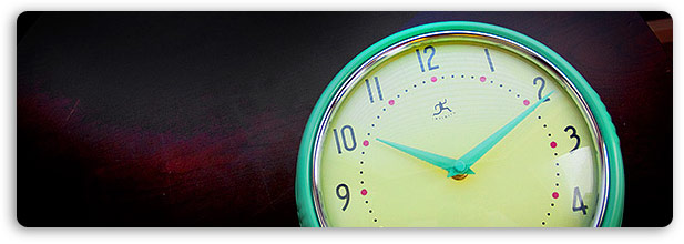
splodge wrote: a huge date/clock and count down timer in the H2H pannel would make sure everyone knows what is happening, i could easely build that in Flash,
Make it so,
In Aus the contests are realeased around 10 at night, but that changes from 9pm through to 11am with daylight savings etc, plus sometimes you're just too damn dumb to have to do the math! Took me a week to figure out when the h2h source would be released, don't make my head hurt next time!
|
Oscar

Location: Northern California
|
Thu Apr 09, 2009 6:22 pm Reply with quote
I'm going to put this in the easy way, SIMPLIFY !
We want this site to look professional and clean... no offense pak but your design looks like a cheap template. I love the site as it is, but it needs some TLC... new features along with better design. Sites that are messy with a lot of boxes and things tend to be hard to navigate, and please people if you are going to design something don't for any reason emboss anything or use the 1999 glassy look.
oh yes and NO FLASH CLOCKS.
|
gravyboat

Location: Northern NY
|
Thu Apr 09, 2009 6:50 pm Reply with quote
The clock is a great idea. 
_________________ Not All Who Sing "The Wanderer" Are Dion
The Closer you get to Canada the more things there are that wanna eat your horse.
|
ReinMan

Location: Kingston, ONTARIO, CAN
|
Thu Apr 09, 2009 7:17 pm Reply with quote
gravyboat wrote: The clock is a great idea.
A SEXY clock! Oh YES! PLEASE!!!! 
_________________
_________________________________
THIS SITE REALLY DOESN'T EXIST
the way our EGO THINKS IT MIGHT!
_________________________________
|
JORDAN792

Location: Michi-gan
|
Thu Apr 09, 2009 7:36 pm Reply with quote
Clock is a good idea and I like Pakimo's idea but, like Oscar said, the 1999 glossy look could go. We should make a daily contest a PSC layout contest, and whoever wins we use it!
|
ReinMan
Location: Kingston, ONTARIO, CAN
|
Thu Apr 09, 2009 7:43 pm Reply with quote
As long as we get to keep this WONDERFUL BANNER AD at the top of the page, I don't care WHAT you do with the site design.
MAN, I just LOVE that advert! 
_________________
_________________________________
THIS SITE REALLY DOESN'T EXIST
the way our EGO THINKS IT MIGHT!
_________________________________
|
|
|
Thu Apr 09, 2009 8:18 pm Reply with quote
So, upon looking at it...I think my MAIN issue with the look of the site is that horrid blue color...and the fact that for some reason the boxes on the left containing the active contests and such just don't seem to line up quite right. So I fixed that (except for the blue links in the calendar...oops)
|
|
|
Thu Apr 09, 2009 8:36 pm Reply with quote
Now...if I were to change the header...
I think the grey breaks it up just enough without being to overbearing on the white...and I also changed the links in the calendar to a dark red.
|
Goto page Previous 1, 2, 3, 4, 5, 6, 7 Next
Photoshop Contest Forum Index - Contests and Entries - A diffrent layout for PSC - Reply to topic
You cannot post new topics in this forum
You cannot reply to topics in this forum
You cannot edit your posts in this forum
You cannot delete your posts in this forum
You cannot vote in polls in this forum
|