Photoshop Contest Forum Index - Contests and Entries - Lets show off what we do! - Reply to topic
Goto page Previous 1, 2, 3, 4, 5 Next
|
|
 Mon Apr 13, 2009 6:40 am Reply with quote Mon Apr 13, 2009 6:40 am Reply with quote
what abe is saying is correct for some, maybe its an idea just let all the entries roll for a few seconds, so one big and 3 small , as in a loop, so evrybodys entrie will be on the frontpage sometimes , just an idea 
|
sonic3

Location: Devon, UK
|
Mon Apr 13, 2009 6:42 am Reply with quote
The darker colour scheme looks great, it draws your eye to the entries and looks very pleasing.
It also gives it a much more upto date look.
|
|
|
Mon Apr 13, 2009 6:45 am Reply with quote
sonic3 wrote: The darker colour scheme looks great, it draws your eye to the entries and looks very pleasing.
It also gives it a much more upto date look. i agree it gives more quality to the site, but i think for the competion pages it can stay white for better judgment of the entries
|
bigbuck

Location: Australia
|
Mon Apr 13, 2009 6:49 am Reply with quote
Remember this post wasn't about colour schemes etc.
It's simply about how we can show more of our work. More interesting stuff for visitors to click on.
|
|
|
Mon Apr 13, 2009 6:50 am Reply with quote
bigbuck wrote: Remember this post wasn't about colour schemes etc.
It's simply about how we can show more of our work. More interesting stuff for visitors to click on. AGREE the design looks very good BB
|
sonic3
Location: Devon, UK
|
Mon Apr 13, 2009 6:58 am Reply with quote
candron wrote: sonic3 wrote: The darker colour scheme looks great, it draws your eye to the entries and looks very pleasing.
It also gives it a much more upto date look. i agree it gives more quality to the site, but i think for the competion pages it can stay white for better judgment of the entries
Yeh your right, a neutral colour on the competition page is a must. White or a light grey is normally used in the lab where i work, as it allows you to see the colour of images better.
|
Tesore

Location: On the way to Utopia!
|
Mon Apr 13, 2009 7:01 am Reply with quote
I'm sure everybody have something to say, so do I... *in my best English*
 Just a little thing: Please place the source of the day on the front page...
It summons people to creativity and brings them on ideas, choppers anyway!
Looks great BigBuck!
|
Tesore
Location: On the way to Utopia!
|
Mon Apr 13, 2009 7:05 am Reply with quote
Bdw... I love the colours of Pakimo's example!
|
malnsk

Location: 46°03' N 14°30' E
|
Mon Apr 13, 2009 7:32 am Reply with quote
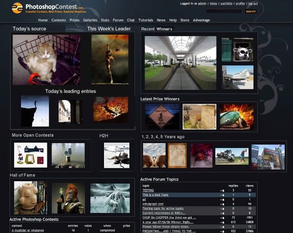
wow i love all the ideas! It looks awesome with so many images. The hall of fame is a nice touch. I would add a little spot where information about psc would be. Like how many registered members we have(only problem are the spammers but they disspear soon,thanks to splodge and others) and number of entries in this week and other maybe useful or at least interesting information. Great discussion guys.
|
|
|
Mon Apr 13, 2009 7:36 am Reply with quote
indeed malnsk it is, maybe if its possible a little intro video spot somewhere,
|
malnsk
Location: 46°03' N 14°30' E
|
Mon Apr 13, 2009 8:15 am Reply with quote
candron wrote: indeed malnsk it is, maybe if its possible a little intro video spot somewhere, yeah it would be great
|
|
|
Mon Apr 13, 2009 8:24 am Reply with quote
No no no no no.

I swear, some of you are getting a bit carried away don'tcha think?
Some of you have some wonderfully brilliant ideas for adding to a possible future redesign of the site. The best idea so far was from bigbuck.
But it appears some of you think that this is a group decision...that whenever the new layout is implemented that we will have a big say-so as to how it looks. Sure, it'll be nice to have ideas and suggestions taken into serious consideration but if it doesn't happen...don't be surprised (that being said...if no one uses your idea, Brad...they're mad.)
And for what it's worth...I'll say it again...those trendy vector swirly thingies are just that...a TREND. They suck. Just makes us look like every other entry over at deviantArt.
|
ReyRey

Location: In a world of $#!t
|
Mon Apr 13, 2009 8:37 am Reply with quote
Your hired!
_________________
I try to think, but nothing happens.
Splodge..you rock!! Wherever you are.
I keep checking the obituaries to see if my name is there. If it's not, then I figure I'm ok.
|
delia

Location: Near Albany, NY
|
Mon Apr 13, 2009 8:46 am Reply with quote
Yes. All of it. Fresh, and relevant, great ideas!
|
Goto page Previous 1, 2, 3, 4, 5 Next
Photoshop Contest Forum Index - Contests and Entries - Lets show off what we do! - Reply to topic
You cannot post new topics in this forum
You cannot reply to topics in this forum
You cannot edit your posts in this forum
You cannot delete your posts in this forum
You cannot vote in polls in this forum
|