Photoshop Contest PhotoshopContest.com
Creative Contests. Real Prizes. Essential Resource.
You are not logged in. Log in or Register


Photoshop Contest Forum Index - General Discussion - Illustration Scholarship Help - Reply to topic

Goto page 1, 2  Next

kittie

Location: Florida

Post Fri Apr 16, 2010 1:33 pm   Reply with quote         


As some of you know, I'm getting ready to (finally) go back to school later this year!
After being screwed by the government, it looks like I'm going to need just a little bit more aid than I'm given. Rolling Eyes

I'm entering an illustration contest for a chance at some $$$.
I have to come up with 3 illustrations having to do with fantasy or science fiction. There are a few different mediums that are allowed, but I decided to sketch mine and paint them in PS.

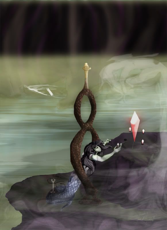
My first one is about done, and I was wondering if I could get some insight/critique on what might make it better. I'm not looking for ideas on elements or what to make the illustrations about... I'm thinking more along the lines of lighting/reflection/shadows/etc.

Here is my first, it took a little over a week on the coloring. Sorry if the picture stretches the thread a little bit.


Thanks guys!
(give me a break if some of the edges aren't straight, I'm working with a mouse here...)

Edit:
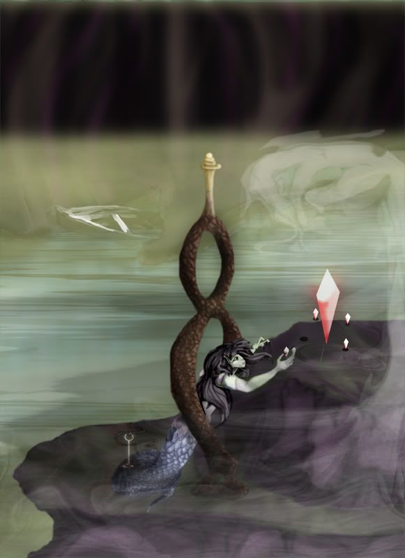
BS suggested that I soften some of the edges with the blur tool or a "fuzzy eraser" to bring the image more together.
Here's an updated version.


Took Rey's advice and cropped out the ceiling instead of adding more at the top, had to keep a near 8.5x11 ratio.. (glad for hi-res, for the first time...)
Tried to define the fog to see the boat more clearly.. went darker in the back for distance.
More shadows around the girl to show where she sits.. hopefully she's no longer floating, but if it looks like it to you I'd like to know.. (about any of it, really..)
Added a few more lights and darks in certain areas and added a fun little lens flare to the crystal.. (thanks Blurker...)

Overall I think it's a lot clearer. Happy to have such talented friends Smile
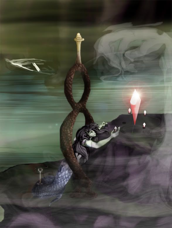
If anyone else sees something I've missed, please let me know.


Dechene pointed out the poor quality of my rope, and that the boat could use a little work/may not be necessary. I turned the rope into more of a shining thread.
I attached the other end of the broken rope to the boat, giving it more of a purpose than just to create balance. I messed with the bottom of the boat as well, hoping to get rid of the "I just messed with the opacity" look. Laughing
He also pointed out that the placeholders for the crystals could just be shadows... so I added silver rings around each, making them more solid.
Thanks Dechene!


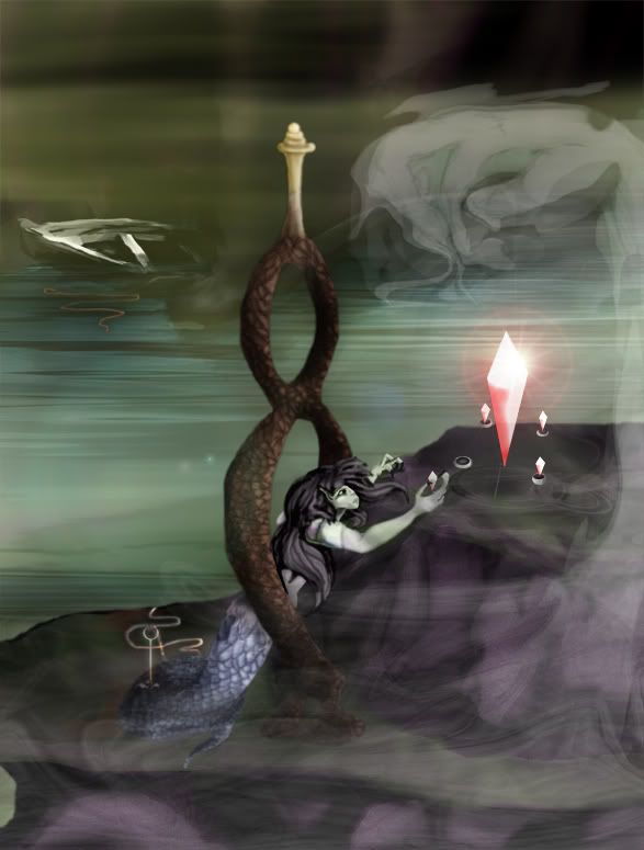
I did one last edit to try and make the colors unite a little better, also to draw out just a little more contrast. Unless anyone else sees anything I should be worried about, I think I'm going to finally go on to my next piece.
I really appreciate everyone who's given this some thought, and I'm sure I'll be back with my next one!


ReyRey

Location: In a world of $#!t

Post Fri Apr 16, 2010 4:24 pm   Reply with quote         


Hi Kit,
It seems like an awful lot of empty space in the left corner where my eye is wandering around. Everything of importance is jammed down the bottom. Now that works sometimes if it's designed right but it doesn't seem to be working here. You can almost crop it off right where the dark area stops and it would be a better design.
Also it's a little hard to tell, whats above water, whats smoke, whats under water. It's a bit confusing and needs to be defined.
Also, Is she laying on the rock?? Is she being held up by that brown tree thing? I cant tell. The image need to be more defined to understand what's going on. It doesn't have to be real, but it does have to be able to be understood.
(It is a nice image)
Hope this helps.


_________________
I try to think, but nothing happens.
Splodge..you rock!! Wherever you are.
I keep checking the obituaries to see if my name is there. If it's not, then I figure I'm ok.
ReyRey

Location: In a world of $#!t

Post Fri Apr 16, 2010 4:27 pm   Reply with quote         


Is that boat supposed to be real or a ghost version of it. It gets lost.


_________________
I try to think, but nothing happens.
Splodge..you rock!! Wherever you are.
I keep checking the obituaries to see if my name is there. If it's not, then I figure I'm ok.
ReyRey

Location: In a world of $#!t

Post Fri Apr 16, 2010 4:27 pm   Reply with quote         


P.S.
You too young to be doing acid. Wink


_________________
I try to think, but nothing happens.
Splodge..you rock!! Wherever you are.
I keep checking the obituaries to see if my name is there. If it's not, then I figure I'm ok.
kittie

Location: Florida

Post Fri Apr 16, 2010 4:38 pm   Reply with quote         


Thanks for the honest criticism Rey.

She's supposed to be holding herself up on the rock. I'm not quite sure how to convey that.. probably with proper shadows... Not a strong point of mine.

The boat is supposed to be real, but half sunk and beneath the fog... which is supposed to be thick above the water, but I don't want it to confuse the image if that's what it's doing.

As for the top... I can see how it's out of balance. I put the boat in on the left to balance it, but I didn't think of balance from top to bottom. I don't know if I want to crop it just yet, but maybe if I can't think of anything of merit for the image to put up there.


ReinMan

Location: Kingston, ONTARIO, CAN

Post Sat Apr 17, 2010 12:15 am   Reply with quote         


Pretty cool image Kitty. Agree with Rey˛ on things he noticed.

That black space at the top for me cries out for some cropping or else something TEXTUAL to me. (don't know if fonts can be included in your image for this project?).

Just a quick example :


I would NOT add anything else in to fill spaces, as I feel you've got PLENTY going on here - I think you risk OVER COMPLICATING it if you add MORE to fill in space. Part of my idea of TEXT is that, with the right text, it will clarify the whole image to people and anchor the image with them. (some argue that art needs to be interpreted, and I think that is so in many cases. but if this is graphic design, then text is a HUGE part of graphic design.)

Best of luck with this.


_________________

_________________________________
THIS SITE REALLY DOESN'T EXIST
the way our EGO THINKS IT MIGHT!
_________________________________
kittie

Location: Florida

Post Sat Apr 17, 2010 9:01 am   Reply with quote         


Ha!! That's pretty cool Reinman!

I'm not quite sure I can include text, but it doesn't really specify. I agree that there's a lot going on... if I were to put anything up at the top I was thinking maybe some crystal stalactites.... nothing too important but still something to even out the image.

As I told blurk though I may do two images, one cropped as suggested and one with the stalactites, just in case it does indeed turn out to be too busy.


kittie

Location: Florida

Post Sat Apr 17, 2010 9:02 am   Reply with quote         


I like the text though... looks like the cover of a book.


kittie

Location: Florida

Post Sat Apr 17, 2010 11:13 am   Reply with quote         


Edit bump.


Dechene

Location: Australia

Post Sat Apr 17, 2010 12:32 pm   Reply with quote         


I can't sleep, so I'll critique, Smile

I like the latest version, especially the flare. The smoke is much easier to see and it looks like a screenshot from a nice, 80's style animated movie.

Now that it's been cropped, I think you can get rid of the boat. It doesn't look like it's half sunk to me, it looks more like it's just had the opacity lowered on the right hand side of it.

I don't get the little shadows under the small crystals. The top left crystal is floating above the rock but the shadow is still there, and the shadow is still in position on the crystal that she has taken.
If they're not shadows but more along the lines of a marker or 'place-holder' for the crystals, maybe turn them into leaves, or stones, something other than a black pool. If you do want them to stay as shadows, put a light gaussian blur over them so they merge into the image a bit instead of being so cut & dry.

While i'm on the crystals, I think the large one is too transparent. You can see the rock outline & water ripples through it .

The only thing that really NEEDS to be changed though is the rope near her tail. Is it the 'stroke' effect? Change it! The rest of the image is so dreamy and awesome and then there is this squiggly line that looks like it was added in MS Paint!
Lower the opacity of the stroke, and change the colour to a lighter brown. Or if you have time, just play around with dodge/burn on the rope and I'm sure you'll come up with something that's as good as the rest of the image.

I didn't mean to write so much, but like I said, I can't sleep!
I do like the image so I hope I haven't offended you anywhere, this is just my opinion so feel free to ignore it!

Good luck in the competition! Smile


kittie

Location: Florida

Post Sat Apr 17, 2010 1:04 pm   Reply with quote         


No offense taken at all Dechene! That's what I wanted.

I feel I need to keep the boat.... even if not for balance purpose... kind of a story in my head I'm wanting to convey..
You caught me on the opacity change though Razz I'll see what I can do to make that more realistic.

I'm glad that you caught they were placeholders beneath the crystals, I think I'll put a ring around each of them to show that they weren't meant to be ill-placed drop shadows... Laughing


Thanks!


kittie

Location: Florida

Post Sat Apr 17, 2010 2:54 pm   Reply with quote         


edited bump


Dechene

Location: Australia

Post Sun Apr 18, 2010 7:19 am   Reply with quote         


kittie wrote:
She also pointed out that the placeholders for the crystals could just be shadows...


Nope, HE said that! Evil or Very Mad

Dechene is a dude!

Just for that, your image sucks! Laughing


Tesore

Location: On the way to Utopia!

Post Sun Apr 18, 2010 8:05 am   Reply with quote         


I love to see this growing Very Happy


marcoballistic

Location: I am everywhere, and Nowhere, but mostly, I am right here!

Post Sun Apr 18, 2010 11:01 am   Reply with quote         


me too Smile

Laughing at Dech


Goto page 1, 2  Next

Photoshop Contest Forum Index - General Discussion - Illustration Scholarship Help - Reply to topic

You cannot post new topics in this forum
You cannot reply to topics in this forum
You cannot edit your posts in this forum
You cannot delete your posts in this forum
You cannot vote in polls in this forum


Navigate PSC
Contests open  completed  winners  prizes  events  rules  rss 
Galleries votes  authentic  skillful  funny  creative  theme  winners 
Interact register  log in/out  forum  chat  user lookup  contact 
Stats monthly leaders  hall of fame  record holders 
PSC advantage  news (rss)  faq  about  links  contact  home 
Help faq  search  new users  tutorials  contact  password 

Adobe, the Adobe logo, Adobe Photoshop, Creative Suite and Illustrator are registered trademarks of Adobe Systems Incorporated.
Text and images copyright © 2000-2006 Photoshop Contest. All rights reserved.
A venture of ExpertRating.com