Photoshop Contest Forum Index - Ask the Experts - Logo... - Reply to topic
Goto page 1, 2, 3 Next
Marx-Man

Location: The United Kingdom!
|
 Fri Mar 18, 2011 7:22 am Reply with quote Fri Mar 18, 2011 7:22 am Reply with quote
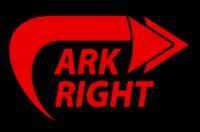
So after a solid day working on my brand image, looking for the simplest connotation for moving forward and animation, etc...
I finally got a logo that would suit me...
After a lot of time, here is what I came up with.
Thoughts?
|
DaVinci

Location: The Netherlands
|
Fri Mar 18, 2011 8:10 am Reply with quote
It looks more like a crop from a website to me, but it's a start...
How about one of these? I spend a whole 5 minutes on these @ work
|
Marx-Man
Location: The United Kingdom!
|
Fri Mar 18, 2011 8:28 am Reply with quote
Facepalm.
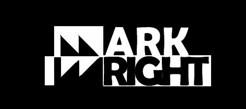
After five minutes of careful thought... You didn't realise that it is just my name in red on a black background.
The logo works as an M and a W hence the spacing.
It also is designed to look like a fast forward, (nice to see the symbolism is clear).
|
|
|
Fri Mar 18, 2011 8:42 am Reply with quote
LOL, I see's the M!
Just not feeling it for some reason, might be the colors, can't put my finger on it. Nice concept.
Seeing you stormed a concept for mine, I shall return the creativity. Based off you article you posted in my topic. Simple and clear.
|
seamusoisin

Location: Ottawa Strong!
|
Fri Mar 18, 2011 8:47 am Reply with quote
Not to be overly critical but I find the colors very hard on the eyes. The double arrows with this M and W is too vague and your logo doesn't seem to say what you do. What is the correct name of the company. Logos of small companies should state what you are doing. The word animation doesn't appear in your logo. Establish companies GE, IBM, Ford don't have to as they are a brand.
You might want to use a broader name like Graphics instead of Animation not to limit yourself.
Google logos and see what your competition is doing and set that as the bar. Then raise the bar.
|
Marx-Man
Location: The United Kingdom!
|
Fri Mar 18, 2011 8:51 am Reply with quote
In this topic, bad trolling...
I guess the iconography was too strong, it needs a bigger definition between the two halves...
The logo is just for my name, it's going on a business card so it has to be visible from a distance.
|
Marx-Man
Location: The United Kingdom!
|
Fri Mar 18, 2011 8:55 am Reply with quote

The point of this design is so that I can fax it.
Which is why it hasn't got any effects on it, it is simple two tone.
The colours are irrelevant for now.
|
sonic3

Location: Devon, UK
|
Fri Mar 18, 2011 9:12 am Reply with quote
If you must keep it on the same theme, i would rearrange it like this.
|
DaVinci
Location: The Netherlands
|
Fri Mar 18, 2011 9:15 am Reply with quote
Marx-Man wrote: Facepalm.
After five minutes of careful thought... You didn't realise that it is just my name in red on a black background.
The logo works as an M and a W hence the spacing.
It also is designed to look like a fast forward, (nice to see the symbolism is clear).
Haha, ah ok..I see it now, first I only saw the fast forward symbol and "Ark Right" but ok now I see Mark Wright 
That's nice how your initials togheter turns out to be the FF symbol, but maybe not that clear (well for me that is)  nice concept though
|
DaVinci
Location: The Netherlands
|
Fri Mar 18, 2011 9:17 am Reply with quote
sonic3 wrote: If you must keep it on the same theme, i would rearrange it like this.
I like this one, but not I see iRight
|
sonic3
Location: Devon, UK
|
Fri Mar 18, 2011 9:34 am Reply with quote
DaVinci wrote: sonic3 wrote: If you must keep it on the same theme, i would rearrange it like this.
I like this one, but not I see iRight
Ha Yeh your right
How about this:
|
TofuTheGreat

Location: Back where I belong.
|
Fri Mar 18, 2011 9:36 am Reply with quote
The M/W thing is too subtle. It's cool once pointed out but yeah I immediately read Ark Right as well. Still see that in the later versions.
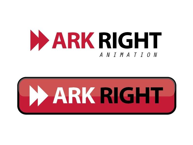
Ever thought of playing up the word play from "Mark Wright" to "Mark Right"? As in "mark right" implying marked correctly. So instead of playing up the fast-forward you play up the "you made the right choice" angle.
Quickie concept:
_________________ Why I do believe it's pants-less o'clock! - Lar deSouza
The mind is like a parachute, it doesnt work if it isnt open. - Frank Zappa
Created using photoshop and absolutely no talent. - reyrey
|
pakimo

Location: Norway
|
Fri Mar 18, 2011 9:41 am Reply with quote
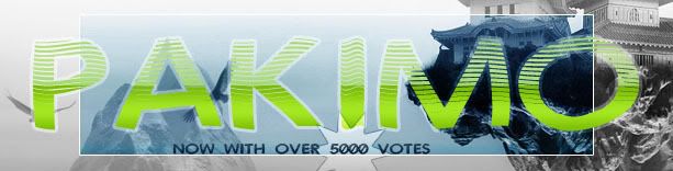
Personally I would have worked a bit more with the fonts and the graphic to make them more uniform. You have a problem and that is that the 'farward'-graphic is so recognisable by everyone that it hard to see beyond it. Here is an idea that breaks it up a bit more. But I would work more on graphic and font to make it more cohesive.
|
supak0ma

Location: Photoshop Nation
|
Fri Mar 18, 2011 10:01 am Reply with quote
TofuTheGreat wrote: The M/W thing is too subtle. It's cool once pointed out but yeah I immediately read Ark Right as well. Still see that in the later versions.
Ever thought of playing up the word play from "Mark Wright" to "Mark Right"? As in "mark right" implying marked correctly. So instead of playing up the fast-forward you play up the "you made the right choice" angle.
Quickie concept:
this is an interesting take, i'd evolve this idea
|
Goto page 1, 2, 3 Next
Photoshop Contest Forum Index - Ask the Experts - Logo... - Reply to topic
You cannot post new topics in this forum
You cannot reply to topics in this forum
You cannot edit your posts in this forum
You cannot delete your posts in this forum
You cannot vote in polls in this forum
|