Photoshop Contest Forum Index - General Discussion - Launch of Site that My Friends At PSC Helped Build! :D - Reply to topic
Goto page Previous 1, 2, 3, 4, 5, 6, 7 Next
AtHeaMo

Location: Duketown
|
 Thu May 26, 2005 6:10 pm Reply with quote Thu May 26, 2005 6:10 pm Reply with quote
I think you should put a naked chick in your logo.
yess.
|
Michel

Location: Montreal, Canada
|
Thu May 26, 2005 7:01 pm Reply with quote
We need to get invited at the inaugural, we will need LOTS and LOTS of CANADIAN beer.
How crappy is THAT for a logo?
|
|
|
Thu May 26, 2005 7:33 pm Reply with quote
ok ReinMan
i'll tell you my opinion about the 7 logos:
1- the firet logo is like pacman not like an eye & fonts are just weak
2-the light blue version is better but the eye can be better
3-is my favorite , except the fonts are not matching , but it's the best logo
4- the 4th logo is just a font , i don't like the simplicity of it
5-that's really the worst , the triangle is bad
6-the words placement is good , but not good enough overall
7- seems like a logo of a farm , just away from the concept
so i'll pick number 3
hope i've been helpfull
|
|
|
Thu May 26, 2005 7:34 pm Reply with quote
go with a 9B configuration, but make the eye part more like a realistic eye... or at least the characteristics of one. something that looks back at you.
|
Michel
Location: Montreal, Canada
|
Thu May 26, 2005 8:19 pm Reply with quote
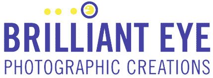
If your niche is nostalgic gamers, you should consider this one.
|
Cambria

Location: Sunny So California
|
Thu May 26, 2005 8:22 pm Reply with quote
One doesn't jump out at me. But if I had to choose, I'd go with #3 for font & style.. but in the darker blue. Very close to #8... but I agree with Fem's comments.
I do not like #12... looks either like an ANGRY eye.. or an owl.
Psychologically, an oval is more comforting & less threatening then an angular boxy look. Plus, it denotes the eye feeling.
This is something you need to live with for a while... I'd keep looking or just use name as "working logo" for now.
|
Michel
Location: Montreal, Canada
|
Thu May 26, 2005 10:33 pm Reply with quote
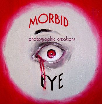
ReinMan, I made one for you, I just changed the name some...
If you ever use it, I can make a special price for you...
|
st1n3r

Location: Uranus
|
Thu May 26, 2005 10:54 pm Reply with quote
good luck 
_________________
SWINGING BLADES LIKE A HELICOPTER
|
Cambria
Location: Sunny So California
|
Fri May 27, 2005 1:31 am Reply with quote
OOooh! I like Rob's! Not only does it look like an eye.. but also a camera lens!
Nicely done!
|
AtHeaMo
Location: Duketown
|
Fri May 27, 2005 1:35 am Reply with quote
a vectorized shot of your naked chest would do fine as well, Reinie! 
|
vunt van pumununt

Location: the netherlands
|
Fri May 27, 2005 7:13 am Reply with quote
9b. reason: if you scroll through the lot quickly, this one sticks out (positively) and has a pleasant 'mental image afterglow'.
i also think this one is the most balanced. the logo is made up of 3 parts: the name "brilliant eye", the description "photo etc" and the image. 9b is the only one which integrates these 3 parts to a whole: it's clear that the image reflects the name, and the image contains the description in a subtle manner, which is in line with the hierarchy of importance of the 3 elements (description is least important for the eye-grabbing properties and memorability of a logo).
_________________
"This is a really cool quote"
|
chrispis

Location: The Netherlands
|
Fri May 27, 2005 7:51 am Reply with quote
Another quikie, just to give you another ideas.
|
Goto page Previous 1, 2, 3, 4, 5, 6, 7 Next
Photoshop Contest Forum Index - General Discussion - Launch of Site that My Friends At PSC Helped Build! :D - Reply to topic
You cannot post new topics in this forum
You cannot reply to topics in this forum
You cannot edit your posts in this forum
You cannot delete your posts in this forum
You cannot vote in polls in this forum
|