Hey there,
I've been spending some time bettering (or so I think) some old entries of mine. The ones that I was never totally satisfied with but didnt have the time to get them to where I
really wanted them for the contest. I mean , I think they were pretty well done, but I'm always seeing possibilities for improvement. Guess I'm a bit anal bout this stuff.


...anyway....I value all your opinions, so I'm gonna post some of em...
here's one...:
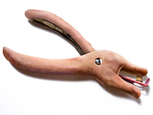
Skin Punch
The original entry:
eh
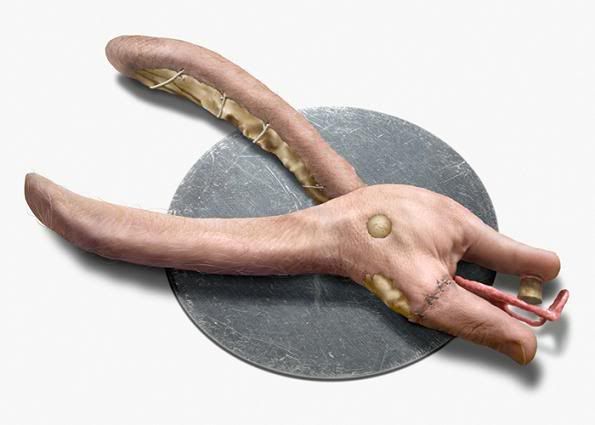
and the
revised one (with more of the look I wanted):
LARGE w. more detail, here:
http://www.deviantart.com/deviation/48482482/
OK...so what do you think....better, sucks or just don't care?
If you're interested and have some old chops of your's that you were never really
totally satisfied with.... you know the ones ...
Add to them,improve them and post em.
Do you think this is a good topic idea?