Photoshop Contest PhotoshopContest.com
Creative Contests. Real Prizes. Essential Resource.
You are not logged in. Log in or Register


Photoshop Contest Forum Index - Ask the Experts - This is long overdue... - Reply to topic

Goto page 1, 2  Next

bneises

Location: Silver Spring, MD

Post Sun May 27, 2007 4:17 pm   Reply with quote         


I need help. If I work on a chop for too long, I start to not see what is missing or wrong with the chop. The last two chops that I've done, the Mona Lisa and The Awakening: Mars Edition(the H2H chop), make me feel like they are not finished but don't know what needs to be done to make it better.

I would like to know what you all would have done to either pic. Please be critical. Its been eating at me... Thanks

-Brandan


Post Sun May 27, 2007 4:31 pm   Reply with quote         


the first one would be much better if you had textured the cat to appear to be part of the painted canvas. The second is actually very nice, but I think it needs some more shadow and light work to make it blend even better.


_________________
"Recently, NASA scientists discovered that most people love to play video games but hate to die in fiery airplane crashes."
Micose

Location: Quebec (CAN) & France

Post Sun May 27, 2007 4:39 pm   Reply with quote         


mason4300 wrote:
the first one would be much better if you had textured the cat to appear to be part of the painted canvas. The second is actually very nice, but I think it needs some more shadow and light work to make it blend even better.

voila.Smile
armogeden

Location: The other side of your screen

Post Sun May 27, 2007 4:39 pm   Reply with quote         


the only reason i didnt vote for the second one in the head to head, was that it just lacked atmosphere. Vary the lighting maybe, add to the composition maybe, it just needed a lil something to make it a more intesting picture.

With the first one, I agree with mason, I thought it was great, but it could have looked a bit more authentic Smile

I had the exact same problem that your having, all you do is ask someone around you what they think of the picture, and they'll probably say it's great but the poportions look slightly odd or something Very Happy


_________________
Please check out my student blog Smile
http://gdc1tombrushwood.blogspot.com/
Lets stick together, we won't lose our way
Meaty

Location: cheshire/uk

Post Sun May 27, 2007 5:05 pm   Reply with quote         


I woulda perhaps weathered the glass on the second one a bit, give it the appearance of being in a sand storm and being buried, although that would never happen it would give the eye something to look at instead of just a reflection.


_________________

bneises

Location: Silver Spring, MD

Post Sun May 27, 2007 5:15 pm   Reply with quote         


Thats exactly what I needed... I'm going to keep working on these to see if I can get it right... Thanks for the comments...


ScionShade

Location: VeniceFlaUS

Post Sun May 27, 2007 5:23 pm   Reply with quote         


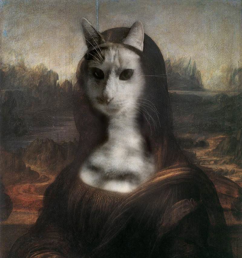
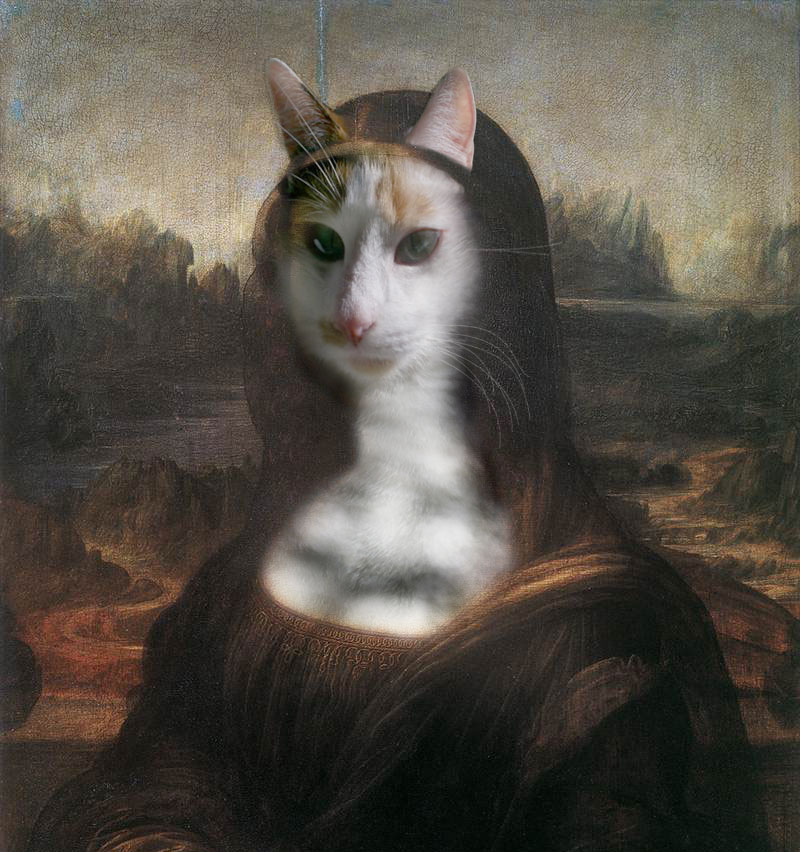
I hope this is helpful.
A sixty second job of what i would like to do to the first chop.

1.made a quick copy and paste selection of top left corner of image.
2.duplicated that new layer three times.
3.lined up the three layers till the covered the whole cat area.
4.merged three layer together then made a spare copy of that layer.
5.turned one copy off...the layer now above, a very quick 100 pixel soft edged eraser to wipe away most of the layer not over cat.
6.clicked on the layer in layers palette to get to layer style.
at bottom of layer styles there are two sliders...the top slider says 'this layer." Hold down alt key to split little slider at right into two sliders, take left one and slide almost to other end.hit OK.
7.desaturate that layer now.at top of layer palette set layer to linear burn and decrease opacity to around 60%.
8 now switch to other saved copy of that layer,quick erase around cat--set layer to 'color' and again about 60%.
9. on original image layer---use sponge tool quickly over cat with a soft brush, 100pixels is fine, and desaturate it till it looks natural to you.
done.


bneises

Location: Silver Spring, MD

Post Sun May 27, 2007 5:29 pm   Reply with quote         


Wow scion... That is amazing... I definately need to explore more and get out of my photoshop box... Very helpful, thank you.


Post Sun May 27, 2007 5:52 pm   Reply with quote         


Regarding the second one. If you notice the shadows on the rocks, it is a hard shadow and the astronaut has no shadow underneath the light fixtures or anywhere else that is being blocked from the overhead sunlight. I think this would make a big difference in the blending of the astronaut with the environment.


splodge

Location: Yorkshire,

Post Sun May 27, 2007 6:44 pm   Reply with quote         


drink vodka, lots of it, or do some tut's, don't get me wrong, both chops were great, i just love promting my tut's, not mine, i stole them

http://www.bluetorials.com/free%20stuff/ps_tuts.html


_________________


Hallcross Toots
the burning couch

Location: I don't know, but it sure is dark in here

Post Sun May 27, 2007 6:46 pm   Reply with quote         


It also would help (The Awakening: Mars Edition) to add some kind of narrative( kindof what armo. said) that would give it more appeal...for example maby a reflection of a "curious inhabitant" in the helmet glass or "menacing inhabitant" ...... .
Boosting the saturation and contrast would do some good also.


Post Sun May 27, 2007 7:29 pm   Reply with quote         


excellent work Scion. Exactly what I was talking about earlier. salut Good comments in this thread here, bneises. You're lucky to get a thread this constructive. Smile


_________________
"Recently, NASA scientists discovered that most people love to play video games but hate to die in fiery airplane crashes."
TofuTheGreat

Location: Back where I belong.

Post Sun May 27, 2007 10:51 pm   Reply with quote         


I love threads like this! These threads benefit everyone as long as they stay constructive. Very Happy

First thing I noticed in your H2H chop is the sharp delineation of the soil and the hand. It gives it a cut/paste look.

It also looks like your erased areas to give a look like sand/soil build-up on the suit. Good idea but doesn't look "right". Check out the light module by the hand and you'll see what I mean. Also the entire left side of to suit looks like it's been made transparent because of the technique. Again this makes it look like a quickie chop.

Biggest thing is the theme. It just does not seemed finished as there's nothing to go with the story in the helmet's mask reflection. If you look at all the winning H2H entries that weren't transformations you'll see they told a story with the reflected image.

I think that's where I went wrong with my H2H entry. I wanted to have the facial expression visible and still show the ship leaving without him. This proved too much. Almost everyone who commented to me wondered what was in the mask. My wife thought it was lemons. Laughing


_________________
Why I do believe it's pants-less o'clock! - Lar deSouza
”The mind is like a parachute, it doesn’t work if it isn’t open.” - Frank Zappa
Created using photoshop and absolutely no talent. - reyrey

318830

Location: Calgary, AB, Canada

Post Mon May 28, 2007 12:28 am   Reply with quote         


I agree with everyone so far, for the mona lisa except for one thing... I would adjust you colour saturation, and colour correct the cat image to suit the mona lisa one, and if needed still, adjust the layer opacity. Maybe duplicate the cat layer and play with an artistic filter and then fool around with opacity!

Good Luck with these!


marcoballistic

Location: I am everywhere, and Nowhere, but mostly, I am right here!

Post Mon May 28, 2007 4:54 am   Reply with quote         


just a quick edit:


Goto page 1, 2  Next

Photoshop Contest Forum Index - Ask the Experts - This is long overdue... - Reply to topic

You cannot post new topics in this forum
You cannot reply to topics in this forum
You cannot edit your posts in this forum
You cannot delete your posts in this forum
You cannot vote in polls in this forum


Navigate PSC
Contests open  completed  winners  prizes  events  rules  rss 
Galleries votes  authentic  skillful  funny  creative  theme  winners 
Interact register  log in/out  forum  chat  user lookup  contact 
Stats monthly leaders  hall of fame  record holders 
PSC advantage  news (rss)  faq  about  links  contact  home 
Help faq  search  new users  tutorials  contact  password 

Adobe, the Adobe logo, Adobe Photoshop, Creative Suite and Illustrator are registered trademarks of Adobe Systems Incorporated.
Text and images copyright © 2000-2006 Photoshop Contest. All rights reserved.
A venture of ExpertRating.com