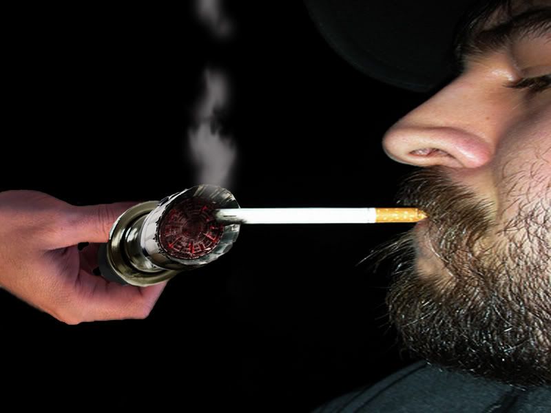
the car lighter is the better of the two.......it's not a horrible execution, and you are able to tell what it is, but.....it is lacking in the idea category...seems like it needs to be in a scene, such as actully lighting a smoke or something. think: when would you ever see a cigerette lighter on a white background....give it a theme/scene/background....also the black end doesn't look rounded(looks kinda flat on the right)
on the motorcycle, I'm not really sure why you decided on making birds into a motorcycle, I don't really get the idea you are going for..... it's got lots of rough jagged edges which make it unappealing to the eye....observe the top voted posts and see what ideas and styles are winning, even try to recreate highly voted posts for practice, and don't be afraid to ask people how they do certain things.....I think alot of people here find it flattering that people want to learn how to create elements from their chops and are happy to share knowledge.
oh yeah.....preview chops for a few minutes before posting, maybe even step away for a few minutes then come back and look at them again. Try keeping images clearer and not blurred...resolution is important, make sure you preview the images at their full size
Keep on choppin, practice doesn't always make perfect, but it does help.

You are off to a good start.
