-------------------------------------------------------------------------------------------
TUTORIAL: Done using Photoshop 7 and mouse
-------------------------------------------------------------------------------------------
Start first with the biggest/highest res photo you can get your hands on. If you can't get a high res, you can enlarge a poor quality image to an extent. Some graininess and noise can help your brush strokes stand out. Too much, makes your painting look terrible. Practice will help you find the balance of when an image is just not suited to be painted.
-------------------------------------------------------------------------------------------
I'm using an image of my daughter that I painted this past summer for my website. The finished painting looks like this:
Sadly, I didn't save it as I was going along step by step, so I am recreating the painting. For this tute, I am only painting a portion of the face and hair, not the whole image. Forgive me for the short cut, a portrait can take anywhere from one to eight hours depending on difficulty....
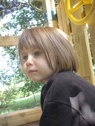
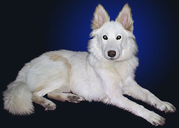
First, the starting image. Emily on the swing set:
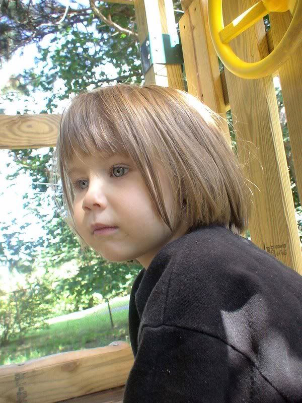
Here is where you'll want to do any adjustments to the hue/saturation, the contrast etc. I found that the shadow on her face was pretty harsh, so I softened that up a big, upped contrast a smidge, and warmed her tone just a smidge, too.
Updated starting image:
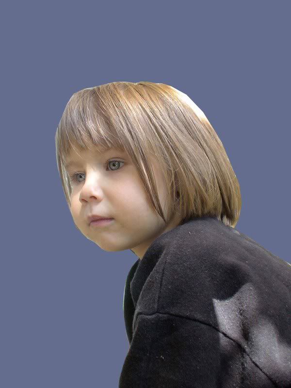
Next, using the pen tool, I marked off a path around the subject. I try to stick to the edges of the shirt and face, etc, but get a little loose through the hair area. I want to be sure to get all of it. Then, later on, I use the eraser tool, or lasso tool, or polygonal selector to get the background out of the image. After the main subject is selected, I make a selection with a 1 pixel or 2 pixel feather, and make a new layer via cut.
You will now have the background layer, and the new subject layer. Add a new layer between these two, and fill it with your desired background color.
Here's where we are at now:
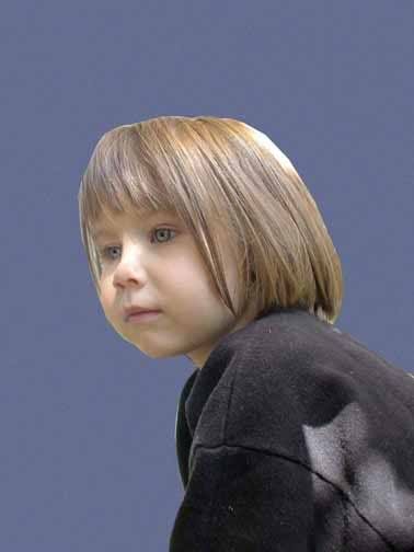
I like to give the background layer some texture to represent the paper being drawn on. For a chalk painting, I like to use the "sandstone" texture (Filter>Texturizer) at 1 or 2 relief, scaled appropriately depending on the size of the image. It can be fun to add noise to the background before adding the texture. This is a portion of the process that is a personal preference, and you can get different effects by experimenting here.
Now you have the subject on a textured background color:
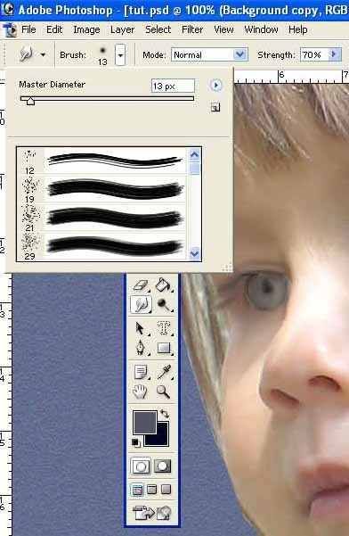
The actual painting process begins at this point. Choose your subject layer, then click on the smudge tool. Your brush can be one of the zilllions of choices available. This is another part of the process where personal preference comes in... Experiment! My favorite brushes for portraits are the "Natural Brushes".
I like the first brush for hair (sized up usually to match the scale of the image) and the third one down (21) for skin and clothing.
To begin the painting, process, choose your brush and your smudge strength. For skin on a high res photo, I am usually in the 65 - 70% strength range. For hair, I bump up the strength a lot, 80-85%.
I use a mouse, but I know many of you use a tablet, so use what ever suits you to add strokes to the subject. What you are trying do essentially, is blend the colors of the photograph as if they were paint. You are pushing color around. Be careful along shadow lines, and around the iris of the eye. It is easy to distort the perfect roundness of an eye with the smudge too.
Brush size? Depends on the size of your image. Larger brushes= more brush strokes. Small, tiny brushes=hard to see or notice brush strokes. Personal preference and practice again....
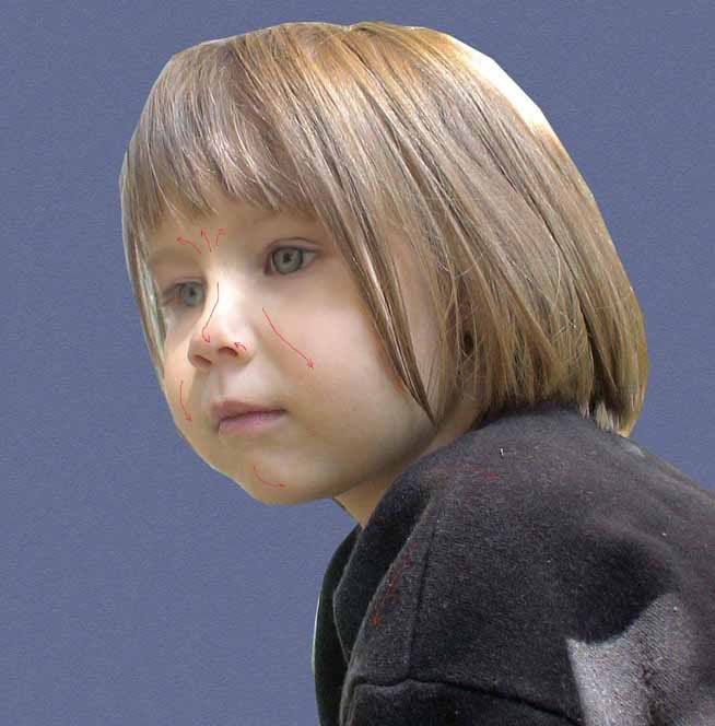
Follow the contours of the face, the clothing, the hair. Imagine you are sitting an an easle with a paintbrush and actually working. Horizontal strokes wouldn't be appropriate for a cheek... think like a painter.
This shows some of the stroke directions I used on this image:
You must stroke the
entire image. If you miss any spots, they will become painfully obvious when you sharpen at the end. Try to get everywhere, then double check your work at the sharpening stage when that time comes. Also, be sure to stroke along the edge of your cropped image. This will help the strokes blend into the background and keep you from getting that "cut and paste" look where the subject is floating off the background.
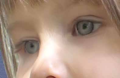
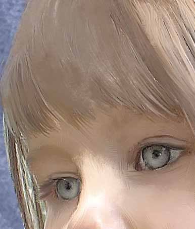
Tip for eyes... Before you paint the eyes, read this!
Eyes can get depth and life very easily by a couple quick clicks of the dodge tool.
Think of where they light would fall, and make a crescent in the iris, and a smaller crescent inside of that using the dodge tool at around 25% exposure (maybe less, maybe more... again, experiment)
Before dodging the eyes:
After dodging the eyes:
Also, when I do eyes, I tend to follow the contour of the eyelid, smudging out all the eyelashes. After the eye is done, I come back with a tiny brush (first one on the Natural brushes list) and smudge in new eyelashes of my own, stroking in the direction the lashes would have grown naturally. Not too many, not to few, and not all the same length and direction, so they look correct. (more practice and personal preference)
Tips for hair.... Hair can be troublesome. Make sure you do all the skin
before moving on to the hair. Hair would naturally fall over any brush strokes you did already on the skin. Trying to stroke skin around tiny hair strokes... not fun.
Use a much scruffier brush (as I said above, I like the first "natural brush" for hair and eyelashes (tiny size for eye lashes) and crank up the strength of your smudge tool (80-85% is what I usually use.) Long strokes for long hair. Short strokes for short hair, or moustaches and beards. Be careful to follow the direction the hair is already growing. Also, if your strokes look too thick, and straw-like at the tips fo the hair, simply lower your brush size and go over the area to make it more realistic.
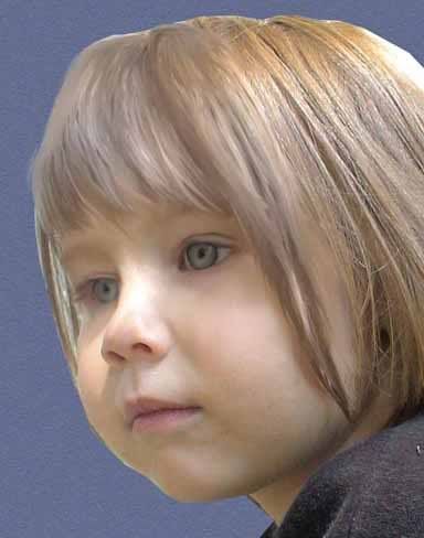
Here's a portion of the hair done:
Once your subject has been completely smudged, add a layer mask to it... Reset your brushes, and use the default chalk brush to fade the subject's shoulders/torso into the background.
Now it is time to sharpen the image and make your strokes really pop... I use an USM at 500% strength, 1.0 radius, and 0 threshold on most of the images. A lower res image may need a much lower strenght on the USM. Be sure your image is at 100% size on your screen. When you set your USM, look around the entire painting for pixels that you missed while smudging (they will stick out very prominantly, don't worry!) If you see any, note their location, cancel the USM and go smudge that spot. Repeat USM until all pixels are smudged.
Next, add a new layer between your subject and the background color layer. Here is where you can add your accent background strokes. I like to use colors from the painting and shades of the background itself, but again, the possiblities are endless, and personal preference rings in again. I like to reset my brushes, and choose the "chalk" brush (it is default set at 36 size, and is found just below the leaves and star brushes usually)... I like to use strong bold strokes, in varying shades of the same color to almost "halo" the subject. Look online at actual chalk/pastel paintings to get background stroking ideas.
After the background is added, add a new layer at the top of painting. I like to call this layer "embellishment" becaus this is where I chalk over my smudges painting strokes to make it look more authentic and embellish it further.
Using the chalk brush of varying sizes as appropriate, use the color selector to choose colors directly from your image (I like it set at 3x3 so I get an accurate "average" color) and stroke with chalk again to highlight, lowlight, and generally create an appearance of a chalked image. I like to do these strokes at 60% opacity, so that some of the brush strokes still show through for depth.
Here's some of my embellishing strokes:
Be sure to add strokes on top of your clothing and blend them down where we masked the subject to help it blend into the background of the image... It helps the mask not be so sharp and strong...
After the larger areas of the subject are chalked in, I like to go back over it with a tiny chalk, in a very light color (white, or very pastel version of whatever color is in the photo) and add crisp highlights on clothing and lip lines.
I also like to use this tiny chalk to go to the background strokes layer to add some "guidelines" around the image, like I had sketched out the shape of the figure before I drew it... some curvy swirliness where the image fades into the background.
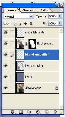
When you are finished, your layers might look something like this:
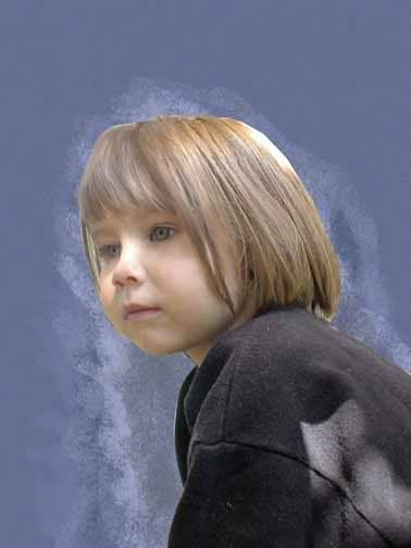
And hopefully, when you are all done (anywhere from one to eight hours later) your image will look something like this:
For more samples of my work, you can visit my website, it's right down there in my siggy.
Please give me feedback on the tute, any ideas to improve it, and ask any questions!!
PRINTING OPTIONS:
These images look good printed on normal photo papers, but really go WOW when printed on watercolor paper, handmade papers, or better yet, canvas....... oooh la lah!