By: ledirlo
Photo editing, or illustration may be practiced for fun, but no one can pretend being a "designer" without knowing the rules of graphic design.Many people think that being original, and thinking out of the box is a good thing, but it actually isn't if you don't follow the rules...Even the weirdest looking ads,or the funniest ones, follow these rules.
You have to know that the colors that are used in a picture always give a feeling to its spectator; colors are assiociated with feelings, mood, temperature, concepts, they are true symbols; for example , you may have noticed from watching ads, or packages, that white and blue are associated with products that have hygienical purposes, or that plain red is used to warn for danger, or that purple is used for expressing wealth, or luxury.Just because these colors have a true meaning in everyone's mind.
As you always have to keep this in mind when you design something, you have to remember not to please yourself, but to please the consummer, and that the picture you make should not express your own feelings, but a message.
On the other hand, when you make a picture with an artistic purpose, you have to express your own feelings, whatever they might be, but in these two different situations, colors are tools that you have to master.Therefore, you should always remember that the viewer's eye may be more sharp, accurate, sensitive, than yours.
Shapes:
Whether you work on a photography, or design a web page, or a logo, you should be able to see the basic shapes that compose it.The basic shapes you will use are square, circle, and triangle, any of them being composed of lines, and dots.
- the square expresses, or shows a structure, a frame.
- the circle has two properties: it is a target the eye focuses on, and it is also seen as an element of an organic, or abstract strucure (ex:molecule, planets, bubbles)
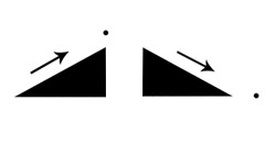
- the triangle is a perfectly balanced and stable shape that expresses energy.It can also show a direction when the size of its sides is altered.
Simplicity:
Here I want to demonstrate by the simplest possible way to make an "eye catching" picture: the last 20 years of advertisement have constantly tried to find new means of catching the consumer's eye, with flashy colors, pictures full of effects, they gradually put more and more things in the sceneries they created, untill it became too much, and meaningless.Here's the most eye catching picture you'll ever see:

This simple dot on a white rectangle is the structure used by almost every picture, poster ad, commercial web page, because our use of the latin alphabet got our brain accustomed to reading a page from its upper left corner to its lower right corner.In the pic, the grey rectangle is the frame that the eye watches into, the black dot is a target for the eye, and its power is multiplied by the highest contrast possible (B/W).If the dot had been a pale grey, it would have made the eye look for it, and concentrate on it, inducing questions into the viewer's mind ; if it had been a killer red, it would have been too agressive to be looked at.
Although all this may sound a bit too simple, or abstract, these are the basics of designing, and composing a picture.Every artistic director is aware of their importance.
So just try to analyse the composition of the pictures you see around you, paintings, ads, web pages, book covers,...it will help you understand this, and assimilate these rules so you can use them efficiently.No way this small explanation could be complete, it just means to make you always remember that "the less, the better".Always ask yourself these questions before you decide your work is over:
-Does the foreground object really need a background ?
-What do my eyes focus on when I watch the pic ?
-Do the colors need to be more or less contrasted and saturated ?
-How much time does it take an average viewer to understand the pic ?
-Would I like this pic if it was made by someone else than me ? :)
These questions apply to designers, but also to artists, so always keep the layers in your PSD file handy so you can fix what you dont like.
� all photoshop tutorials
|