Photoshop Contest PhotoshopContest.com
Creative Contests. Real Prizes. Essential Resource.
You are not logged in. Log in or Register


Photoshop Contest Forum Index - Featured Pic - mismatching - Reply to topic

waleed

Location: iraq,baghdad

Post Sat Aug 19, 2006 4:42 am   Reply with quote         


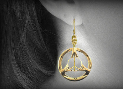
i need guidelines i can follow in matching an object \to the background...and even when colors are ok....the whole pic is not!!!what am I missing


bigbuck

Location: Australia

Post Sat Aug 19, 2006 5:18 am   Reply with quote         


If you're talking about the earring....maybe it just needed a little more saturation to match the top part a bit better. It's just a little 'washed out'.


armogeden

Location: The other side of your screen

Post Sat Aug 19, 2006 8:10 am   Reply with quote         


things to consider when intergrating a picture:

colour / b/w (even if the destination picture is in grayscale like yours, you can make it either colour or b/w depending on if you want to match it or to make it stand out respectively)

saturation levels: big buck right about this- a way to stop it looking so pale and washed out is to increase the saturation, which was i think about the only thing wrong with yours.

colour: the colours fine in yours but you should always check it just incase

lighting: in my experience 9/10 times the lighting is the only thing wrong when intergrating a picture. when it comes to lighting in pictures there are two types:

when there is an obvious light source which isn't obstructed (like strong sunlight outdoors)
these types have:
hard shadows/highlights
soft shadows/highlights

when there isn't an obvious light source, and more just general lighting (common in indoor scenes) like yours is
these types have
soft shadows/highlights
sometimes no definable shadows/highlights

just think about these things you'll make a lot more realistic pictures.

try adding some atmosphere aswell Razz i do that by adding a soft black around the outside not too much, just adjust it untill it looks right.

this kind of thing

perhaps this is a little much

i hope this helps you


_________________
Please check out my student blog Smile
http://gdc1tombrushwood.blogspot.com/
Lets stick together, we won't lose our way
armogeden

Location: The other side of your screen

Post Sat Aug 19, 2006 2:37 pm   Reply with quote         


pay attension that took a long time to write ! Laughing


_________________
Please check out my student blog Smile
http://gdc1tombrushwood.blogspot.com/
Lets stick together, we won't lose our way
ReinMan

Location: Kingston, ONTARIO, CAN

Post Sun Aug 20, 2006 9:33 am   Reply with quote         


Good points from the BuckMan and ArmagettinItMan!

Just a hint of a shadow I think would help this too... There is usually always SOME displacement of light when there is an object over another object. A plain DROP SHADOW won't do... sometimes you have to paint in the shadow yourself and then control the OPACITY / Transperancy of it VERY CAREFULLY.

Notice that the top part of the earring and the part you added are slightly different shades of yellow... a simple shift in the HUE will help that. Again, it is subtle.

Also, as Ledirlo says below - take a look at real gold jewellery pictures: perhaps the Saturation needs to come DOWN a bit, in the YELLOW channel/spectrum?


Cropping the image will also generally help. Putting the earring slightly off center makes for a somewhat more interesting composition. This also makes the viewer look at the WHOLE image, instead of just ZOOMING INTO the chopped object.

Also, keep an eye on the "grain" or NOISE in the different pieces in your post. In other words there shouldn't be any difference in the lumpyness of your bits. Sometimes you have to ADD NOISE to something so it sits on the other parts without looking like it was chopped from another picture.

Oh, and adding the "peace" sign is not required - but it might make it a bit GROOVIER! Very Happy


_________________

_________________________________
THIS SITE REALLY DOESN'T EXIST
the way our EGO THINKS IT MIGHT!
_________________________________
ReinMan
Guest

Post Sun Aug 20, 2006 9:49 am   Reply with quote         


I'd advise looking at a photo of a gold ring to see what it looks like and replicate


Post Sun Aug 20, 2006 1:39 pm   Reply with quote         


try adding some shadows to the background


Synthvet

Location: Oregon

Post Sun Aug 20, 2006 3:06 pm   Reply with quote         


AND MOST OF ALL...........NEVER...NEVER...NEVER....DO THIS!!!!!!!!!!!!!!!!!!!! Laughing

Laughing Laughing Laughing Laughing


_________________
Due to the shape of the North American Elk's esophagus,
even if it could speak, it could not pronounce the word lasagna.
- Cliff Clavin

Photoshop Contest Forum Index - Featured Pic - mismatching - Reply to topic

You cannot post new topics in this forum
You cannot reply to topics in this forum
You cannot edit your posts in this forum
You cannot delete your posts in this forum
You cannot vote in polls in this forum


Navigate PSC
Contests open  completed  winners  prizes  events  rules  rss 
Galleries votes  authentic  skillful  funny  creative  theme  winners 
Interact register  log in/out  forum  chat  user lookup  contact 
Stats monthly leaders  hall of fame  record holders 
PSC advantage  news (rss)  faq  about  links  contact  home 
Help faq  search  new users  tutorials  contact  password 

Adobe, the Adobe logo, Adobe Photoshop, Creative Suite and Illustrator are registered trademarks of Adobe Systems Incorporated.
Text and images copyright © 2000-2006 Photoshop Contest. All rights reserved.
A venture of ExpertRating.com