Photoshop Contest Forum Index - General Discussion - ok who do......... - Reply to topic
Goto page Previous 1, 2, 3, 4 Next
vokaris
Site Moderator

|
 Sat Mar 03, 2007 9:10 pm Reply with quote Sat Mar 03, 2007 9:10 pm Reply with quote
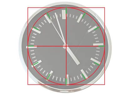
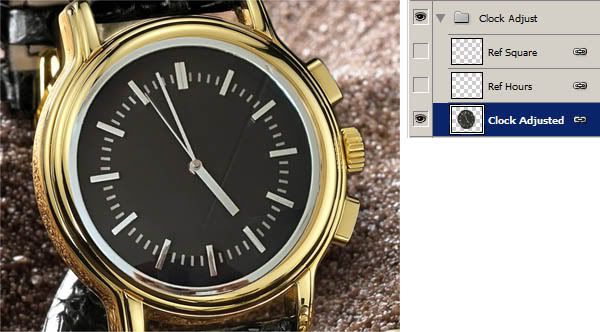
Open the source clock. Since it is not a perfect circle, we need to fix it. On a new layer draw a square, a circle, a cross (which we'll match later to the watch) and the hours ticks.
Free-transform the source clock to match the reference lines.
|
vokaris
Site Moderator
|
Sat Mar 03, 2007 9:14 pm Reply with quote
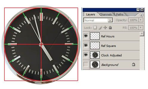
Link the adjusted clock layer with the reference and bring them in the 'watch' PSD
With the layers linked, bring the clock face layer transparency to zero and transform the reference grid until it matches the 12-6/3-9 cross of the original.
Because the layers were linked, the clock face will be deformed the same as the reference. Turn on the clock face layer, turn off the reference.
|
vokaris
Site Moderator
|
Sat Mar 03, 2007 9:18 pm Reply with quote
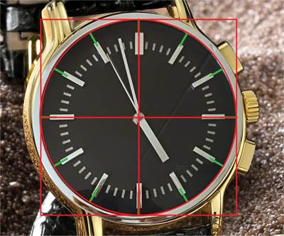
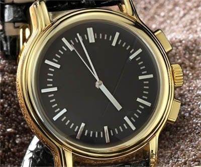
Mask around the clock face until it blends with the watch frame. Smudge some of the reflections from the original small print.
Make a selection around the small dials, copy them to a new layer and bring them on top
Clean up the small dials from what has remained from the original clock hands, adjust levels/colors to match. Add some bevel to make the dials 'sink' a bit.
|
Eve
Site Moderator

Location: Planet Earth
|
Sat Mar 03, 2007 9:19 pm Reply with quote
and that's the scientific way to do it!
I lower the opacity and distort it till it screams, THIS WILL DO!!!

*edit*
oops, Sorry, didn't realize it was a continuing tut...
|
vokaris
Site Moderator
|
Sat Mar 03, 2007 9:22 pm Reply with quote
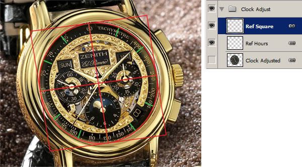
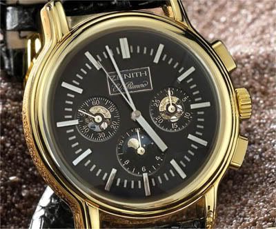
Make a selection around the Source clock hands, copy to a new layer and bring on top, add some shadow. Also bring forward the hidden parts of the 3-6-9 ticks.
Add an adjustment layer (i.e. selective color) masked to the clock face to match the gold color.
Now, this result is still far from perfect, but it would get my vote. Hope this helps.
|
blade_in_exile

Location: lancashire
|
Sat Mar 03, 2007 9:27 pm Reply with quote
voks thanks for the mini tut will get on it tomorrow and post the original and new one when complete so we can see the difference.
again thank you for taking time out to help me get better
_________________ chopper with training wheels
|
TofuTheGreat

Location: Back where I belong.
|
Sun Mar 04, 2007 12:27 am Reply with quote
Freaking wicked awesome tut Voks! 
This sooooooo needs to be put into standard tut format and put into the tuts section as an example of how to do a great integration.
I really liked the bit about how to match the perspective. That's a great technique. Until you showed that I'd have just lowered opacity and matched it by eye. Your method is much more precise.
I LOVE when we get to learn new stuff here. 
_________________ Why I do believe it's pants-less o'clock! - Lar deSouza
The mind is like a parachute, it doesnt work if it isnt open. - Frank Zappa
Created using photoshop and absolutely no talent. - reyrey
|
|
|
Sun Mar 04, 2007 12:36 am Reply with quote
Yeah, More great tutorials....More,more,more.
|
marcoballistic

Location: I am everywhere, and Nowhere, but mostly, I am right here!
|
Sun Mar 04, 2007 3:26 am Reply with quote
lol hungover this morning by any chance Anf 
|
blade_in_exile
Location: lancashire
|
Sun Mar 04, 2007 5:50 am Reply with quote
voks thanks for the tutorial i managed to do it but still no where near like yours, is there anywhere where i can learn about how to use adjustment layers????
_________________ chopper with training wheels
|
TheShaman

Location: Peaksville, Southeast of Disorder
|
Mon Mar 05, 2007 4:32 pm Reply with quote
damn nice tut there voks
gotta start your own thread... I've learned a lot these past few weeks from yours
|
Mir

Location: Malta E.U.
|
Tue Mar 06, 2007 4:52 am Reply with quote
TheShaman wrote: damn nice tut there voks
gotta start your own thread... I've learned a lot these past few weeks from yours
I agree with Shaman, this is a great tutorial and so very easy to follow, if everyone could put in one tutorial this good we would all make great improvements. Everyone has their own kind of field they are better at.
|
Granulated

Location: London
|
Tue Mar 06, 2007 4:58 am Reply with quote
blade_in_exile wrote: i have to kill/bribe/suck up to
to get votes, no this isn't me complaining i am just after some CONSTRUCTIVE advice about my last two posts as they IMO and a couple of other members been undervoted and i would like to know why they were
1 not voted for and
2 overlooked/ignored
3 no comments posted to suggest improvements (as i had from marco and tofu) in the last contest
here are the images that i am wondering about
18 votes
16 votes
see my comment when i voted for your watch entry...and i also voted for the other entry you're moaning about and it was a friggin ANONYMOUS contest !!!!!!!!!!!!!!
|
blade_in_exile
Location: lancashire
|
Tue Mar 06, 2007 10:01 am Reply with quote
Quote: see my comment when i voted for your watch entry...and i also voted for the other entry you're moaning about and it was a friggin ANONYMOUS contest !!!!!!!!!!!!!!
didnt post any of this until after the contests had been closed so wasnt vote whoring, i was just wondering, as for comments in the watch contest i did take notes and very much appreciated what you had said Gran as you were not the only one to say so.
just wanted to know overall why it didnt get voted as when i saw your comment and a cpl of others it made me think
_________________ chopper with training wheels
|
dewking

Location: Pembroke, MA
|
Tue Mar 06, 2007 10:57 am Reply with quote
My opinion - take it or leave it, and I'll be honest, possibly brutally.
1. If you have to say "I'm not complaining..." you're complaining.
2. People vote for different reasons, some posts stand out more than others. It may be an incredible photoshopped image, but if the overall idea is boring and unimpressive, people wont vote.
3. I could see complaining... sorry, commenting on only getting one or two votes and asking for help, but 18+ votes isn't all that bad.
4. Go through the winning entries and see what it was that got them the votes. Chances are, they all have that "wow" factor, or the "That's a cool idea!" feel. Not to make you feel bad, but you took a clock face and put it on a watch.... it's not exactly "outside the box". Its a copy/paste/mask. Not to mention it was very overdone in that contest, so many people may have just thought "oh another clock/watch...pass."
So basically some things to work on:
Take more time to get the source to fit in the image seamlessly. The tut by Vok was very good. notice how the gold would have made it blend better with the image. However, this may have only gotten you a couple of extra votes.
The reason: You also need to work on your theme. Again, taking a clock face and putting it on a watch doesn't really scream "original idea", as you can see by the amount of people that actually thought of the same thing.
As for the lighthouse post. Honestly, I think you should be very happy with 16 votes. I just think the quality was very low on it, it seemed grainy, out of focus, and the large light gradient on the left was really distracting and unnecessary.
That's my opinion on it. It may/may not be the popular opinion, but you asked for help and that's what I thought. I try not to sugar coat things when giving a critique. It doesn't do anyone any good. If you want to hear "you were robbed!", you won't get that from me.
_________________
zebob 06/09 @ 11:14 am
im more of an alethic computer geek that doesnt play sports but is still strong.
|
Goto page Previous 1, 2, 3, 4 Next
Photoshop Contest Forum Index - General Discussion - ok who do......... - Reply to topic
You cannot post new topics in this forum
You cannot reply to topics in this forum
You cannot edit your posts in this forum
You cannot delete your posts in this forum
You cannot vote in polls in this forum
|