Photoshop Contest PhotoshopContest.com
Creative Contests. Real Prizes. Essential Resource.
You are not logged in. Log in or Register


Photoshop Contest Forum Index - Requests ONLY - Logo - Reply to topic

Goto page 1, 2, 3, 4, 5  Next

Post Wed Apr 18, 2007 2:33 pm   Reply with quote         


I'm gonna pretend to be a newbie with zero contest entries....

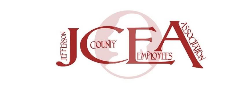
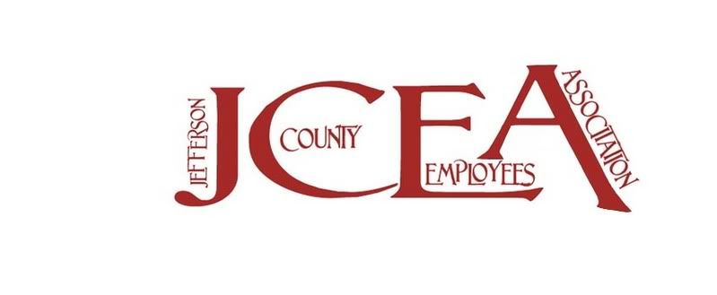
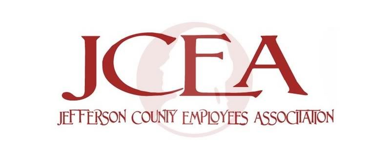
If anyone wants to play around with logos.....I am working on creating a logo for our employees association where I work.
Design will be one color or Black and White
Will be used on letterhead as well as T-shirts, and will include either the words Jefferson County Employees Association or JCEA somewhere in the design.....

I have done about 15 options myself so far, but I'm always open to ideas......
and as you probably guessed, I'm not offering any money

here are a few ideas I was playing with... http://volkswes.com/photos/jcea01.jpg
... I'm by no means a logo designer, so any tips and criticism is always welcome.

The sillhouette face comes from our official county seal/logo.... We call it the county nickel....it doesn't have to be in the design.


Post Wed Apr 18, 2007 2:43 pm   Reply with quote         


I think the bottom one is cool!


Post Wed Apr 18, 2007 2:47 pm   Reply with quote         


digitalpharaoh wrote:
I think the bottom one is cool!


Thanks, I like that one too....I may try several variations on that idea


Post Wed Apr 18, 2007 2:50 pm   Reply with quote         


Maybe increase the size of the star slightly...or move it over a bit. Really good idea, in my opinion.


Procyon
Site Admin

Location: Toronto, ON

Post Wed Apr 18, 2007 2:53 pm   Reply with quote         


I like 2 and 5!


_________________
Feel free to PM me, but PM a mod if you think they can help you. If you've won a prize, contact me!

Post Wed Apr 18, 2007 2:55 pm   Reply with quote         


digitalpharaoh wrote:
Maybe increase the size of the star slightly...or move it over a bit. Really good idea, in my opinion.


oops.....yeah I didn't notice that I didn't get the star centered.


TofuTheGreat

Location: Back where I belong.

Post Wed Apr 18, 2007 2:59 pm   Reply with quote         


Procyon wrote:
I like 2 and 5!


Ditto. I wouldn't include the text. Especially if this is going on shirts later on.


_________________
Why I do believe it's pants-less o'clock! - Lar deSouza
”The mind is like a parachute, it doesn’t work if it isn’t open.” - Frank Zappa
Created using photoshop and absolutely no talent. - reyrey

Post Wed Apr 18, 2007 3:01 pm   Reply with quote         


TofuTheGreat wrote:
Procyon wrote:
I like 2 and 5!


Ditto. I wouldn't include the text. Especially if this is going on shirts later on.


good thinking Very Happy


Post Wed Apr 18, 2007 3:25 pm   Reply with quote         


BTW this is where the face comes from.........

http://volkswes.com/photos/county-nickel01.jpg


glennhanna

Location: Eugene, Oregon

Post Wed Apr 18, 2007 3:55 pm   Reply with quote         


The 4th one down was my favorite. As for others, I don't see the nickel as being a "C".... it looks more like an "O" or lower case "e". And placing the Nickel in the middle makes it look like you've added an "O" to the acranym.


lozerkidzunited

Location: My Room.

Post Wed Apr 18, 2007 4:09 pm   Reply with quote         


I might be on my own here, But I really like the first one. I'm going to mess around in photoshop and see if I can come up with one for you. I'm not that good yet, But its worth a try Huh..


_________________

Best place in the world.
TofuTheGreat

Location: Back where I belong.

Post Wed Apr 18, 2007 4:16 pm   Reply with quote         


glennhanna wrote:
The 4th one down was my favorite. As for others, I don't see the nickel as being a "C".... it looks more like an "O" or lower case "e". And placing the Nickel in the middle makes it look like you've added an "O" to the acranym.


That's a very good point that I didn't notice before. This does tend to make the 4th one the better option.

However it all depends on how recognizable that "coin" logo is in the County. The logo for the county I work for is very well known. Actually we have two. One for the seal, letterhead, etc. and one for the tourism campaign.

That second logo caused quite a stink when it was being developed. It says "Good Times Are Carved in Wood" (Wood County, get it). Anyway people thought that was going to be the new official logo for the county. So some thought it wasn't appropriate to have a summons or other bad news to have that saying on it. Laughing


_________________
Why I do believe it's pants-less o'clock! - Lar deSouza
”The mind is like a parachute, it doesn’t work if it isn’t open.” - Frank Zappa
Created using photoshop and absolutely no talent. - reyrey

FootFungas

Location: East Coast!

Post Wed Apr 18, 2007 4:22 pm   Reply with quote         


What you've got now are pretty cool.
I like the top one the best.


Post Wed Apr 18, 2007 4:34 pm   Reply with quote         


Here is another variation I did using the bottom one.

http://volkswes.com/photos/jcea02.jpg

....and here is a variation on the 2nd one

http://volkswes.com/photos/jcea03.jpg

and yes the Nickel is highly recognized here.........it is on all of the official letterhead, and is on all of the county's vehicles and equipment.


lozerkidzunited

Location: My Room.

Post Wed Apr 18, 2007 4:55 pm   Reply with quote         


I gave it a try, and made a few. Hope you like Smile


_________________

Best place in the world.

Goto page 1, 2, 3, 4, 5  Next

Photoshop Contest Forum Index - Requests ONLY - Logo - Reply to topic

You cannot post new topics in this forum
You cannot reply to topics in this forum
You cannot edit your posts in this forum
You cannot delete your posts in this forum
You cannot vote in polls in this forum


Navigate PSC
Contests open  completed  winners  prizes  events  rules  rss 
Galleries votes  authentic  skillful  funny  creative  theme  winners 
Interact register  log in/out  forum  chat  user lookup  contact 
Stats monthly leaders  hall of fame  record holders 
PSC advantage  news (rss)  faq  about  links  contact  home 
Help faq  search  new users  tutorials  contact  password 

Adobe, the Adobe logo, Adobe Photoshop, Creative Suite and Illustrator are registered trademarks of Adobe Systems Incorporated.
Text and images copyright © 2000-2006 Photoshop Contest. All rights reserved.
A venture of ExpertRating.com