Photoshop Contest Forum Index - Fun and Games - Please critque my new logo design - Reply to topic
Goto page 1, 2, 3 Next
Heinlein

Location: Rochester, New York
|
 Wed Nov 07, 2012 1:19 pm Reply with quote Wed Nov 07, 2012 1:19 pm Reply with quote
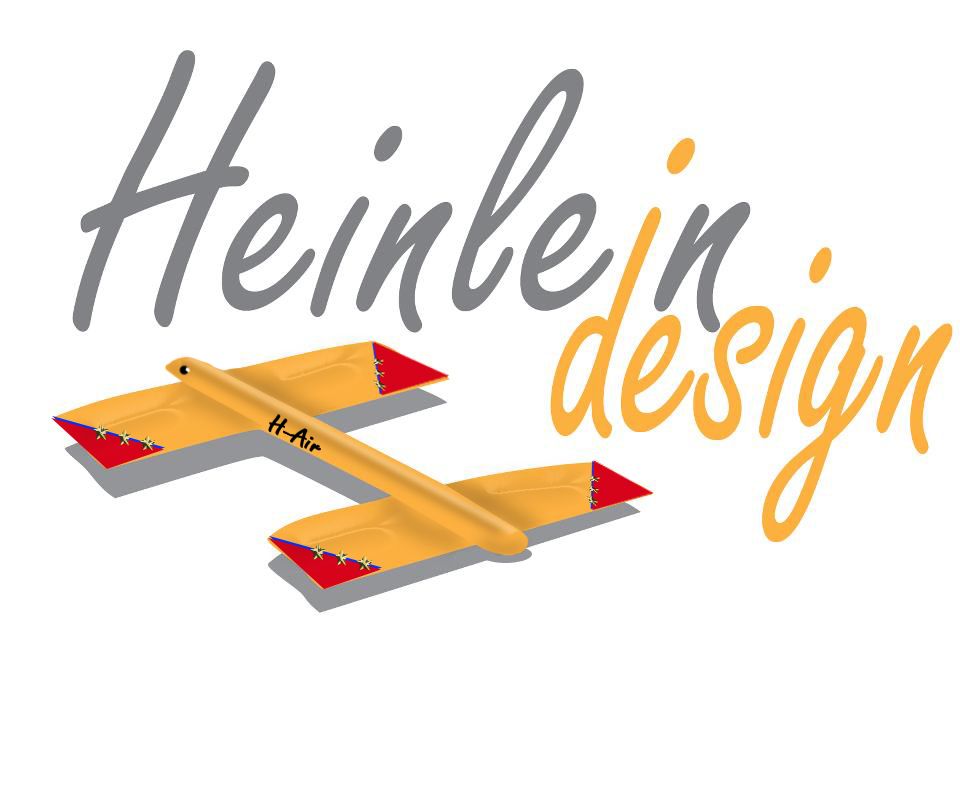
Hi Everyone,
I am revamping my Heinlein Design logo, and here is what I came up with.
If you do not mind, any suggestions for improvement would be appreciated.
Please be gentle.
|
Tesore

Location: On the way to Utopia!
|
Wed Nov 07, 2012 1:36 pm Reply with quote
I just did, on Facebook 
This is what I think, ok!
If you sell little, yellow paper airplanes, it's perfect!
The font and colors are a little too soft for you.
Make it more sparkling, alive, let it rock!

|
kittie

Location: Florida
|
Wed Nov 07, 2012 2:55 pm Reply with quote
You may even be able to do without the Giant H underneath, in fact, making the text the only focal point may help it out a lot. At first I thought you may need something more bold, as I felt the text seemed a little weak for your business, but the more I looked at it, the more I liked it.
I have no idea what I'm doing.
|
Werdnaibor

Location: Albany, NY
|
Wed Nov 07, 2012 3:13 pm Reply with quote
vokaris wrote:
Typo! Just kidding. I like that idea.
But what does the secret acronym "HLDS" mean?
|
cringer8

Location: Seattle
|
Wed Nov 07, 2012 3:18 pm Reply with quote
Heinlein wrote: Hi Everyone,
I am revamping my Heinlein Design logo, and here is what I came up with.
If you do not mind, any suggestions for improvement would be appreciated.
Please be gentle.
I think the composition is good. The font is a little weak, though. Also, from a printer's standpoint, that grey will come out just fine on a press, but not so hot off a four color mix (CMYK). It will always have a tone; on some printers, it will be bluish while on another it might be reddish. Nothing but headaches, if you're a perfectionist Maybe if you darken it to nearly pure black...
For the font, the strokes are too uniform in thickness. It makes it look too "cookie-cutter." I would outline the strokes and play with the control points in Illustrator to customize the font; give it a little more edge.
Just my thoughts 
|
Eve
Site Moderator

Location: Planet Earth
|
Wed Nov 07, 2012 6:59 pm Reply with quote
Heinlein wrote: Hi Everyone,
I am revamping my Heinlein Design logo, and here is what I came up with.
If you do not mind, any suggestions for improvement would be appreciated.
Please be gentle.
I'm not too keen on the font either, Jim. Between the graphic and font it looks very retro and the letters need some kerning. If you were going for a retro look, it fits.
Anytime I've made a logo I keep in mind how it will look when it's reduced to 1" and how it will look in b&w.
_________________
"Recently, NASA scientists discovered that most people love to play video games but hate to die in fiery airplane crashes." lifted from mason4300
|
Heinlein
Location: Rochester, New York
|
Thu Nov 08, 2012 9:09 am Reply with quote
Thanks everyone. Maybe I should stick with my original logo below.
|
DaVinci

Location: The Netherlands
|
Thu Nov 08, 2012 9:42 am Reply with quote
Heinlein wrote: Thanks everyone. Maybe I should stick with my original logo below.
Personally I do prefer your current logo over the new one, I think it's more appropriate here.
My first thought when I see the new logo is a logo for a painting company (I think)...also not sure about the font.
Maybe create some more drafts and show them here, play with the fonts and colors, etc.
Good luck!
|
arcaico

Location: Brazil
|
Thu Nov 08, 2012 3:00 pm Reply with quote
It´s great... for an illustrator. Passes the idea you work mainly with illustrations... but that´s just my 2 cents. I may be wrong.
_________________
TheShaman wrote: fine fine! I'm an idiot!
|
arcaico
Location: Brazil
|
Thu Nov 08, 2012 3:01 pm Reply with quote
Eve wrote:
Anytime I've made a logo, all the two of them, I keep in mind how it will look when it's reduced to 1" and how it will look in b&w.
_________________
TheShaman wrote: fine fine! I'm an idiot!
|
|
|
Thu Nov 08, 2012 6:57 pm Reply with quote
My two cents:
- too airy and wishy-washy. It lacks strength, partly because of the kerning of the font, the font itself and the lightness of the orange
- For CMYK printing, you'll often get inconsistent results with orange.
- I prefer your old logo design, but maybe with a bit of a revamp...the emphasis on CMYK colours is unnecessary and makes it look a bit dated.
|
shane.e.randall

Location: Indiana, PA
|
Fri Nov 09, 2012 12:49 am Reply with quote
Heinlein wrote: Hi Everyone,
I am revamping my Heinlein Design logo, and here is what I came up with.
If you do not mind, any suggestions for improvement would be appreciated.
Please be gentle.
OK... The colors are more so leaning towards "make me hungy type colors" I used to know someone who worked in the advertisement company for Dunkin Donuts. The colors just remind me of that. Its not just the colors its that there is no contrast (thats a personal preferance) its too soft reminds me of something you would put in an add for babies. Its a good logo, I just dont think it fits your style. More so the color and lack of contrast than anything.
_________________ <iframe></iframe>
|
delia

Location: Near Albany, NY
|
Fri Nov 09, 2012 9:33 am Reply with quote
I prefer the old logo too... maybe just updated the magenta/yellow to comething a little newer/trendy?
|
Goto page 1, 2, 3 Next
Photoshop Contest Forum Index - Fun and Games - Please critque my new logo design - Reply to topic
You cannot post new topics in this forum
You cannot reply to topics in this forum
You cannot edit your posts in this forum
You cannot delete your posts in this forum
You cannot vote in polls in this forum
|